
Honda "Paper" Des oiseaux qui jouent de la guitare au Musée des beaux-arts de Montréal. Vue de l'installation « from here to ear » Photo : Céleste Boursier-Mougenot / Paula Cooper Gallery Après s'être consacrés au chant, les oiseaux se sont mis à la guitare.
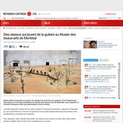
C'est l'impression que donne la nouvelle installation du Musée des beaux-arts de Montréal, dans laquelle un collectif d'oiseaux offre une performance rock en direct. L'insolite dispositif musical met en scène quelque 70 diamants mandarins, originaires d'Australie, qui, en se perchant sur l'une des 10 guitares et des quatre basses électriques branchées à des amplificateurs, produisent des mélodies. Pour apprécier cette mélodie improvisée, les visiteurs sont invités à circuler dans cette volière géante, installée dans le Carré d'art contemporain du musée.
Des oiseaux qui jouent de la guitare... Des oiseaux qui jouent de la guitare au Musée des beaux-arts de Montréal. Des oiseaux qui jouent de la guitare au Musée des beaux-arts de Montréal. Live Texturing of Augmented Reality Characters from Colored Drawings. These Jaw-Dropping Halloween Costumes Are For Kids In Wheelchairs. Yung Cheng Lin. The 2016 U.S. Presidential Candidates’ Logos, Ranked. — organizer sandbox. I’ve long held the ridiculously biased and shamelessly partisan opinion that Republican campaigns are…uh…less than excellent at graphic design.
I have some theories on why this might be the case, which I will not be sharing. What I will be sharing is my attempt at assessing and ranking the logos of the fourteen (as of June 7, 2015) declared candidates. I have also reviewed all of the candidates’ websites for logo integration and overall design, and oh man do you ever owe me for that. As there are currently ten Republican candidates and only four Democratic candidates, this isn’t exactly a fair fight in terms of “which side is better.” The real takeaway is that bad design is bipartisan. 14. 13. 12. 11. 10. 9. 8. 7. 6. Eerie Chalkboard Drawings From Almost 100 Years Ago Were Discovered Unscathed. BusinessTown. Este artista transforma música em pinturas de forma precisa.
As belas aquarelas animadas em 3D de Aaron Becker, ex-Disney e Lucasfilm. Political Emojis Become Unexpected Tools in Social Unrest. Earthmojis, emoji-based protest placards, effectively tell dire environmental stories With social media and visual exposure becoming an ever-more-powerful factor in whether news of a protest gets around, it’s surprising there haven’t been more designers lending their skills to better placard communication.
But Naresh Ramchandani, a partner at the design firm Pentagram, decided to boldly step into the political realm, designing and leaving out a set of striking emoji-based placards called Earthmojis for the People’s Climate March in London on March 7th. Amid the hand-scrawled enthusiasm of the hundreds of handmade signs drawn by the masses, the signs managed to use the spare visual language, which originated in its most popular form on iOS devices, to bring attention to a variety of issues.
In a few instances, there were some minor tweaks to the graphics. Each placard has a brightly-colored background to make it stand out against all the cardboard signs. Pintor deficiente visual arrecada mais de U$ 1 milhão pra caridade com seus incríveis trabalhos em 3D. Floating Flower Garden – 花と我と同根、庭と我と一体と βVer. The Type Taster: How fonts influence you. Designer and Type Tasting founder Sarah Hyndman has published a new book exploring our emotional and subconscious responses to type.
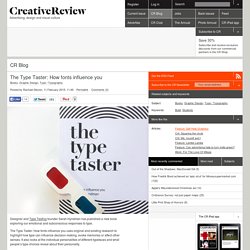
The Type Taster: How fonts influence you uses original and existing research to highlight how type can influence decision-making, evoke memories or affect other senses. It also looks at the individual personalities of different typefaces and what people’s type choices reveal about their personality. The book begins with an introductory section explaining type’s importance, followed by a brief history of key developments in typography from the 1450s to the present day as well as some general rules on use. Most of it, though, deals with how we respond to type through a series of diagrams, quizzes, games and experiments.
Hyndman also cites her own findings on emotional responses to type throughout, gathered through a series of interactive experiments conducted online and in workshops. Watch A Calligrapher Recreate Famous Logos In Mere Seconds. Série gratuita mostra os bastidores da criação de obras gráficas. LIQNYC plays god, turns our solar system into consumable candy LIQNYC has created a series of lollypops made to resemble the surfaces of the different planets in our solar system.
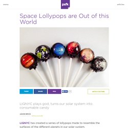
Though space spent the decades between 1990 and 2010 as a sort of “also ran” topic in the public eye, recent events surrounding SpaceX and Mars have spawned several popular space-oriented products. Though planet-based lollypops seems almost obvious as an idea, the process for making them is complex and interesting. Most lollypops are solid colored or randomly colored because that’s the easiest way to make candy, but the LIQNYC team borrowed techniques from candy cane making and salt water taffy to create these reasonably accurate depictions of Earth and her nearest neighbors. Within a certain margin for error in both candymaking and how good our extraterrestrial imaging is, the final product is fairly accurate.
O artista de rua que espalha “portais” coloridos pelas cidades. E se você pudesse virar uma árvore depois que falecer? Jjhyun. Enhanced Tasty Formulas Cutlery design focuses on getting food in bite-sized morsels from the plate to the mouth, but it could do so much more.
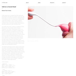
The project aims to reveal just how much more, stretching the limits of what tableware can do. Focusing on ways of making eating a much richer experience, a series of dozens of different designs has been created, inspired by the phenomenon of synesthesia. This is a neurological condition where stimulus to one sense can affect one or more of the other senses. An everyday event, ‘taste’ is created as a combination of more than five senses. The materials in the design currently compose of metal, plastic and ceramics. Design Ah! (デザインあ) introduces kids to design concepts. In 2011, Japan’s NHK television network began broadcasting Design Ah!
, a Peabody award-winning children’s educational program that explores different types of creative thinking for viewers of all ages. With an “Ah” that stands for that Ah! Moment, as well as for あ, the first character of the Japanese alphabet, the program is full of minimal, rhythmic, well-crafted short clips that don’t shy away from sophistication. Cobertura Hypeness: cheio de estilo, Estúdio Glória reúne peças vintage originais e coloridas em SP. Ao andar pelo bairro Vila Madalena, em São Paulo, alguns lugares legais podem até passar despercebidos por você.
Série revela o que há por trás das fotos de comida que vemos em propagandas. Predominantly. Animated Typographic Architecture Is A Design Nerd's Dream. Elaborate typography + fantasy architecture + GIFs + clever logo design = German creative firm Deepblue Networks latest promotional campaign and a design nerd’s complete breakfast.
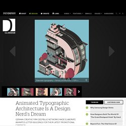
The firm collaborated with illustrator and graphic designer Florian Schommer of Hamburg-based Kjosk Collective to create this series of animated buildings shaped like the letters of their logo (DEEPBLUE). Each building-letter is filled with little Sim-like people running around, and represents a department within the firm, including art direction, copywriting, interaction design, and motion graphics. The animated site is meant to explain to visitors and potential hires how the firm works, in a much more exciting way than most corporations’ "Who We Are" pages do.
Mission and History - Now I Lay Me Down To Sleep. It’s Kind of Cheesy Being Green — The Message. Apple is petty sometimes A few months ago my friend Edd Dumbill shared a discovery.
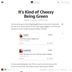
He pointed out that if you search Twitter for the words “green bubbles” you’ll find very consistent results. People hate green bubbles. Example: I’ve been performing that same Twitter search every few days and the results are consistent. What those tweets are referring to is how iPhones deal with text messages. It’s Kind of Cheesy Being Green — The Message. Roteiro Hypeness: conheça a Tatuí, a primeira banca de títulos independentes do país. Plataforma on-line reúne obras de artistas com síndrome de Down.
A Guy Created A "Sexist Tip Calculator" That Stiffs Female Servers To Highlight The Wage Gap - BuzzFeed News. This Project Is Turning Ex-Cons' Prison Tattoos Into Beautiful Artwork. Ordinary people, Hollywood budgets. People often look up to the superstars in magazines, marveling at how amazing they look without realizing that they too can look the same. Armed with $20,000 of lighting equipment and a homemade rain machine, I wanted to prove to them how amazing they looked, straight out of camera. Great Lighting. No Photoshop. This Video Of Fibonacci Sculptures That Look Like They're Moving Will Be The Only Thing You Want To Watch Today — VIDEO.
Prepared to be hypnotized by these stunning Fibonacci zoetrope sculptures, created by John Edmark, an inventor, designer, and artist who currently teaches at Stanford University. These sculptures, created using a 3D printer, are designed to animate when spun while lit by a strobe light or, in the case of this video, when filmed with a very short shutter speed. According to the video’s introduction, Edmark’s “placement of the appendages is determined by the same method nature uses in pine cones and sunflowers… If you count the number of spirals on any of these sculptures you will find that they are always Fibonacci numbers.”
Posters that Mess With the System. Outdoor Advertising is more than just posters. Context and form can be played with to produce a powerful and surprising result. These examples from the 2014 D&AD Awards show just what lengths brands can go to to get the audience to pay attention. At D&AD there's a sub-category for this called Enhanced Posters. Or you might prefer to call it Posters that Mess with the System. The Legends Return. Disney Invents an Adorable Robot for Making Giant Sand Drawings. Disney's newest robot is designed to bring characters to life on beaches. ETH Zürich The prongs on the rake can be controlled individually, allowing the lines the BeachBot draws to vary from two inches to 15 inches. The robot's bulbous balloon wheels allow it to traverse the entire sandy canvas without leaving tire tracks.
The laser-based positoning system gives the BeachBot to draw accurately down to the millimeter. Kids will recognize the design cue from the turtles in Finding Nemo. Fresh Guacamole by PES. A Childhood Ritual Transforms Roadkill Into Art — Vantage. Over a summer holiday in the South of Sweden during bike trips to the beach, photographer Maria Ionova-Gribina encountered what anyone riding their bike near a busy road is bound to see — the unfortunate animals dashed by passing cars.
The first was a bird. Far from being repulsed by its dormant form though, she was reminded of her own childhood. Ilustrações que mostram como é a vida moderna no Japão. Imagens mostram ilustradores de desenhos animados estudando seus reflexos no espelho para criar as expressões dos personagens. Skillshare - 20 Online Resources Every Graphic Designer Should Know. These Medieval Doodles Might Be The Coolest Thing Ever. Artista passa 10 anos construindo uma caverna fantástica com seu cachorro. Projects. FOME DE QUÊ? 32 Of The Most Beautiful Book Covers Of 2014. Hayao Miyazaki agora está fazendo arte para capas de livros. Designer inova e cria jóias com flores de verdade dentro. Após crítica, marca deixa que menino de 7 anos recrie rótulo de produto.
Três fontes inteligentes que resolvem problemas do cotidiano - Gizmodo Brasil. Cidade espanhola lança competição de vasos nas janelas e deixa toda a cidade florida. New Logo and Identity for Porto by White Studio. Play: Experimental Typography. Galerie de ereieme. Galerie de Zéh Palito. Galerie de ALTO*CONTRASTE ((A*C)) Galerie de M E D O. How Tattoodo Got Started.