
PRIDE - Responsive HTML Template. PRIDE – Responsive HTML Template Powerful site template designed in a clean and minimalistic style.
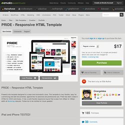
This template is very flexible, easy for customizing and well documented, approaches for personal and professional use. Pride has been coded in HTML5 & CSS3 and jQuery. It has a solid flexible responsive layout that scales from 320px to 1260px width all Bootstrap features. Follow me to be notified for future updates! iPad and iPhone TESTED! 20 Thèmes Responsive Stupéfiants à Connaitre Absolument. 60+ Best Responsive WordPress Themes. A responsive WordPress theme is a theme build to adapt with the purpose of giving tablet and smartphone users a great experience.
This without maintaining multiple websites and multiple sets of content! For some time dedicated WordPress mobile themes was the best option, but recently responsive WordPress themes have been all over the place. There is no doubt that responsive web design is the new hot trend and so it is to use responsive CSS frameworks to implement the responsive layouts. With the rapid growth in number of smartphones and Internet enabled gadgets being sold world wide, it is time to take mobile web design serioust and ensure that your blog or business website is ready.
WordPress themes with responsive layouts makes this possible and at a reasonable cost. Having a responsive web design allows your website content to be displayed correctly to all users by adjusting the layout to accommodate screens of different sizes and orientation. Advertisement. 25 thèmes WordPress responsive magnifiques et gratuits. Offrez-vous un magnifique thème responsive WordPress pour embellir votre site ou votre blog et ce à moindre coût puisque les templates présentés dans cet article sont gratuits !
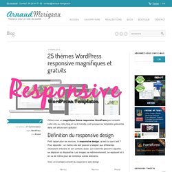
Définition du responsive design Petit rappel pour les novices, le responsive design, qu’est-ce que c’est ? Pour répondre : un même site doit pouvoir s’adapter aux différentes résolutions d’écrans et son contenu aussi. Les colonnes peuvent s’ajuster, se déplacer ou disparaître. Les images se redimensionnent, se replacent et il en va de même pour de nombreux autres éléments. Voici un exemple concret du responsive web design : 25 thèmes responsive WordPress gratuits Voici la sélection de thème WordPress responsive gratuits que vous attendez tous mais avant de télécharger et concocter de beaux sites, vous conviendrez qu’un petit merci ou un partage sur Twitter ou sur Facebook ne sera pas de trop 1. Démo Télécharger 2. 3. 4. iTheme2 WordPress thème responsive 5. 6. 7. 8. 9. 10. 11. 12. 13. 14. 15.
Design Process in the Responsive Age. Le plein de ressources sur le responsive design. Impossible que tu n'en ai pas entendu parlé si tu t'intéresses un minimum au web, le responsive web design (ou conception de sites web adaptatifs pour les francophones acharnés), consiste à concevoir des sites web avec une seule interface, qui s'adapte automatiquement à la taille de l'écran du terminal utilisé par l'internaute.
Ce n'est par exemple pas (encore) le cas ici, puisque j'ai pour le moment mis en place un design spécifique pour les mobiles (tu dois normalement être redirigé automatiquement vers l'adresse m.coreight.com). J'espère d'ailleurs que ce n'est pas trop le bordel suivant les versions de mobiles et de tablettes, je ne suis pas encore équipé de tous les modèles du marché pour tester. Mais j'accepte les dons. Deep dive into responsive mobile design, part 1. November 8th, 2011 It’s time to take a closer look at the design and implementation principles of responsive mobile design, and this will be the first part in a series that will answer three underlying questions: what are we designing, why are we designing it in a certain way and how are we implementing the target design.
This series is based primarily on our experience in unifying the two separate code bases that we had for the Android market client – one optimized for small phone screens, and another optimized for large tablet screens. The main goal is to show the basic principles of designing and developing for a wide variety of screen sizes, ratios, resolutions and form factors. Keep in mind that the Market client UX and UI design used to highlight the specific points is always work in progress, as we continue refining and polishing the application across the entire gamut of supported devices.
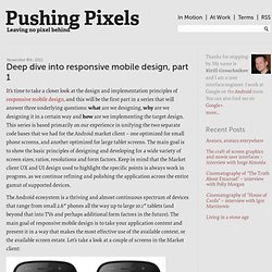
This is a screenshot of the application details page. What happens on a larger form factor? W3C Looks to Improve Responsive Design With New Media Queries. The W3C, the group charged with overseeing the creation of web standards like HTML and CSS, recently gave its official blessing to one of the cornerstones of responsive web design — CSS Media Queries. CSS Media Queries are the basic building block of responsive design, which, at its simplest, just means building websites that work on any device.
That way, when a dozen new tablets suddenly appear on the scene you can relax knowing your site will look and perform as intended, no matter which device your audience is using. Now that the Media Queries Level 3 spec has been finalized, work has started on CSS 4 Media Queries, or more formally, Media Queries Level 4. The W3C’s draft spec of Media Queries Level 4 adds three new features you can query in your stylesheets, including: script — Query to check if JavaScript is enabled.pointer — Query to see what sort of input device is being used (mouse, finger, stylus etc).hover — Query to see if the :hover pseudo-class will work on the current device.