
Responsive Web Design: What It Is and How To Use It. Advertisement Almost every new client these days wants a mobile version of their website.
It’s practically essential after all: one design for the BlackBerry, another for the iPhone, the iPad, netbook, Kindle — and all screen resolutions must be compatible, too. In the next five years, we’ll likely need to design for a number of additional inventions. When will the madness stop? It won’t, of course. In the field of Web design and development, we’re quickly getting to the point of being unable to keep up with the endless new resolutions and devices. Convert a Menu to a Dropdown for Small Screens. The Five Simple Steps website has a responsive design with a neat feature. When the browser window is narrow, the menu in the upper right converts from a regular row of links into a dropdown menu. When you're on a small screen (iPhone shown here) and click the dropdown, you get an interface to select an option where each option is nice and big and easy to choose.
That sure makes it easier to pick a place to go than a tiny link. Yeah, it's two taps instead of one, but that's arguable since you'd probably have to zoom in to tap the right link otherwise. The HTML. Adaptive layouts with media queries. 50 Useful Responsive Web Design Tools For Designers. Responsive web design ja Mobile first – Mitä ja miksi? Jo pitkään on alalla keskustelu siitä, miten suhtautua monimuotoiseen kohdelaitteiden joukkoon.
Pelkkä puhe mobiililaitteista ja puhelinten huomioimisesta suunnittelussa ei riitä. Kyse on paljon laajemmasta kysymyksestä kuin vain sivuston toteuttamisesta eri laitteissa käytettävinä versioina. Kyse on käyttäjien ja käyttötapojen huomioimisesta ja siitä miten toteutus vaikuttaa käyttäjien toimintaan. Ehkä periaatetta parhaiten kuvaan ohje: Don’t shrink – rethink! Vaihtoehtoja eri päätelaitteiden huomioimiseksi On selvää, ettei verkkosivustoa kannata toteuttaa useana eri versiona ylläpidon ja sisällöntuotannon hankaloitumisen vuoksi. Ensimmäinen vaihtoehto on se, ettei tehdä mitään! Toinen vaihtoehto on toteuttaa täysin oma mobiililaitteille suunnattu sivusto.Tämä näkyy usein omana URL osoitteena kun sivulle tullaan vaikkapa älypuhelimella. Designing for a Responsive Web. The web as we know it is changing.
In the past, designers and developers only had to concern themselves with one medium: the computer screen. In recent years, however, a plethora of fully internet-enabled devices with scores of different shapes and capabilities have cropped up, meaning that we now have to design our websites to fit comfortably in as many screen sizes, shapes, and resolutions as you can possibly think of. Our old fixed-width layout approach is out of the question now. So what do we do? Responsive Design in 3 Steps. Responsive web design is no doubt a big thing now.
If you still not familiar with responsive design, check out the list of responsive sites that I recently posted. Web Fonts. 45+ Very Functional Javascript Sliders and Scrollers. Every web developer needs to use Javascript in creating web applications, and when it comes to displaying multiple items on a page with a focus on a single item, sliders and scrollers come in handy.
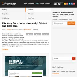
You can use Javascript sliders and scrollers with news, images or products to display data in an organized and user friendly way. In this article, I compiled a list of 46 very functional Javascript sliders and scrollers for you to use in developing web applications. Cluster Cluster has a great solution to fit the large bold text. They’re using a slider in their banner area by making the image full width and place the large bold text to fit in. Preview Of course, there are many various solutions in the list as well. Slider Revolution Slider Revolution is a responsive(mobile friendly) or full-width slider with must-see-effects and meanwhile keep or build your SEO optimisation (all content always readable for search engines). Few other important benefits to Slider Revolution: 2. 5. Creative Kilta. 50 Example CSS3 and Tutorials Style. Today i collected beautiful style design of CSS3 tutorials, examples that available for demo view and download such Text Effects and Layout, CSS3 Animated, CSS3 3D Text, Pure CSS, CSS drop-shadows, CSS image replacement, css background, css rounded corners, border radius, box shadow,css3 inner shadow, css drop shadow, css3 drop shadow and CSS3 slider/slideshow … etc.

CSS 3 are going to be very interesting. They will allow the designer/developer to select on much more specific levels of the document. One of the nice things about this module is that many browsers are already starting to support the advanced CSS 3 selectors, so you can start trying them out now. You can find out more 40 Useful HTML5 Lessons, Tutorial for Learning HTML5 . CSS3 tutorials has brought about a number of aesthetically impressive new features. Pre-loaders are a common sight in modern web design. Here’s some form input checkboxes styled with CSS3 to look like iPhone style on/off buttons. Opera Mini & Opera Mobile browsers.
Color Scheme Designer 3. Free textures for your next web project. Nothing like a field of beautiful flowers. Download Download These lovely water-colorful dots will make your designs pop. Download More leaves from another angle. Download Download Look at all these bubbles!