
PHP image resizing on the fly. A ridiculously easy-to-use PHP script for resizing images the smart way.

One of the challenges that comes with maintaining a graphic-intensive website like Shifting Pixel is finding a way to get high quality images throughout the site with as little effort as possible. To tackle this, I developed the Smart Image Resizer and have been using it around the site for the past few months. I couldn’t be happier. The major advantage of this script is that it allows me to resize and crop any image on my website without touching the actual image or writing any code. I upload each image once at a high enough resolution and can then reuse it at any size I want, anywhere I want. And, if this wasn’t a big enough time-saver for me right now, it’ll be a huge time-saver the next time I decide to redesign my site. Features Requirements PHP 5.1.0+ compiled with GD. Download Download SLIR 2.0 Download Smart Image Resizer v1.4.1 (Released August 6, 2008) Tip jar To Install Troubleshooting Common error messages.
The Fluid Grid. This website is designed and built using a fluid grid.

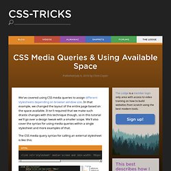
It will display properly on almost any screen resolution. It will render properly on mobiles, tablets, and Web enabled TV’s. No plugins required; no subdomains or mobile specific URLs (ie. mobile.promediacorp.com; promediacorp.com/mobile). Resize your web browser window and you will see that the content on this page renders differently depending on the height and width, as seen in the short clip below: This is how the homepage renders on a mobile handset, such as an iPhone: This is how the homepage renders on a tablet (portrait orientation), such as an iPad: This is how the homepage renders in a typical desktop view: Responsive web design on a fluid grid eliminates the question of whether you need a mobile site. An evolution in web design? CSS Media Queries. We've covered using CSS media queries to assign different stylesheets depending on browser window size.

In that example, we changed the layout of the entire page based on the space available. It isn't required that we make such drastic changes with this technique though, so in this tutorial we'll go over a design tweak with a smaller scope. We'll also cover the syntax for using media queries within a single stylesheet and more examples of that. The CSS media query syntax for calling an external stylesheet is like this: You may be familiar with the media attribute, normally being "screen" or "print" or even a comma separated list, like "screen, projection". Likewise, you can use more advanced CSS media queries like: You may use as many media queries as you would like in a CSS file.
Example Let's say we have a fluid width design where the sidebar is 35% of the width of the page. In our example sidebar, we are going have a list of names of the Super Team which function as email links. Types. Adaptive Images in HTML.