
Console Twitter - Ministère des Affaires étrangères français. Guide to CSS support in email. Version history 14 November 2017 Outlook.com and the Outlook iOS app added support for CSS background images and some related properties, as well as certain Flexbox and Grid properties.
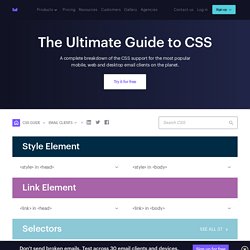
Also added iOS 11 Mail to the guide, with no noticeable differences from iOS 10. 22 September 2017 Microsoft updated the Outlook apps for iOS and Android with more consistent CSS support, including media queries. 13 September 2017 A complete rewrite and redesign of the guide, testing 278 different CSS properties and features across 35 email clients. To accommodate the huge increase in content, we’ve added search functionality and the ability to link directly to individual the email clients and properties for easy sharing.Discuss this on our blog. 2 May 2014 Removed support for various selector options (E) in Gmail and added support for direction, vertical-align and list-style-type in Outlook ’07/’10/’13. 19 September 2013 30 January 2013 1 February 2012 background-image is now supported in Gmail. 10 December 2010.
5 Common Causes of Slow Website Performance. One of the benefits of working in the website performance industry is the treasure trove of interesting data just sitting out there in the public domain.
Over the last few days we aimed our website performance scanner at the Alexa Top 1000 websites to gather various performance metrics of interest. In this post we’d like to highlight the top 5 most common high impact performance causes we uncovered in those scans. Our testing methodology was simple: for each site in the Alexa top 1000 list, we performed a homepage analysis using the Zoompf WPO product, recording the # of issues found for each of the 400 performance best practices we analyze. A distinct count of each issue type was then summed up across all 1000 sites and ranked in the order of decreasing frequency as discussed below. 1.
Sites impacted: 90% Unoptimized images were the clear winner, impacting 90% of the Alexa Top 1000. Retour d’expérience sur le responsive design. Au-delà de notre satisfaction d'avoir sorti un site dont nous sommes particulièrement fiers, nous avons voulu partager notre retour d'expérience sur la refonte de notre site en responsive design.
Refondre son site web est toujours un défi pour une agence web. Notre précédent site fêtant son 3ème anniversaire, il n’était plus très en phase, ni avec notre discours, ni avec nos méthodologies et commençait à être technologiquement obsolète. Avec l’arrivée du HTML5, des CSS3 (media queries, @font-face, multi-columns, animations…) et l’expansion du javascript (à travers jQuery ou Mootools…), nous possédons désormais les outils nécessaires pour pouvoir mettre en ligne simplement des sites à la fois agréables, accessibles,rapides et portables.Avec cette refonte, nous avons voulu construire un site qui soit en phase avec notre image,nos méthodes de travail et notre vision du Web. Faire les bons choix Responsive Design, mais jusqu’à quel point ? Non les écrans HD d'abord ! Site officiel :