
Comment aligner verticalement une image et une ligne de texte. CSS permet de gérer l'alignement vertical du texte.
Prenons cet exemple de code HTML : <p><img src="image.jpg" alt="" /> Texte à aligner</p> La propriété CSS vertical-align agit sur le positionnement vertical du texte. Les différentes valeurs possibles sont : Détection flash par javascript - Alsacreations. Openclassrooms. Window alert() Method. Openclassrooms. Détection flash par javascript - Alsacreations. How To Create an Accordion. Image Caption Hover Demo with Hover Effects Demo 3 – WebCodingPlace. Accordion tabs Design Inspiration - HTML & CSS Snippets ~ Page 2 of 2 ~ CodeMyUI. Favicon.ico multi-résolution, icônes de favoris - favicon.fr. Blueprint: On-Scroll Animated Header. Blueprint: Horizontal Drop-Down Menu. Blueprint: Responsive Full Width Tabs. 100% width tabbed content with some example media queries for smaller screens.
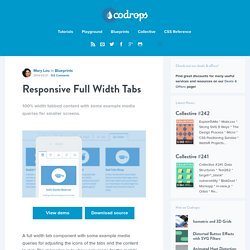
View demo Download source A full width tab component with some example media queries for adjusting the icons of the tabs and the content layout. The main idea is to show only icons for the mobile view and allow the text to appear when there’s enough space. The content columns and the containing media boxes have three different layouts. The food shapes in the content images are from PsdBlast. The HTML The CSS. Horizontal Slide Out Menu. A horizontal slide out menu with a grid-like thumbnail layout for the submenu.
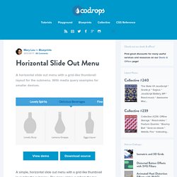
With media query examples for smaller devices. View demo Download source A simple, horizontal slide out menu with a grid-like thumbnail layout for the submenu. The menu slides out from the top when a main menu item is clicked and the sub-items fade in. When clicking on another item, the height of the submenu will adjust and the content will fade in and out while switching. Nested Accordion. A simple, nestable accordion with some examples of nesting levels and a media query.

View demo Download source A simple accordion that allows for a nested structure. The style comes with some examples of how to style three levels and how to add a media query for decreasing the size on smaller screens. Elastic Content Slider. A fluid content slider that will adjust in width and height depending on the size of its parent.
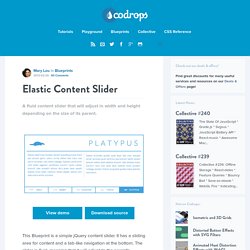
View demo Download source This Blueprint is a simple jQuery content slider. It has a sliding area for content and a tab-like navigation at the bottom. The slider is fluid, meaning that it will adjust to the parent’s container width and height. A couple of media queries show how to minimalise the look by just leaving icons for the navigation when the screen is very small. Note that we don’t show vendor prefixes here, but you’ll find them in the files.
Production Company. Hover.css - A collection of CSS3 powered hover effects. All Hover.css effects make use of a single element (with the help of some pseudo-elements where necessary), are self contained so you can easily copy and paste them, and come in CSS, Sass, and LESS flavours.
Many effects use CSS3 features such as transitions, transforms and animations. Old browsers that don't support these features may need some extra attention to be certain a fallback hover effect is still in place. Licenses. Centrer en CSS, un guide complet. Le centrage en CSS est souvent un véritable casse-tête, car il existe plusieurs techniques différentes selon les cas d'utilisation.
Flexbox, guide complet. Le module Flexbox Layout fournit une façon plus efficace de disposer, aligner et distribuer l'espace entre les éléments de votre page. 4 riches articles de Chris Coyier sont réunis ici.
Par Chris Coyier NdT : Ce tutoriel est la réunion de quatre articles de Chris Coyier formant une introduction à Flexbox. Vous pouvez ensuite consulter tous les articles sur Flexbox traduits dans la Cascade notamment les exemples concrets d'implémentation et les astuces techniques. Le module CSS3 Flexbox Layout fournit une façon efficace de disposer, aligner et distribuer l'espace entre les items d'un container, même lorsque leurs dimensions sont inconnues et/ou dynamiques - d'où le terme "flex". Download Free Adobe Muse Tabs Color Box.
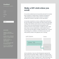
Download Adobe Muse Classic Tabbed Box Widget. Home. Adobe Muse Tabs - Adobe Muse Templates. W3Schools Online Web Tutorials. Make a DIV stick when you scroll. I’ve seen this method used a lot around the web and I’ve recently been working on a website where I wanted to incorporate it.
After finding zero results in about a minute of research, I thought this would be a neat topic to write a post about. So my main concept here is to have a sidebar that would stick to the top of the page once the window was about to pass it by while scrolling. This could be used for dozens of reasons. Perhaps you want to ensure your advertisements are being shown the maximum amount of time possible; or maybe you want to offer your visitors an area of quick-links so they wouldn’t have to scroll to the top of the page to navigate somewhere else. The site I’m working on is e commerce, so it will be an area to up-sell other products relative to the page the user is viewing. In the code below, I have two DIVs floating that represent the main content area and the sidebar. 60+ Free jQuery Image Slider & Slideshow Plugins - freshDesignweb. CSS3 Hover Effect Transitions, Transformations, Animations.
This post is all about CSS3 effect examples.
We’re going to find out more about hover effect transitions, transformations and animations. All of them come with visual examples. I’ve also included the source code. Feel free to use and adjust the code provided on whatever you are planning to do.