
40 Popular Mobile Website Templates. The trend is clear.
Mobile website templates and responsive WordPress themes are in demand nowadays. 40 Popular Mobile Website Templates. 23 Essential iPad Apps for Web Designers and Developers. There are already many tools which we can talk about for web design and web development on your iPad.
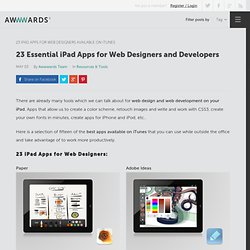
Apps that allow us to create a color scheme, retouch images and write and work with CSS3, create your own fonts in minutes, create apps for iPhone and iPod, etc.. Here is a selection of fifteen of the best apps available on iTunes that you can use while outside the office and take advantage of to work more productively. Paper Adobe Ideas Palettes Pro Palettes Pro is an ideal tool for creating and maintaining color palettes and color schemes. It lets you take a screenshot of a website or add to any of the 5 color modes. Five responsive web design pitfalls to avoid. Mobile Patterns and Why Use Them in Design. Mobile Patterns or Mobile Templates are, as the name obviously states, templates to use for easing our work when designing a site for portable devices.
As mobile web design means more and more nowadays, designers often have problems reaching deadlines because of a high workload. In web design we have grid systems we build on in order to help us maintain a clean visual pattern, but also to help us build a web page faster. Many of us even buy WordPress themes and customize them to our use. And it is worth mentioning that 10 years ago HTML templates were widely used in the industry. Mobile App Trends Series. Multi-Device Layout Patterns. Through fluid grids and media query adjustments, responsive design enables Web page layouts to adapt to a variety of screen sizes.
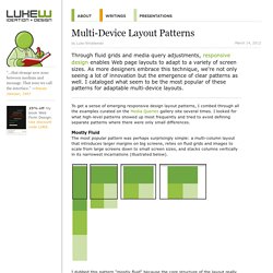
As more designers embrace this technique, we're not only seeing a lot of innovation but the emergence of clear patterns as well. I cataloged what seem to be the most popular of these patterns for adaptable multi-device layouts. To get a sense of emerging responsive design layout patterns, I combed through all the examples curated on the Media Queries gallery site several times. I looked for what high-level patterns showed up most frequently and tried to avoid defining separate patterns where there were only small differences. Mostly Fluid The most popular pattern was perhaps surprisingly simple: a multi-column layout that introduces larger margins on big screens, relies on fluid grids and images to scale from large screens down to small screen sizes, and stacks columns vertically in its narrowest incarnations (illustrated below).
Column Drop. Awesome tutorials to master responsive web design. Create an adaptable website layout with CSS3 media queries With the rise of both very large screens and mobile devices, web developers have to be able to create websites that display correctly and look good whatever the device is.
Sure, you can use good old techniques like fluid layouts, but I’ve got something better to show you today. This tutorial will teach you how you can create an adaptable website layout using CSS3.→ Read tutorial: Create an adaptable website layout with CSS3 media queries Fluid images This tutorial will shown you how to make your image scales down when the browser is resized or when your website is viewed through a smaller screen.→ Read tutorial: Fluid images Elastic videos Nowadays, videos are widely used on the web. Stop Designing User Experience! I Mean It!
User Experience this!
User Experience that! Stop it, will you? There’s plenty enough research done about User Experience . Now, can we please start designing? The problem with the Internet is that literally anything can go viral in no time. Well, lots of questions there. First Things First. Click on the sign up button on any page and it takes you to the signup page which requires minimal user input before registering the user. So, UX is photography, coding, graphics, security, branding, information and design etc. So, Who Are UX Designers? Read the pointers above? The Responsinator. Mobile App Trends Series. Getting Started Building iPhone Apps in Xcode 4.2. The newest version of Xcode comes packaged with a few noticeable interface changes.
For beginners and intermediate users it can be difficult figuring out even the most basic functionality. And although Apple’s online documentation is well-written, it’s certainly not friendly for the average user. So in this guide I’d like to put together some basic steps for building any iOS app. I’ll be focusing exclusively on iPhone & iPod Touch devices since iPad opens up a whole new chapter of research. You aren’t required to understand Objective-C or MVC programming to get started with this Xcode guide. I should point out that Xcode can only be installed on a Mac laptop or desktop running OS X. Creating a New Project. Working with Property Lists in Xcode 4.2. Property lists are designed specifically for Objective-C apps to store and retain data.
These are straight XML files formatted for easy access to bundles and application resources. There isn’t anything overly confusing about Property Lists, but they are unconventional compared to web applications. In this guide I’d like to go over property lists in a bit of detail in relation to Xcode. Both Mac OS X and iOS app developers will find these property lists very handy in aspects of programming.
They are also perfect for storing types of object data, such as personal user characteristics(birthdays, friends, e-mail address, etc.). Brief Introduction Property lists are also known as plists because of their unique file extension. Let’s first create a new property list that we can play around with. This brings up a dialog box with dozens of options. Adding Some Data You’ll recognize this is a totally blank file that has been created.
BooleanDataDateNumberString Dictionaries vs.