
Designing for WordPress: Complete Series & Downloads. Over the last few weeks, I have been been doing a video screencast series on Designing for WordPress.

It is a three-part series which covers downloading and installing WordPress on a server all the way to a completed theme. Part One: Download, Install, "Reset" Theme Video PageDirect Video Download (.mov) Part Two: Structure Video PageDirect Video Download (.mov) Part 3: Finishing Touches, Extra Stuff. Demo: CSS3 Buttons. CSS-Tricks. Sexy CSS3 menu – Red Team Design. One of the most common elements when talking about a website or an application design is definitely the menu navigation.

No matter if vertical or horizontal, simple or complex, a menu is essential and it has to look that way. In today's article, you'll learn how to create a good looking menu using some CSS3 magic. View demo The idea If you are a web developer you may have heard of tools called CSS pre-processors. While visiting LESS's site, I noticed their download button, which is an image, and I thought to myself: I can do it using CSS only. LESS download button - at this time The HTML <nav><ul><li><a href="#"><span>Home</span></a></li><li><a href="#"><span>Categories</span></a></li><li><a href="#"><span>About</span></a></li><li><a href="#"><span>Portfolio</span></a></li><li><a href="#"><span>Contact</span></a></li></ul></nav> Pretty clean, except for the span element.
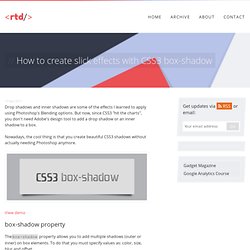
The CSS Removing the default list styles Style the proper links Multiple CSS3 properties were used to create the above. How to create slick effects with CSS3 box-shadow – Red Team Design. Drop shadows and inner shadows are some of the effects I learned to apply using Photoshop's Blending options.

But now, since CSS3 "hit the charts", you don't need Adobe's design tool to add a drop shadow or an inner shadow to a box. Nowadays, the cool thing is that you create beautiful CSS3 shadows without actually needing Photoshop anymore. View demo box-shadow property Thebox-shadow property allows you to add multiple shadows (outer or inner) on box elements. <shadow> = inset? Rocket science? Not at all, here's an quick example: box-shadow: 3px 3px 10px 5px #000; This CSS declaration will generate the following shadow: A positive value for the horizontal offset draws a shadow that is offset to the right of the box, a negative length to the left.The second length is the vertical offset. The above theory it's just a small amount, if you want to read more, than be my guest and check the W3C specs. Enough theory, let's see some stuff!
Add depth to your body Reference URL Drop shadows Quick tips. CSS Tutorial. CSS Reference. 12 Excellent CSS3 Button and Menu Techniques. 1139 shares 20 Fresh CSS3 Tutorials The design industry is probably one of the fastest changing and growing. Designers have to keep their eyes on everything, including new trends in visual design, as well as interaction technologies like jQuery, HTML5, and CSS3. Designers are using these technologies to express more creativity in design production and make user experience richer. In this… Read More 559 shares Developing Streamlined and Efficient CSS Styles CSS can be compared to the sculptor’s tool set when crafting a sculpture. CSS3 Patterns Gallery.
Browser support The patterns themselves should work on Firefox 3.6+, Chrome, Safari 5.1, Opera 11.10+ and IE10+.

However, implementation limitations might cause some of them to not be displayed correctly even on those browsers (for example at the time of writing, Gecko is quite buggy with radial gradients). Also, this gallery won’t work in Firefox 3.6 and IE10, even though they support gradients, due to a JavaScript limitation. Submission guidelines If you have a new pattern to submit, please send a pull request. CSS Tutorial.