
Magyar Nyomdász. N (betűhely): A kézirat terjedelemszámításának alapegysége: 1 n = 1 betűhely.
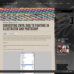
Egy szerzői kéziratoldal terjedelme a kiadói gyakorlatban 2000 n. Nyomdai ív: A terjedelemszámítás egysége, 16 nyomtatott oldal, a könyv formátumától függetlenül. Negatív film Negatív nyomtatási eljáráshoz szükséges film. Négyszínnyomás (CMYK) A színes képeket a négy alapszín segítségével lehet felbontani, illetve kinyomni. Converting CMYK/RGB to Pantone in Illustrator and Photoshop - Graphic Fusion Design. Have you ever finished designing a project only to realize that you forgot to use Pantone colors?
Színskálák. Colormanagement.hu - PANTONE, EIZO, X-RITE, TECHKON, EPSON, CANON, RAL, ADOBE, GRETAG - Monitor, színskála, nyomda, kalibráció. Munken - Arctic Paper. > Design + Data = Delight. Color Style Smooth. Weltformat 2013 – Plakatfestival Luzern. Conqueror envelopes; laid, CX22, wove. Conqueror envelopes; laid, CX22, wove. 100 beste Plakate 12: Jahrbuch & Ausstellungen in Wien und Essen.
Gerade werden die prämierten 100 besten Plakate des vorangegangenen Jahres aus Deutschland, Österreich und der Schweiz auf ihrer dritten und vierten Station in Wien und Essen gezeigt.
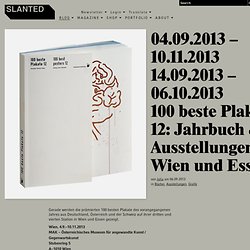
Wien, 4.9.–10.11.2013MAK – Österreichisches Museum für angewandte Kunst / GegenwartskunstStubenring 5A–1010 Wien Eröffnung am 3.9.2013, 19 UhrMAK-Kunstblättersaal. Identity Print. Digitális textilnyomás - Digitális textilnyomás - Pólónyomtatás. Drop : Ink And Texture. Balanced and Geometric Illustrations of Jonny Wan. Sheffield, UK based illustrator Jonny Wan describes his work as ‘combining shape experimentation, facial expressions and symmetry in producing unique and organic visuals‘.
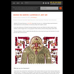
In my view reminiscent of Eastern European design, but also even American Indian artwork, these skillfully crafted images have a strong appeal in their balance and the striking shapes within them. This post features a fairly in depth interview with Jonny, discussing how he got into illustration, his work process and current projects. What got you into illustration? I have never had a doubt that I would end up in the creative industry but just never knew just what area I would end up in. Throughout my foundation course and even on my degree course I was never limited to a single discipline. After all the experimenting I settled on illustration because it was simply what came most naturally to me. What’s the work process behind your precise and symmetrical designs? ASTROBRIGHTS® Papers. Embolden Every Message Flyers Menus Newsletters ProgramsScrapbooking Brochures Announcements Bulletin Board Displays Benefits of Color According to a study conducted by the American Paper Institute comparing response rates between identical mailings of both white and colored paper, the colored paper version showed an unprecedented 20 percent increase in response.
How important is color to the bottom line? According to various marketing studies and the Color Marketing Group, very important! Color improves readership by as much as 40 percent Color increases retention by 18 percent Color accelerates learning from 55 to 78 percent Color increases comprehension by 73 percent The Unexpected Create unique and memorable printed pieces when combining printing effects and ASTROBRIGHTS® Real World Color Management (2nd Edition): Bruce Fraser, Chris Murphy, Fred Bunting: 9780321267221: Amazon.com. Cégér a jó bornak - Two Paperdolls. The Beauty of Engraving. If you look at Neenah Paper’s website “The Beauty of Engraving” you’ll find an image of the beautifully engraved cards we made last week on Crane Paper.
According to Vanessa Kreckel, owner and creative director of Two Paper Dolls who designed the site, in just a few days there have been over 1,000 requests for the cards designed by Armin Vit of Under Consideration . When Tom Wright, director of Marketing for Neenah, saw the engraved cards he commented that “The fine line, great screening elements within the solids, unique color pallet and clarity of the piece are wonderful to behold.
I thank you both for working together on this. I hope you both have enjoyed this journey as we promote engraving and a bit of Cranes product too, to a host of potential designers that wish to reach for the next level of communication in fine printing.” We were delighted to be asked to help show this fine craft that we know so well and bring the Beauty of Engraving to an entirely new generation of designers. COLOR MANAGEMENT PHOTOSHOP CS6 Basic ColorManagement Theory ICC Profiles Color Spaces Calibrated Monitor Professional Printer Proofing. 10 Pre-Press Tips For Perfect Print Publishing. Advertisement A lot of designers think CMYK is the way to go when designing for print.
We will, of course, always use CMYK-based ink, but this does not mean you have to work with CMYK files. You can work with RGB images to perfectly optimize your print colors and save a great deal of time in the process. You may be interested in the following related posts: 1. For several of the following tips to work, you will have to create and save all of your Photoshop images and artwork in RGB color mode. Think of it this way: RGB colors (red, green, and blue) are created with light. A 3-D map showing the range of the Adobe RGB (1998) color space, the sRGB (or small RGB) color space and the common newspaper CMYK color space. sRGB’s range is much smaller than Adobe RGB’s. 2. To successfully use an RGB image in Adobe InDesign, you first need to specify the appropriate color settings. Kuler. Keaykolour. Illustrator Gradient Issues - MyVersacamm.com.
Tips for Using Adobe Illustrator to Create Your Digital Files for Printing Flyers, Postcards, Newsletters, Brochures, Catalogs, and Other Publications. All versions of InDesign are supported for both Apple Macintosh and Windows platforms.
Here are some basic tips that apply to all software versions and for both platforms. For even more tips please visit our Quick Tips section. This is our catch-all category for all manner of miscellaneous tips, tricks, program fixes, and workarounds to help you with building your artwork . We'll add new items from time to time so check in to see what's been added recently.
Return to top of page. Document Setup Basics Set your layout page size to to match your final individual page size. Special Note: You may also submit both copies if you think that you may have text edits but then you must be certain to include all fonts used in your original document. Creating Bleed The way to create bleed is to simply make certain that the image or graphic extends off the edge of the page to a distance of 1/8" (.125) wherever you want something to bleed. Saving Your File as a PDF 1. 2. 3. The Professional Designer's Guide to using Black. Hello!
My name is Andrew Kelsall, a Creative Designer & Illustrator who designs logos, stationary, CD sleeves and other custom works. I design for clients worldwide, including the USA, Australia and here in the UK. Short Bio: I’m a Christian, family man & sci-fi fan, who holds a BA (Hons) Degree in Graphic Design. The Beauty of Engraving. Press My Cards. For Print Only. Poster's.