
CSS Textbox Elements. Pure CSS3 Post Tags. This is a rather simple pure CSS trick you can use to style your blog post tags, usually placed at the bottom of the posts.
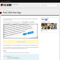
Pure CSS post tags uses at least 2 CSS tricks such as CSS triangles and CSS circles. Take a look at the demo For CSS triangles you need to manipulate borders of an element that has zero height and width. CSS circle is simpler.
When can I use... Support tables for HTML5, CSS3, etc. Select html table cell values when clicking on a row. Spiffy Box - Simple Rounded Corner CSS Boxes made easy. Border-radius: create rounded corners with CSS! Home / CSS3 Previews / Border-radius: create rounded corners with CSS!

The CSS3 border-radius property allows web developers to easily utilise rounder corners in their design elements, without the need for corner images or the use of multiple div tags, and is perhaps one of the most talked about aspects of CSS3. Since first being announced in 2005 the boder-radius property has come to enjoy widespread browser support (although with some discrepancies) and, with relative ease of use, web developers have been quick to make the most of this emerging technology. Here’s a basic example: CSS3 Rounded Corner Generator.
Guillermo Rauch's Devthought.