
What web designers can learn from Google’s Material Design. Material Design is Google’s new visual design language.
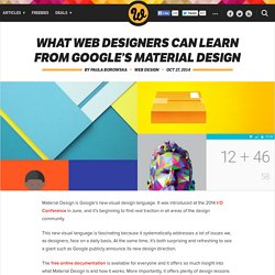
It was introduced at the 2014 I/O Conference in June, and it’s beginning to find real traction in all areas of the design community. This new visual language is fascinating because it systematically addresses a lot of issues we, as designers, face on a daily basis. At the same time, it’s both surprising and refreshing to see a giant such as Google publicly announce its new design direction. The free online documentation is available for everyone and it offers so much insight into what Material Design is and how it works. More importantly, it offers plenty of design lessons for us all; it’s interesting, informative and innovative. The 3 principles of Material Design Material Design’s core values are more than just a progression of the current design trends. Material is the metaphorBe bold, graphic, intentionalProvide meaning with motion Unifying screens and products.
Mockups & Wireframing Apps. 6 fiches pratiques pour rechercher de l’information sur Internet. L’infothèque de l’École Supérieure de Commerce et de management – ESC Chambéry Savoie propose sur son site Web des fiches pratiques (en pdf) pour apprendre à rechercher de l’information sur Internet.
Chacune d’entre elles présente une approche méthodologique pour se former à trouver des données et des informations sur le Web. Ces contenus régulièrement actualisés élaborés par des documentalistes spécialisés sont particulièrement destinés aux étudiants et lycéens qui souhaitent approfondir leurs connaissances et compétences la matière. Les fiches pratiques mentionnent aussi des sites et dossiers ressources complémentaires en ligne. The Dominant Colors of Common Website Qualities. By anthony on 07/26/12 at 2:30 pm Choosing colors for your website is no easy task.
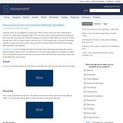
With so many colors and color combinations to choose from, where does a designer begin? The color of your site is important because it influences how users feel about your site. Choose the wrong color, and you’ll repel users from your site. Choose the right color, and you’ll attract them to use your site. Joe Hallock’s research revealed that there are dominant colors that people associate with common website qualities. Trust If trust is an important quality you want users to feel when they visit your site, then use the color blue. Security Blue is also associated with security. Reliability It’s no surprise that blue is also associated with reliability. Fun If your site involves games and entertainment, use orange and yellow on your site to evoke fun. Inexpensive If your site sells things on the cheap, orange and yellow are colors that will help make users feel that your products are inexpensive. High Quality Fear. Free Keynote Mockup Templates for iPhone, iPad, Android, ...
Click the orange button to pop-up a window where you can edit and confirm the tweet, then the download button will be activated Keynotopia Mockup Templates enable you to sketch user interfaces using Apple Keynote or Microsoft PowerPoint, without having to draw each component by hand!

All components are hand-drawn vector shapes created from scratch in Keynote and PowerPoint, and can be edited and customized directly, without needing additional design tools. When your mockups look like simple hand-drawn screens, it’s easier to get feedback on layout and structure, without getting distracted by the detail. And creating Keynote and PowerPoint sketches is better than drawing them by hand, because you can iterate and modify them quickly without having to redraw them from scratch. Watch this 2 minute video to learn how to turn mockups into high fidelity prototypes with a few clicks How to use the mockup templates What’s included Web 2.0 and jQuery Apps Mockup Templates.
Tendances web 2012. Wordpress Themes. Adopting A Responsive WordPress Theme Is More Than Install-And-Go. Le guide complet du débutant en web-marketing. Note de Benoit : Aujourd’hui j’ai le plaisir d’accueillir Augustin Gueldry sur info-ecommerce.
Augustin est spécialisé dans la logistique et le transport avec Colicoach et propose de nombreux articles sur la logistique sur le blog livrezfacile. Il nous propose un bilan de l’année 2013 sur la logistique et une prospective 2014. Le transport et la logistique étant souvent les parents pauvres du e-commerce, surtout sur ce blog ou nous en parlons peu, c’est l’occasion de remettre les pendules à l’heure. Place à Augustin ! Rétrospective 2013 et Tendances 2014 pour le transport et la logistique e-commerce A cette période, il est toujours utile de faire un bilan de l’année écoulée pour mieux se tourner vers 2014. Transport : un secteur en profonde mutation. Après la disparition du Sernam en 2012, c’est au tour du messager MORY DUCROS d’être en grande difficulté. Colis Points Relais Kiala a tourné une page avec le départ de son fondateur, Denis Payre, après avoir organisé la transition vers UPS.