
Wireframe.cc - minimal wireframing tool. App Store - Support. TestFlight Beta Testing - App Store. Using TestFlight as a Beta Tester Installing You can use TestFlight on up to 10 devices and test multiple apps for multiple developers — there is no limit to the number of apps that you can test simultaneously.
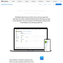
TestFlight can be used to test iOS apps on iPhone, iPad, and iPod touch running iOS 8 or later, and tvOS apps on the new Apple TV. Mac apps cannot be tested. If the beta app does not load on your device, contact the developer. Testing Once you accept your invitation, you’ll be able to download a beta version of the app you’ve been invited to test.
The beta period lasts for 60 days, starting on the day it is released to testers. About iTunes Connect. iTunes Connect is a suite of web-based tools created for developers to submit and manage their apps for sale in the App Store or the Mac App Store.
This document describes how to use iTunes Connect before, while, and after submitting an app for distribution through the store. iTunes Connect organizes your portfolio of store content, legal and tax documents, and contact information so that you can easily find and add to the material. It also collects status information, feedback, and earnings information provided by Apple, allowing you to manage your app’s sales progress from a single place. Sign in with your Apple ID - Apple Developer.
iOS Human Interface Guidelines: Template Icons. A custom icon that you create for a bar or Home screen quick action is also known as a template icon or image, because iOS uses it as a mask to produce the icon you see when your app runs. iOS defines lots of standard small icons, such as Refresh, Action, Add, and Favorites.
iOS Human Interface Guidelines: App Icon. Every app needs a beautiful, memorable app icon that attracts people in the App Store and stands out on their Home screen. iOS can use versions of the app icon in Game Center, search results, Settings, and to represent app-created documents.
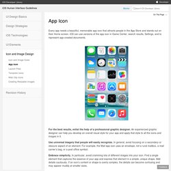
For the best results, enlist the help of a professional graphic designer. An experienced graphic designer can help you develop an overall visual style for your app and apply that style to all the icons and images in it. Use universal imagery that people will easily recognize. In general, avoid focusing on a secondary or obscure aspect of an element. For example, the Mail app icon uses an envelope, not a rural mailbox, a mail carrier’s bag, or a post office symbol. iOS Human Interface Guidelines: Icon and Image Sizes.
Every app needs an app icon and a launch file or image.
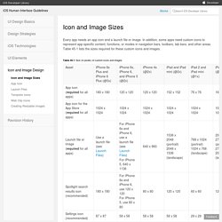
In addition, some apps need custom icons to represent app-specific content, functions, or modes in navigation bars, toolbars, tab bars, and other areas. Table 45-1 lists the sizes required for these custom icons and images. With the exception of the App Store icon—which must be named iTunesArtwork—you can name your icons anything you want. Use image asset entries in your Xcode project for your app’s icon files. To add icons, assign the corresponding image files to the image assets of your project. For all images and icons, the PNG format is recommended. The standard bit depth for icons and images is 24 bits. iOS Human Interface Guidelines: In-App Purchase. iOS Human Interface Guidelines: 3D Touch. Peek and Pop A peek lets users preview an item and perform related actions without leaving their current context.
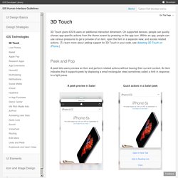
An item indicates that it supports peek by displaying a small rectangular view (sometimes called a hint) in response to a light press. A peek preview in Safari Quick actions in a Safari peek A peek: Appears while a user presses on an item that supports peek and disappears when the user’s finger lifts Opens a detailed view of the item—called a pop—when users press a little deeper on the peek view Can provide quick actions related to the item when users swipe up within the peek view When users press lightly on the screen, an item that supports peek hints that further interaction is available by displaying a rectangular view that you provide.
Use a peek to provide a live, content-rich preview of an item. Provide a pop for every peek. Don’t enable both peek and the Edit menu for the same item. Within a peek, avoid displaying elements that look like buttons. iOS Human Interface Guidelines: From Concept to Product. Define Your App An app definition statement is a concise, concrete declaration of an app’s main purpose and its intended audience.
Create an app definition statement early in your development effort to help you turn an idea and a list of features into a coherent product that people want to own. Throughout development, use the definition statement to decide if potential features and behaviors make sense. Take the following steps to create a robust app definition statement. 1. Go ahead and brainstorm here. iOS Human Interface Guidelines: Design Principles. Aesthetic Integrity Aesthetic integrity doesn’t measure the beauty of an app’s artwork or characterize its style; rather, it represents how well an app’s appearance and behavior integrates with its function to send a coherent message.
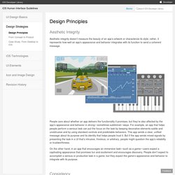
People care about whether an app delivers the functionality it promises, but they’re also affected by the app’s appearance and behavior in strong—sometimes subliminal—ways. iOS Human Interface Guidelines: Navigation. People tend to be unaware of the navigation experience in an app unless it doesn’t meet their expectations.
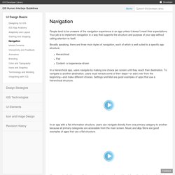
Your job is to implement navigation in a way that supports the structure and purpose of your app without calling attention to itself. Broadly speaking, there are three main styles of navigation, each of which is well suited to a specific app structure: Hierarchical Flat Content- or experience-driven In a hierarchical app, users navigate by making one choice per screen until they reach their destination. To navigate to another destination, users must retrace some of their steps—or start over from the beginning—and make different choices.
iOS Human Interface Guidelines: Icons and Graphics. iOS Human Interface Guidelines: Color and Typography. Color Enhances Communication In iOS, color helps indicate interactivity, impart vitality, and provide visual continuity.
The built-in apps use a family of pure, clean colors that look great individually and in combination, and on both light and dark backgrounds. If you create multiple custom colors, make sure they work well together. For example, if pastels are essential to your app’s style, you should create a family of coordinating pastels that can be used throughout the app. Pay attention to color contrast in different contexts. Although viewing your app on a device can help you find some of the areas you need to work on, it's no substitute for a more objective approach that yields reliable results. iOS Human Interface Guidelines: Branding.
Successful branding involves more than adding brand assets to an app. The best apps integrate existing assets with a unique look and feel to give users a delightful, memorable experience. iOS makes it easy to use custom icons, colors, and fonts to create a distinctive UI that sets your app apart from the rest. As you design these elements, keep two things in mind: Each custom element should look good and function well by itself, but it should also look like it belongs with the other elements in the app, whether they’re custom or standard. Distribution - Support. Development - Support. Xcode - What's New. Submissions - App Store. Guidelines - App Store. Planning - App Store. iCloud for Developers. Search for Developers. iOS Human Interface Guidelines: Designing for iOS. iOS Human Interface Guidelines: iOS App Anatomy. Almost all iOS apps use at least some of the UI components defined by the UIKit framework.
Knowing the names, roles, and capabilities of these basic components helps you make informed decisions as you design the UI of your app. The UI elements provided by UIKit fall into four broad categories: Bars. Bars contain contextual information that tells users where they are and controls that help users navigate or initiate actions. Content views. In addition to defining UI elements, UIKit defines objects that implement functionality, such as gesture recognition, drawing, accessibility, and printing support. Programmatically, a UI element is a type of view because it inherits from UIView. iOS Human Interface Guidelines: Bars. The Status Bar The status bar displays important information about the device and the current environment (shown below on iPhone).
Default (dark) content Light content The status bar: Is transparent When present, always appears at the upper edge of the screen Don’t create a custom status bar. Prevent scrolling content from showing through the status bar. Use a navigation controller to display content. Avoid putting distracting content behind the status bar. Think twice before permanently hiding the status bar. Consider hiding the status bar—and all other app UI—while people are actively viewing full-screen media.