
The future of iOS design? — Product Design. Sweating the details of iOS 7 “Completely flat,” “Like Android,” “Microsoft-flat,” etc., etc., etc.

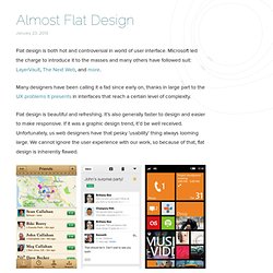
The talk about how Apple is going to “flatten out” its UI style has set the rumour-mills ablaze with completely spurious conjecture. So I thought I’d add to it. However, let’s approach this not from “what one insider source told someone” but instead from evidence of progression within some of the top iOS apps. Let’s start with homescreen icons given it’s the most obvious port of call. Above is a selection of some of the most popular, well-known or lauded apps for the iOS platform.
To me, there is a distinct movement towards a particular style and I would be very surprised if Apple were ignorant of it. One of the jobs of a designer is that you’re very sensitive to trying to understand what goes on between seeing something and filling out your perception of it. — Jony Ive. Matthew Moore Design. Flat design is both hot and controversial in world of user interface.
Microsoft led the charge to introduce it to the masses and many others have followed suit: LayerVault, The Next Web, and more. Many designers have been calling it a fad since early on, thanks in large part to the UX problems it presents in interfaces that reach a certain level of complexity. Simple version control for designers - LayerVault. Examples of 'Flat Design' in Web Design. A couple of weeks back, we talked about the flat design aesthetic.
Just in case you missed it, here is how we described flat design, “Flat design means designing without the usual gradients, pixel perfect shadows, and skeuomorphism that’s been rampant in recent years to achieve what appears to be a ‘flat’ interface.” And yes, just in case you haven’t yet jumped onto the flat web design bandwagon, today we have put together 20 awesome examples (plus some Dribbble shots) that illustrate beautifully the concept of ‘flat’ in web design. Microsoft SpellTower Supereight Studio Hundreds Women and Tech Etch Build 2012 LayerVault Squarespace Combadi Buffalo 2012 Year on Twitter. Beautiful Examples of Flat Icons Design. Flat Design is one of the newest approaches in web design, aiming for simplicity and powerful visual impact and using shapes as patterns and backgrounds.
Microsoft’s Metro user interface is probably the most popular Flat Design example. We already discussed the Flat Design approach in-depth, and we did it for quite some time now. Most of you know Designmodo promotes Flat Design with proudness and designers its own framework according to the Flat Design principles. Therefore today we took our time to browse around the web and find even more flat design examples, only this time we will focus mostly on icons, not on web designs as whole. Responsive Icon This icon can be used to mark themes and layouts which are responsive and fit every device perfectly.
Flat Web Design: Beautiful Examples of Websites. Flat Design is a new trend labeled by the community as an interface striking similar to Microsoft’s Metro UI because it leaves drop shadows, embossing, subtle textures and gradients behind, while favoring clean layouts, sharp typography and solid colors.
Making it Work: Flat Design and Color Trends. We’ve talked a lot here about the flat design trend here at Designmodo.

We’ve raved about it, showed you plenty of cool examples and even developed a free user interface kit for you to download and use for projects. But what if you want to do it yourself? One of the most important parts of the trend is color. Flat UI. Header 3The Vatican transitions to a Header 4Great American Bites: Telluride's Oak, The Header 5Author Diane Alberts loves her some good Header 6With the success of young-adult book-to-movie Paragraph Cum sociis natoque penatibus et magnis dis parturient montes, nascetur ridiculus mus.
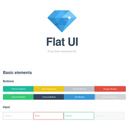
Image Lead Text Cum sociis natoque penatibus et magnis dis parturient montes, nascetur ridiculus mus. Quote Cum sociis natoque penatibus et magnis dis parturient montes, nascetur ridiculus mus. Small Font Cum sociis natoque penatibus et magnis dis parturient montes, nascetur ridiculus mus. Design Trends 2013 - Flat and Minimal. Flat UI Design - A showcase of the best examples of the flat UI design aesthetic on the web. Reflections on Web Design Trends in 2013. Let’s try to reflect on today’s trends and look a bit ahead.
Today, design is developing by leaps and bounds, and changes in styles are happening almost daily. A huge impact on design comes from inspiration boards. When in years past, a designer showed his creation to his granny, she nodded her head and the designer was satisfied. And then, the stream of thought stopped. Now, there is a tremendous amount of quality inspiration boards, especially on sites such as Behance and Dribbble, where anyone can upload his/her work, and earn praise or criticism from the community. Designers see each other’s work, browse likes and comments, and draw conclusions. So, let’s think more about what we will likely see in 2013. 16_Interface. Flat design.