CSS3 Hover Effects. Hello guys, this time I will show you other five examples of hover effects using different CSS properties compared to the old tutorial posted on Codrops.
In summary, we seek the same method but we will act especially using the border property, as we shall see later that allows us to create very particular effects. Please note that this will only work properly in modern browsers that support the CSS3 properties in use. HTML Markup This simple structure allows us to make these effects. As you can see in the code below we create a parent class view, and the contents inside. <div class="view"><img src="images/1.jpg" /><div class="mask"></div><div class="content"><a href="#" class="info" title="Full Image">Full Image</a></div></div> Here you will set the basic properties of our tutorial. 1 Example Add the special class effect to the element with the class view for this effect. Go to View the Example 2 Example.
Elastic CSS Framework. CSS-Tricks. Musings on the Relationship Between Grids and Guides. Though it has been around for years in print design, the concept of working on the grid has become really popular in web design in recent times, especially with the success and availability of CSS frameworks like the 960 Grid System.

Many tutorials and articles that I have seen make explicit use if grids, even going so far as to specifically recommend the use of one particular system. Musings on the Relationship Between Grids and Guides That’s great. Though certainly not a necessity, using a grid in web design is a great way to establish a strong, underlying structure that provides consistent, visual unity between the elements in a design. Moreover, the several different CSS grid frameworks that exist out there provide an excellent means of implementing a grid into a site, and can help with process of rapid prototyping. Personally, I’ve been used the 960 Grid System in several designs, and will be using some form of grid in the upcoming redesign of this very blog. Grids Guides The Half Grid. Responsive Design with CSS3 Media Queries. Screen resolution nowsaday ranges from 320px (iPhone) to 2560px (large monitor) or even higher.
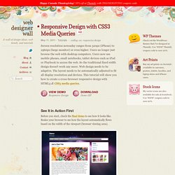
Users no longer just browse the web with desktop computers. Users now use mobile phones, small notebooks, tablet devices such as iPad or Playbook to access the web. So the traditional fixed width design doesn't work any more. Web design needs to be adaptive. The layout needs to be automatically adjusted to fit all display resolution and devices. View Demo Responsive Design Download Demo ZIP See It in Action First Before you start, check the final demo to see how it looks like. More Examples. CSS3 Image Styles. When applying CSS3 inset box-shadow or border-radius directly to the image element, the browser doesn't render the CSS style perfectly.

However, if the image is applied as background-image, you can add any style to it and have it rendered properly. Darcy Clarke and I put a quick tutorial together on how to use jQuery to make perfect rounded corner images dynamically. Today I'm going to revisit the topic and show you how much more you can do with the background-image CSS trick. I will show you how to use box-shadow, border-radius and transition to create various image styles. View Demo Image Styles Problem (see demo) CSS3 Transitions And Transforms From Scratch. There are some amazing examples of CSS transforms and transitions, and whilst you may be blown away by them, there's a good chance that you're also overwhelmed and a bit intimidated!
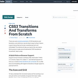
This tutorial will take you back to the very basics. We're going to create some fundamental CSS3 transitional movements, step by step. A Quick Note on Browser Support: Support across browsers is already pretty reasonable. Firefox 3.5, Chrome, Opera 10.5, Safari 3.1, and Internet Explorer 9.0 have you covered where transforms are concerned. A Quick-Start Guide to Teaching Yourself Creative Software. “I really need to learn how to use Photoshop.”
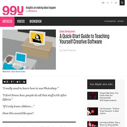
“I don’t know how people do all that stuff with After Effects.” “If I only knew Ableton…” Does this sound like you? Learning creative software can be intimidating, but it’s not as hard as you might think. An ever-growing catalog of high-quality, online video tutorials available on sites like Lynda.com and Kelby Training are making learning on your own both efficient and engaging. For Photographers and Image Editors Kelby Training ($25/mo, $200/yr) KelbyTraining.com specializes in Photoshop and Photography by having skilled professional photographers teach courses in HD video. For Adobe Creative Suite Users AdobeTV (Free) Adobe provides a series of free tutorials for all of their creative suite products, including Photoshop, InDesign, Illustrator, Premiere, and more.
Maximize the Use of Hover. Usually, we create hover effects by changing: font color, font styles, border styles, background, and etc.