
Cytoscape: An Open Source Platform for Complex Network Analysis and Visualization. Graphite - Scalable Realtime Graphing - Graphite. D3.js Tutorials, Screencasts and a Newsletter. World Inequality Database on Education. Where Are House Hunters Searching? - Trulia Insights. Les Misérables Co-occurrence. Source: The Stanford GraphBase.
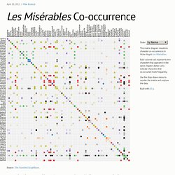
A network can be represented by an adjacency matrix, where each cell ij represents an edge from vertex i to vertex j. Here, vertices represent characters in a book, while edges represent co-occurrence in a chapter. Given this two-dimensional representation of a graph, a natural visualization is to show the matrix! However, the effectiveness of a matrix diagram is heavily dependent on the order of rows and columns: if related nodes are placed closed to each other, it is easier to identify clusters and bridges. This example lets you try different orderings via the drop-down menu.
While path-following is harder in a matrix view than in a node-link diagram, matrices have other advantages. Want more? Graphing Every* Idea In History « Griff's Graphs. Update: Graph has now been made interactive.
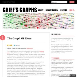
I was originally put onto network visualisation by Simon Raper by his fantastic post graphing the history of philosophy. I’ve learned a lot in the last week and decided to be ambitious. I wanted to see what the entire network would look like – with everyone on Wikipedia. Well, everyone with an infobox containing ‘influences’ and/or ‘influenced by’.
For those unfamiliar to this work please see his post first – even if it is just for the pictures! For those new to these types of graphs: the node size represents the number of connections. Method First I queried Snorql and retrieved every person who had a registered ‘influence’ or registered ‘influenced by’ value (restricted to people only so if they were influenced by ‘anime’, they were excluded).I then decoded these using a neat little URL decoder and imported them into Microsoft Excel for further processing (removing things like ‘(Musician)’ and other similar syntax). Caveats The Future The Network. A Periodic Table of Visualization Methods. Occupy George. Vous n’habitez pas chez vous.
Vous pensiez habiter à Paris ?
Et bien non, d'après ce que vous pensez de votre territoire, vous habitez dans l'Eure. Si les données étaient ouvertes, ce genre de méprise n'arriverait pas. La preuve avec ce quiz. Entrez votre code postal dans l’application ci-dessus et faites le test pour découvrir que vous n’habitez pas chez vous… S’interroger sur la perception de son territoire, se dire que, finalement, même en pleine mégapole on habite à la campagne, le tout pour promouvoir l’Open Data – l’ouverture des données, en français. Ce questionnaire interroge le citoyen sur sa connaissance des données publiques de son territoire : pense-t-il vivre dans une ville de personnes âgées ? Pour chacune des 16 questions, nous évaluons s’il a “raison”, si sa perception correspond à ce que les données publiques décrivent de son territoire. Notre but : démontrer la différence qui existe entre cette perception et la réalité.
Les dessous des données publiques L’INSEE a donc été notre source principale. Citeology - Projects. Update: We have submitted a Citeology paper to alt.CHI which you can download here.
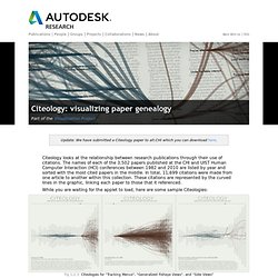
Citeology looks at the relationship between research publications through their use of citations. The names of each of the 3,502 papers published at the CHI and UIST Human Computer Interaction (HCI) conferences between 1982 and 2010 are listed by year and sorted with the most cited papers in the middle. In total, 11,699 citations were made from one article to another within this collection.