
30 creative and professional letterhead designs for your inspiration. 40 Professional Examples of Letterhead and Print Work. The Internet is an incredibly powerful tool for the modern business owner. It’s possible to share contact information with people all across the world in just a few seconds. But when it comes to actually doing business you’ll always want to be working in person. This is where print design and branding effects come into play. Many professional companies will at least print some business cards for their employees, but others gather a whole set of print identity. In the spirit of our modern digital era I have collected 40 instances of professional letterhead designs. B’seen Visual Identity Cooper & Ford Freq Nightclub Lewin Consulting Nada Identity A Cowboy’s Dream Herofilm Branding. Browse Business Card Design Templates. Casa Rex. Color Scheme Designer 3.
Creative Workshop — David Sherwin. Have you ever struggled to complete a design project on time?
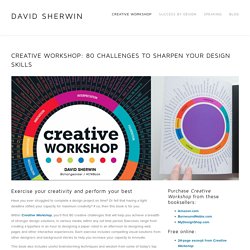
Or felt that having a tight deadline stifled your capacity for maximum creativity? If so, then this book is for you. Within Creative Workshop, you'll find 80 creative challenges that will help you achieve a breadth of stronger design solutions, in various media, within any set time period. Exercises range from creating a typeface in an hour to designing a paper robot in an afternoon to designing web pages and other interactive experiences. Each exercise includes compelling visual solutions from other designers and background stories to help you increase your capacity to innovate. This book also includes useful brainstorming techniques and wisdom from some of today's top designers. This best-selling design book is used by ens of thousands of designers worldwide, and has been translated into Standard Chinese, Traditional Chinese, Thai, Russian, and Korean.
Face. Works. / Mal de Mar. Studio graficzne. Graphic design / Layout. How to not suck at design, a 5 minute guide for the non-designer. If you don’t believe you can learn design, just remember what our legendary friend David Eric Grohl said about learning new things: I never took lessons to play the drums.
I never took lessons to play the guitar. I just sort of figured it out. I think that if you’re passionate about something and you’re driven and you’re focused, you can do anything you want to do in life. — Dave Grohl, Foo Fighters With Mr. 1. The background and font color should be different enough to not cause eyestrain. 2. If you have the choice, try using the color #333333 RGB (51,51,51) instead of pure black for your text. 3. Layout the most important information first to clearly support the primary use case of your app or website. Lets view some examples of good visual hierarchy in the wild.
Instagram (below, on the left) puts a clear focus on the photo/video posted by the user. Pinterest (below, on the right), creates visual hierarchy by pinning their search bar to the top followed by their nice grid below. Layout. Trollbäck+Company. The Worlds Most Innovative Business Cards - PlasmaDesign. Typography handbook. Journals/Books © Кир Ростовский. Web Design Questionnaires, Project Sheets and Work Sheets. Advertisement It’s nearly impossible to provide an accurate quote to a prospective Web design client without first gathering information about what that particular client needs.
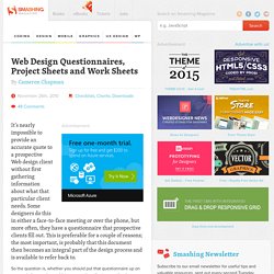
Some designers do this in either a face-to-face meeting or over the phone, but more often, they have a questionnaire that prospective clients fill out. This is preferable for a couple of reasons; the most important, is probably that this document then becomes an integral part of the design process and is available to refer back to.
So the question is, whether you should put that questionnaire up on your website or only send it to prospective clients once they’ve contacted you. There are a couple of reasons you may want to make it available online, but the obvious one is that clients are often eager to get started with their projects; providing the questionnaire online eliminates a step in the pre-contract part of the process. Downloadable Questionnaires We Are Pixel8 Happy Cog Clearleft Ltd Lunamedia. What makes good design? ‹ Web Design Los Angeles l 21TOWIN. Why Facebook is blue: The science of colors in marketing.
33.5K Flares Filament.io 33.5K Flares × Why is Facebook blue?

According to The New Yorker, the reason is simple. It’s because Mark Zuckerberg is red-green colorblind. This means that blue is the color Mark can see the best. In his own words Zuck says: “Blue is the richest color for me; I can see all of blue.” Not highly scientific right? After all, the visual sense is the strongest developed one in most human beings. So how do colors really affect us and what is the science of colors in marketing really?
First: Can you recognize the online brands just based on color? Before we dive into the research, here are some awesome experiments that show you how powerful color alone really is. Example 1 (easy): Example 2 (easy): Example 3 (medium): Example 4 (hard): These awesome examples from Youtube designer Marc Hemeon, I think show the real power of colors more than any study could.