
CSS3 Generator - By Peter Funk & Eric Hoffman. YUI: CSS Grid Builder. Compact CSS Grid Generator - Dark House Media. CSS3 Linear Gradients (new style syntax) Gerador de esquema de Cores. JA T3 Framework 2/Guides - JoomlArt Wiki. From JOOM In this section we are going to explore The Structure & The Extensions - explore the file & folder structure, purpose of most important files; Layouts & Blocks - explore the concept, features and advanced parameters Themes - explore the concept, typology, override coding Profiles - explore the concept, typology, override coding Template Administration - full usage instructions for all panels The structure of the framework changed since the introduction of the JA Menu Parameters Plugin.
Generally, the template is lighter and faster, core scripts are now hold inside JA T3 Framework Plugin. The latest release of the JA T3 Framework 1.0 comes with JA Menu Parameters Plugin to solve all SEO related issues and also to make menu management easier. JA T3 Framework 2.0 now incorporates this plugin to easily update the core files separately from your customized template design. Extensions Starting the JA T3 Framework 2.0 you will need to have: JA T3 Framework Plugin The core folder. TopStyle. TopStyle 5 includes a new style definition for CSS3.
This new CSS3 definition is powering many TopStyle features, including the Inspector (Shift+F9), Insight (Ctrl+Space), and Style Checker (F6). Prefixr CSS3 is great, but not every web browser out there fully supports CSS3 and CSS3 itself has not reached its final release stage. That is why some web browsers require so-called vendor-prefixed properties. The vendor prefixes ensure that there are no clashes with the changing specification and to allow the browser maker to start supporting experimental CSS properties.
While creating your style sheets in TopStyle, you focus on the standards-compliant properties and do not worry about browser support. CSS2 allows you to specify a stylesheet for specific media type such as screen or print. In this example, the style sheet you're adding to your document will apply if the maximum width of the device is 480px (eg. iPhone display). CSS Gradient Generator Text Shadow Generator HTML5-only Validator. Online CSS Editor. CSS3.0 Generator. CSS3 Generator. Design+ » Parâmetros do template: seu layout mais flexível* Photo credit: Louis Engival Muitos parâmetros de templates são possíveis – variação de cores, XHTML, HTML5 etc.
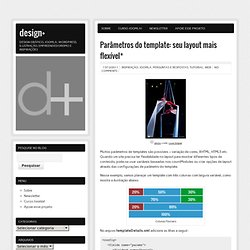
Quando um site precisa ter flexibilidade no layout para mostrar diferentes tipos de conteúdo, pode-se usar variáveis baseadas nos countModules ou criar opções de layout através das configurações de parâmetro do template. Nesse exemplo, vamos planejar um template com três colunas com largura variável, como mostra a ilustração abaixo. Colunas flexíveis No arquvo templateDetails.xml adicione as lihas a seguir: <config><fields name="params"><fieldset name="basic"><field name="layout" type="list" default="50" label="Escolha laterais" description="Controle da largura das barras laterais e da área de conteúdo"><option value="50">esquerda e direita</option><option value="70">somente direita</option><option value="80">somente esquerda</option><option value="100">sem barras laterais</option></field></fieldset></fields></config> <?
<div id="barralateral-<? Be Sociable, Share! Blueprint Grid CSS Generator. CSS Pattern Generator. The W3C CSS Validation Service.