
Behance. Fonts. Handpicked Font & Color Combinations. Apparently we had reached a great height in the atmosphere, for the sky was a dead black, and the stars had ceased to twinkle.
By the same illusion which lifts the horizon of the sea to the level of the spectator on a hillside, the sable cloud beneath was dished out, the car seemed to float in the middle of an immense dark sphere, whose upper half was strewn with silver. Looking down into the dark gulf below, I could see a ruddy light streaming through a rift in the clouds. It was probably a last glimpse of London, or some neighbouring town; but soon the rolling vapours closed, and shut it out. I now realised to the full that I was nowhere, or to speak more correctly, a wanderer in empty space—that I had left one world behind me and was travelling to another, like a disembodied spirit crossing the gloomy Styx. A strange serenity took possession of my soul, and all that had polluted or degraded it in the lower life seemed to fall away from it like the shadow of an evil dream.
Karu Font. Karu.
Archetype, Digital Typography Design Tool by Our Own Thing, using Google web fonts. Behance. Atipo foundry. Tabular figures and slashed zero tabular figures each have the same width, this uniform spacing allows them to align vertically in tables, price lists, financial reports and other columns of figures. the slashed zero is a representation of the number '0' (zero), with a slash through it. the slashed zero glyph is often used to distinguish the digit "zero" ("0") from the latin script letter "o" fractions, superiors and ordinals noway includes features for numeric typography, including pre-designed fractions, numerators and denominators, superscript, scientific inferiors and ordinals.
Atipo foundry. Behance. Sans titre. Fonts. Rising Star Monoline Script — download free fonts by PixelBuddha. Octanis Font Family — download free fonts by PixelBuddha. Feminine Minimal Logo Creator — download free templates by PixelBuddha. Behance. Diamor Script - download free fonts by PixelBuddha. Behance. Free Fonts. Google webfonts helper. FontBase : un gestionnaire de polices de caractères gratuit. Dans la collection des outils pratiques, indispensables et gratuits, on vous parle aujourd’hui de FontBase. Sorti depuis déjà quelques mois, ce logiciel permet de consulter en temps réel le rendu des polices installées. De quoi vous faire gagner en temps et en créativité ! Toutes plus différentes les unes que les autres, il n’est pas toujours évident de s’y retrouver et de visualiser les typographies en direct.
Grâce à ses nombreuses fonctionnalités, FontBase vous permet d’avoir un aperçu de la police sélectionnée, de visualiser cette police sur le texte de votre choix, de tester les jeux de couleurs, de taille, de hauteur de ligne, d’alignement et d’optimiser ainsi le résultat de votre travail. A partir du menu, accédez directement à l’ensemble des polices installées, même les plus récentes.
FontBase est gratuit et disponible uniquement sur Windows pour le moment. Gidole Open Source Modern DIN. OpenFoundry / Hot 30. Winning Font Combinations - download free by PixelBuddha. Karmina Bold: Free Handwritten font. Today’s exclusive freebie is Karmina Bold, an handwritten font designed by Dmitry Mashkin from Artcoast Design.
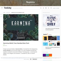
It is a very readable and balanced typeface suitable for every kind of design. The full version – containing two weights more (Regular and Shadow) – is available for sale on Creative Market. Download Karmina Bold View full version Created by Dmitry Mashkin Dmitry is the founder of The Courage Magazine & Artcoast Design Studio. Gutenberg — A Meaningful Web Typography Starter Kit. Gutenberg v1.1 Gutenberg is an open source project licensed under Creative Commons 3.0.
Feel free to use, adapt or contribute. What is Gutenberg? Vienna Hotel – Handmade Typeface ~ Display Fonts on Creative Market. Free Fonts With Personality. Typography can make all the difference.
However, if your project has to get along on a very limited budget and you need to rely on free fonts, good ones are never easy to find. Luckily, we stumbled across some real gems lately. Control Your Type: Google Fonts + Chrome = trouble? — Signal v. Noise. TL;DR: If you use Open Sans and let Google Fonts host it for you, it probably looks terrible for some users on Chrome.
Solution is below - you'll probably need to host it yourself. A user recently reported having some trouble with Highrise: This is happening to everyone here at our company. 100+ people here in the building. Grenale Slab™ FontReach. Bonie · Free Typeface on Behance. Typement. TypeSource: Google Web Font inspiration in HTML & CSS. Behance. Delicate free font. Download Free Fonts - an awesome list of 101 free fonts - The Hive. Fonts and typefaces.
Making the choice of the right font at the right time is a bit of an art. One font which could work very well in a specific setting could be a hateful choice for a different scenario. However, there’s always a good font for every setting, and there’s always going to be good fonts and horrible fonts which should be wiped off the face of the internet (and the face of the planet for that matter). We’ve gone around and researched. We asked the designers, the creatives, the artistic directors and the typeface geeks at the office, and made a list of fonts which we believe you could find very good use for. The typefaces that have plenty of intrinsic character work well when a designer really puts them to good use. We’ve saved you the hassle of visiting all the sites and downloading the files individually.
Typographies gratuites les designers français les plus populaires sur Behance. Handmade font regular freehand - Fait main 1 on Behance. Glamor - Chic & Modern Free Type Family on Behance. Inspiration Typographiques. QUITO - Free Font. Web Font Anti-Pattern: Agressive subsetting - Bram Stein. October 13, 2015 Subsetting is a great way to reduce the file size of your fonts.
Don’t go overboard with subsetting though, there may be unexpected consequences. Using Web Fonts The Best Way (in 2015). – Anselm Hannemann, Freelance HTML & CSS Contractor. 20 websites with brilliant typography. While not as flashy as an HD photograph or the motion of animation, typography is nonetheless an integral part of any design.
Its effects can be subtle to draw attention to other elements on the screen, or they can be boisterous to make the message of the words dominant. In either case, one thing's for sure — typography enhances the design as a whole, one way or another. Subscription offer The current trend in typography today is dramatic typography — typeface that draws attention rather than hides from it.
This coincides with both the flat design and minimalism trends, whose simplistic layouts call for an extra boost to add excitement. Before we get into examples, let's dissect the fabric of typography into individual elements: The 100 best free fonts. In this freshly updated free fonts for designers post, we bring you the world's best free fonts. We've filtered out the diamonds from the thousands of less perfectly designed free fonts available online, for you to use in your designs and illustrations.
Get Adobe Creative Cloud now This list represents the 55 best free fonts we've found in eight categories. You can use the drop-down menu at the top of the page, or the boxout, right, to jump to the section you want. Moon - Free Font. Devious Typeface - download free fonts by PixelBuddha. Handletter. Free Font. on Behance. Font Flame - Tinder for font pairing. The Best Free Alternatives to the Most Popular Fonts. Look at the best sellers on the big font shops and you’ll see the same names sitting proudly in top spot. Proxima Nova, DIN, Futura and Brandon Grotesque in particular are extremely sought after typefaces that are commonly used in web design, branding and print.
It can be pretty expensive to acquire these fonts, which means it’s often beyond the budget of most designers. Thankfully there’s some free typefaces we can rely on that actually match up fairly well. In today’s post I round up 10 of the most popular fonts and give my recommendations of the closest alternatives that can be used with Google Fonts or downloaded for free. Since its release just 10 years ago Proxima Nova has pushed aside all the classics and claimed top spot in the best sellers lists.
Futura is everyone’s favourite geometric typeface with those iconic sharp corners. Roboto is the best contender to the ever so popular FF DIN. It can be difficult to match the double or single story letters ‘a’ and ‘g’ in a font. Measure // typeface on Behance. Hoefler & Co. Best Sellers. Responsive Typography: The Basics. When we built websites we usually started by defining the body text. The body text definition dictates how wide your main column is, the rest used to follow almost by itself. Used to. Until recently, screen resolution was more or less homogeneous.
Today we deal with a variety of screen sizes and resolutions. This makes things much more complicated. In the heat of relaunching ia.net I wrote a quick weblog post on responsive typography, focusing solely on the aspect of our latest experiment: responsive typefaces. Contrast Through Scale. « Back to Blog on Friday 19th of October 2012 Typographic contrast is a deft and powerful weapon in your design arsenal. Its presence and impact typically goes unnoticed by readers, but its absence can ruin a site. In this series of posts, Christopher Murphy of The Standardistas takes a look at a number of techniques you can use to establish harmonious contrast in your designs.
Kinetic Typography: An Introductory Guide. Kinetic Typography: An Introductory Guide Kinetic typography seems to be everywhere these days. From television commercials to website landing pages, movable type is a popular visual tool. This popularity could come from a number of reasons but one obvious factor is that it catches your attention. People tend to be drawn to words and want to read them. Kinetic typography puts this together with some simple animations to create words that move on the screen, grabbing your attention and engaging the senses. More Google Webfonts that Don’t Suck. I was originally planning to simply update my previous article with a couple new fonts, but to Google’s credit I came up with so many additions that I decided to simply write a new post.
Checklist for Better Web Typography. Amsdam Typeface on Behance. STOKED (free font) on Behance. Troupe on Behance. Free Font on Behance. The designer's guide to special characters. When it comes to clear writing, the importance of the mechanics of spelling, grammar, and proper punctuation are always stressed. However, for some reason, the importance of using the correct typographic special characters is often overlooked. Arguably, we can blame typewriters for this historical lack of concern. Before digital type, there were a limited number of characters available on the keyboard, so less common or similar characters were left out.
Why include hyphens, en dashes, em dashes, and a minus sign, when you could just include the hyphen for all of them? Lessons of the past These days, however, computers allow you to access special characters than are immediately visible on the keyboard, but the long learned lessons of the past still persist, even when this leads to inferior typography. 25 Inspirational Typography Projects You Don't Want to Miss. 9 Helpful Typography Related Online Games. Free Typeface on Behance. Kerning.js. 3 Typography Tips For A More Comfortable Read. Tip 2 — Use Vertical Spacing To Make Your Words Easier To Scan This is the spacing and arrangement of text as the reader descends the page. We need to make sure the the line spacing and space between paragraphs is generous enough to allow the eye and brain to more easily decipher characters, words, and word shapes — which is how we all read. Paragraph Spacing. FontCDN: A search tool for Google web fonts.
Designing Without Images: Making Typography Work for You. Showcasing & discussing the world of typography, icons and visual language. Friends of Type. Hallo: Elegant Sans Serif Free Font. Free Typeface on Behance. The Typographic Details Behind Typewolf’s Favorite Sites of June 2015. July 7, 2015 This is the 17th installment of my monthly feature on Typewolf where I share my favorite type-driven websites from the previous month and then write a little about the typographic details behind the designs. 60+ best free fonts, Summer 2015. Font Squirrel. Typetester – Compare and test Web fonts from Adobe Edge, Google and Typekit web hosting services. Edge Web Fonts. The Font Matcherator - Find a font from any image.
Font Finder. Nice Web Type – Pure CSS text gradient (no PNGs) Odin Rounded - Absolut Foundry. Your guide to the best Google web fonts. FitText - A plugin for inflating web type. Infini. Typography Inspiration for the Modern Web → Typewolf. Benton Modern: Case Study On Responsive Web Typography. Typetester – Compare and test Web fonts from Adobe Edge, Google and Typekit web hosting services. Typekit Practice: Using shades for eye-catching emphasis. Butterick’s Practical Typography. The Reading Edge™ Series – A group of fonts for small sizes on screens. Font-To-Width. Universal Typography: Demo. Modular Scale. Setting subheads with CSS. Multi-axes type families. Font service launches that's fair for designers. 34 typographies gratuites à télécharger (mai 2015) Font Recommendation Top 10 Lists.