
5 Big Mobile Design Trends of 2015. The mobile Internet is ramping faster than desktop Internet did, and we believe more users may connect to the Internet via mobile devices than desktop PCs within five years.

Morgan Stanley – December 2009 Photo: Rosenfeld Media I remember the predictions like this back in the late 2000’s. They sounded a little outlandish at the time, but it’s 2015 and the predictions were right, kids! In fact, Comscore had us passing the ‘tipping point’ early last year. So, it follows that if mobile is now the majority viewing device, ‘designing for mobile’ is now just plain ‘designing’ now. With that in mind, today we are running down five big trends that you can expect to see through mobile design in 2015. Subtle Color Palettes While it is quite likely that you will be seeing bigger and bolder colors used in web design, the exact opposite will be occurring as far as mobile apps are concerned.
Simple, subtle color schemes will now take the place of bold and flashy palettes. Animated Elements More Scrolling. 10 Popular Trends in Newsletter Signup Forms. The art of the newsletter signup form is one that you may interact with more often than you think.

Email marketing is one of the best and most-used ways that brands interact with customers. And it all starts with a simple sign up. From pop ups to full-page forms, newsletter signups are everywhere. Many of us click through without consciously thinking about the design, but a well-designed form encourages that action in the first place. Some of the best-designed forms in the email signup landscape are from retailers, which are using emails to sell to customers directly. 1. Your signup form should do just one thing – ask for a user’s email address. This two-step process will give you more flexibility in the design and help create a reason to engage with users again a few days after the initial contact. Code for America Style Guide. Website Style Guide Resources. KAROLINE TYNES DESIGN — 60 LOGOS IN 60 DAYS. The (Sometimes Hidden) Meaning of Shapes. The shapes of objects in your design may be sending a message to users that you aren’t even aware of.

Whether you put an image inside a square or circle or triangle can have an impact on what people think about that image. Sometimes a shape is more than just a group of connected lines. The use of shapes can be obvious or subtle and appear within images or as elements in a design. Here, we will look at common shapes used in design projects and the signals they may convey. Types of Shapes When thinking about shapes, there are three categories to consider: Geometric, organic and abstract. Geometric shapes are the basics that you learn about in elementary school. Organic shapes are those that often represent things found in nature. Abstract shapes are super-simple versions of common elements or forms. Squares and Rectangles Squares and rectangles are the default shape for most projects for a reason. On the flip side, because this shape is so common it can sometimes be seen as boring or plain.
Personal Identity Guidelines by Amanda Michiru. Style Tiles. 20 Design Rules You Should Never Break. Just like with any profession or discipline, design comes with some rules.
While breaking design rules is allowed and even (in some circumstances) encouraged, it’s important to at least be aware of the rules you are breaking so you can break them the right way. From typography to layout, right through to colour and special effects, this list runs through a few basic rules, tips, tricks and guides to some common errors and how to banish them from your design. 01. Don’t Forget To Kern Somebody once said that if you truly hate someone, teach them how to recognise bad kerning. Kerning is the adjustment of space between characters. While we’ll run over a few typographical mistakes in this list, be sure to also check out these 20 other typographic mistakes that you should avoid at all costs. 02.
I’m sure I’ve said this a million times, but the primary purpose of design is communication, so it makes sense that the readability and legibility of your type is a top priority. L’indémodable flat design. Bye bye animations flashs, design surchargé et textes abrutissants, cette année encore le flat design est à son summum.
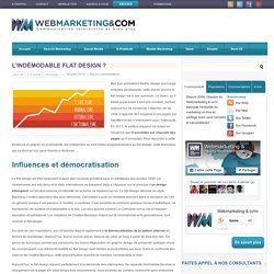
Le blanc, qu’il fallait auparavant à tout prix combler, permet aujourd’hui de conserver l’attention de sa cible. Il apporte de l’oxygène à ces pages qui étouffent et qui n’intéressent plus l’internaute. En 2012, le surfeur-zappeur ne restait en moyenne que 8 secondes sur chacune des pages qu’il consultait. Pour répondre à cette tendance et gagner en productivité, les entreprises se sont mises progressivement au flat design, cette technique qui va droit au but, sans chichis ni fioritures… Influences et démocratisation Le flat design est très largement inspiré des courants architecturaux et artistiques des années 1920.
Au-delà de ces inspirations, son vif succès répond également à la démocratisation de la sphère Internet en termes de webdesign.