
Bar chart race — the most populous cities in the world / johnburnmurdoch / Observable. Europe's most densely populated square kilometres – mapped. The Work of Edward Tufte and Graphics Press. Graphics Press LLC P.O.
Box 430 Cheshire, CT 06410 800 822-2454 Edward Tufte is a statistician and artist, and Professor Emeritus of Political Science, Statistics, and Computer Science at Yale University. He wrote, designed, and self-published 4 classic books on data visualization. The New York Times described ET as the "Leonardo da Vinci of data," and Bloomberg as the "Galileo of graphics. " 8 Free Mind Map Tools & How to Best Use Them. Advertisement Here’s the good news.
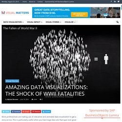
Finally, we can be like Leonardo da Vinci’s in one small way. No, we are not getting his polymathic superpowers. His penchant for taking free-flowing notes that filled notebooks with diagrams and scribblings is more achievable. Maybe, he knew that the human brain likes visuals more than words. Today, we call these brain-cell like intertwinings mind maps. Side by side georeferenced maps viewer - Map images. Amazing Data Visualizations: The Shock of WWII Fatalities - Visual Matters. More professionals are making use of interactive and animated data visualization to get a story across.
This is particularly useful when you have large data sets that span over great lengths of time and that reference multiple sources. The beauty of this form of data visualization is that it includes an audio segment which acts as a ‘legend’, guiding the viewer through the story and emphasizing the words with visual representations. When you also include a musical background, the data visualization takes a turn into a completely new medium as it quickly becomes similar to movie videos that we watch to be entertained. The message is then more readily received. Gamification Infographic. You can now buy your own copy of Datopolis, the open data board game.
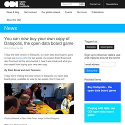
2016-07-26 by The ODI Today the beta version of Datopolis, our open data board game, goes on sale via Gamecrafter for two weeks.
About Blocks - bl.ocks.org. 5 Things I Learned Making a Chart Out of Body Parts. This story was co-published with Source.
Visual Evidence. Beyond the sea. By Andy Woodruff on 24 March 2016 In the northern reaches of Newfoundland, near the town of St.
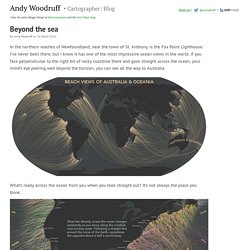
Anthony, is the Fox Point Lighthouse. I’ve never been there, but I know it has one of the most impressive ocean views in the world. UCSB: CSISS Classics. Center for Spatially Integrated Social Science: Linked Index to CSISS Classics Collection, 2015 Schroeder, Matt: Rupert B.

Vance, Space and the American South. CSISS Classics, 2006 Nuernberger, Andrea: Leonhard Ludwig Finke, Medical Geography. CSISS Classics, 2005. Toonz. Breaking New!

Digital Video, the makers of TOONZ, and DWANGO, a Japanese publisher, announced today they have signed an agreement for the acquisition by Dwango of Toonz, an animation software which was independently developed by Digital Video (Rome, Italy). Digital Video and Dwango agreed to close the deal under the condition Dwango will publish and develop an Open Source platform based on Toonz (OpenToonz). Effective Saturday March 26, the TOONZ Studio Ghibli Version will be made available to the animation community as a free download. About the author - Virostatiq. App Engine: Platform as a Service - App Engine. Gle URL Shortener. Google+ Platform for Web The Google+ API is the programming interface to Google+.
You can use the API to integrate your app or website with Google+. This enables users to connect with each other for maximum engagement using Google+ features from within your application. View the Google+ API reference overview with resources People, Activities, and Comments. Google Fonts. Cascading Style Sheets. CSS is designed primarily to enable the separation of document content from document presentation, including elements such as the layout, colors, and fonts.[1] This separation can improve content accessibility, provide more flexibility and control in the specification of presentation characteristics, enable multiple pages to share formatting, and reduce complexity and repetition in the structural content (such as by allowing for tableless web design).
CSS can also allow the same markup page to be presented in different styles for different rendering methods, such as on-screen, in print, by voice (when read out by a speech-based browser or screen reader) and on Braille-based, tactile devices. It can also be used to allow the web page to display differently depending on the screen size or device on which it is being viewed.
CSS specifies a priority scheme to determine which style rules apply if more than one rule matches against a particular element. Syntax[edit] Google Developers. Closure Tools. Getting Started with Web Audio API. Before the HTML5 <audio> element, Flash or another plugin was required to break the silence of the web. While audio on the web no longer requires a plugin, the audio tag brings significant limitations for implementing sophisticated games and interactive applications. The Web Audio API is a high-level JavaScript API for processing and synthesizing audio in web applications. The goal of this API is to include capabilities found in modern game audio engines and some of the mixing, processing, and filtering tasks that are found in modern desktop audio production applications. What follows is a gentle introduction to using this powerful API. Getting started with the AudioContext. Christmas countdown: The 2015 Daily chart Advent calendar.
2015: The Year in Visual Stories and Graphics. 2015: The Year in Visual Stories and Graphics. Layout Cheat Sheet for Infographics : Visual arrangement tips. This is part of our series on infographic design. Feast Your Eyes On The Most Beautiful Data Visualizations Of 2015. A striking infographic visualizing a general decline in the number of people suffering from infectious diseases across all 50 states and the District of Columbia won Gold for Data Visualization at the annual Kantar Information is Beautiful Awards 2015 which were announced in London on December 2. Vaccines and Infectious Diseases by Dov Friedman and Tynan Debold at the Wall Street Journal comprises a series of heat maps showing the number of cases per 100,000 people measured over 70 years.
Data preparation for Social Network Analysis using R and Gephi. # Target is to generate a graph file in gexf format ( for Gephi # Generate nodes and edgelist from each email log file setwd("C:/R") # use sqldf for operations suited for db library(sqldf) # define utility functions. COMM645%20-%20Gephi%20Handout.pdf. How to work with Gephi to visualise a network of Sites connected by Users. Originators/Authors Anne Clarke EVAD , University of Cambridge Purpose. Introduction to Network Visualization with GEPHI. Digital and Computational Studies Initiative Blog.
View topic - how to prepare data set /create clusters. Get Your Data into Gephi: A Quick and Basic Tutorial. Spreadsheet (Excel) Automatically Preparing Edge/Node Data for Gephi. Beautiful, Free Math. Cube. Time Series Data Collection & Analysis. SVG Graphics Library for JavaScript HTML5 :jsDraw2DX. Using Google Charts - Google Charts. BonsaiJS - A Graphics Library. Springy - A force directed graph layout algorithm in JavaScript.
Ember Charts. A charting library built with the Ember.js and d3.js frameworks. Chartkick. Leaflet - a JavaScript library for mobile-friendly maps. Raw. Pizza Pie Charts. Modest Maps. Tour. Turbo Visualization in the Cloud. Free Visualization Software. Paper.js. Home · FlowingMedia/TimeFlow Wiki. Kartograph.org. Dipity - Find, Create, and Embed Interactive Timelines. D3.js - Data-Driven Documents. Humble finance - html5 visualization. Protovis. Axiis : Data Visualization Framework. JavaScript InfoVis Toolkit. Highcharts - Interactive JavaScript charts for your webpage. Arbor.js. Birdeye - Information Visualization and Visual Analytics Library. Envision - demos. Smoothie Charts: A JavaScript Charting Library for Streaming Data. Mahatma Gantti – A simple PHP Gantt Class.
30 Simple Tools For Data Visualization.