
Interactive Content @UK Statistics. Population présente. Gridded Population of the World - GPW v3. Introduction Note: "Gridded Population of the World, v4" is now available and supersedes GPWv3.
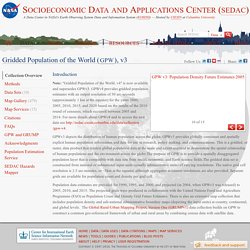
GPWv4 provides gridded population estimates with an output resolution of 30 arc-seconds (approximately 1 km at the equator) for the years 2000, 2005, 2010, 2015, and 2020 based on the results of the 2010 round of censuses, which occurred between 2005 and 2014. For more details about GPWv4 and to access the new data see GPWv3 depicts the distribution of human population across the globe. GPWv3 provides globally consistent and spatially explicit human population information and data for use in research, policy making, and communications. Population data estimates are provided for 1990, 1995, and 2000, and projected (in 2004, when GPWv3 was released) to 2005, 2010, and 2015. Global Population Density at a Glance (Infographic) Fathom Information Design/Promo image This population density map is making the rounds on the blogs today, to near-universal acclaim.
And for good reason; it might be the most intuitive look at global pop. density ever cobbled together. The brainchild of Fathom Information Design, 'Dencity' uses small pixels to connote density, big ones to convey wide-open, unpopulated spaces. Fast Company explains why the design works: In the visual syntax of infographics and maps, bigger equals... well, bigger. Fathom Information Design/Promo image I don't really get what's so unorthodox about this; to me, it seems downright intuitive. Mapping America — Census Bureau 2005-9 American Community Survey. Population Density Maps. Interactive map: 30 years of census data.
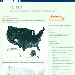
America by Population Group. Images below are via Radical Cartography (h/t Foseti) Similar US maps available for percent Native American and percent Pacific Islander A higher percent European population is generally seen in lower crime and higher income regions.
A higher percentage of persons of African descent is generally seen in high crime, low income regions. Blacks tend to concentrate in cities. The "hispanic" category is misleading and confused. For US populations, "hispanic" typically refers to a range of mestizo populations from Mexico and Central America. As one would expect with such a confused category, crime and poverty rates associated with a high "hispanic" percentage are mixed. As with the hispanic category, the "Asian" category can refer to a wide range of population groups, from East Asians to South Asians to Southeast Asians, etc. Murder Rate per 100,000 in Large Cities Trulia Crime Maps More information, taken from official US government crime statistics, on racial disparities in US crime:
America By The Numbers - Where We Live. Mapping America — Census Bureau 2005-9 American Community Survey. Census 2011 interactive: find out the truth about where you live. Ethnicity On the rise Below are the ethnic groups whose populations have grown most in your area between 2001 and 2011.
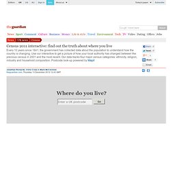
Overall growth is expressed as a percentage change. The figures under the circles to the right indicate the number of people in these groups in each of the two years. People Falling Below are the ethnic groups whose populations have declined most in your area between 2001 and 2011. National Religion Below are the religious groups whose populations have grown most in your area between 2001 and 2011 based on answers to the voluntary question: 'What is your religion?
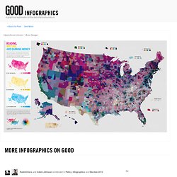
' Below are the religious groups whose populations have declined most in your area between 2001 and 2011 based on answers to the voluntary question: 'What is your religion? ' Industry (men) Are the Richest Americans Also the Best Educated? More Infographics on Good.
Census Maps Using Word Frequency From 19 Million Dating Website Profiles. Chicago area Each decade the United States government embarks on a census of its entire population in order to update population numbers and demographic information that aids in the allocation of Congressional seats, electoral votes, and government program funding. But as helpful and interesting as this data is, what does it really tell us about who we are? What about our likes, dislikes, feelings, and the ways we choose to define ourselves?
In his project A More Perfect Union , artist R. Luke Dubois asked this very question and set out to answer it by joining 21 dating web sites and aggregating language used in the profiles of 19 million people. To join a dating site you have to, quite literally, “put yourself out there”, describing yourself for the express purpose of being liked. I joined twenty-one dating sites in order to make my own census of the United States in 2010. Below are some examples of maps where locations are substituted with words people used to describe themselves. Census 2011 Australia.