
Beautiful Maps. WikiProject France/Osmecum. Le Vademecum de l'OSMeur.
Fiches “pense-bête” pdf et/ou odt A5 recto-verso, noir et blanc, pas chères, non exhaustif et comportant des doublons, à utiliser en complément des cartes “walking-papers” ( à diffuser dans les ”cartoparties”, ou à emporter partout avec soi pour savoir quoi noter et comment le noter. Les fiches OSMecum Quelques règles Format Les fiches OSMecum doivent être dans un format libre ou documenté. Contenu Le contenu doit être synthétique et adapté au niveau de la fiche (facile, moyen...). Notes Jump up ↑ format de documents Scribus. Maps and the Geospatial Revolution. Axis Maps LLC - Cartography. Visualization. Design. TypeBrewer.org. Polices à télécharger. Basic Mapping Principles for Visualizing Cancer Data Using Geographic Information Systems (GIS)
To diagnose heart disease, visualization experts recommend a simpler approach. A team of computer scientists, physicists, and physicians at Harvard have developed a simple yet powerful method of visualizing human arteries that may result in more accurate diagnoses of atherosclerosis and heart disease.
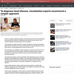
The prototype tool, called "HemoVis," creates a 2D diagram of arteries that performs better than the traditional 3D, rainbow-colored model. In a clinical setting, the tool has been shown to increase diagnostic accuracy from 39% to 91%. Presented today at the IEEE Information Visualization Conference (InfoVis 2011), the new visualization method offers insight to clinicians, imaging specialists, engineers, and others in a wide range of fields who need to explore and evaluate complex, branching structures. Dear NASA: No More Rainbow Color Scales, Please. Dear NASA, The visualization community has noticed your insistence on using rainbow color scales for representing continuous data.
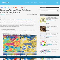
This is a plea to you (and anyone else doing the same thing) to stop. On the surface, the logic behind using a rainbow color scale makes sense: the more colors there are, the easier you would expect it to be to see detail in a huge range of data. How The Rainbow Color Map Misleads. Colors are perhaps the visual property that people most often misuse in visualization without being aware of it.
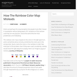
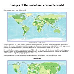
Variations of the rainbow colormap are very popular, and at the same time the most problematic and misleading. The rainbow color map is based on the colors in the light spectrum, and is sometimes done correctly, sometimes the colors are in the wrong order. Vischeck: Home. ColorBrewer.org: An Online Tool for Selecting Colour Schemes for. Mapping Census 2000: Total Population - censr01-103.pdf. Images of the social and economic world. Here is an ordinary map of the world: Click on image for a larger version.
Symbol Store. A clean point of interest icon set from MapBox. Cynthia Brewer's e-Portfolio. Designing Better Maps: A Guide for GIS Users: Cynthia Brewer: 9781589480896: Amazon.com. Untitled. Welcome to GEOG 486 - Cartography and Visualization. Printer-friendly version New to GEOG 486?
Slippy Map. Slippy map Slippy Map is, in general, a term referring to modern web maps which let you zoom and pan around (the map slips around when you drag the mouse).
Here we often talk about "The Slippy Map" to mean the map display on the openstreetmap.org front page. This is a web interface for browsing rendered OpenStreetMap data. By default the slippy map shows tiles rendered in our "standard" OpenStreetMap style, but you we offer several other featured tiles as layers to select and to link to. Making Maps: A Visual Guide to Map Design for Geographic Information Systems. Denis Wood. J.b.krygier: research and teaching. Go to Classes | Research | Making Maps Book & Blog Ohio Wesleyan University Department of Geology and Geography61 South Sandusky StreetDelaware OH 43015.
NACIS: Welcome to NACIS.org. Quantum GIS tutorial - Learn Practical GIS. By Ian Allan Announcing my FREE Newbies Quantum GIS Tutorial … * How to download and install QGIS. * How to open GIS air photos and maps in QGIS. * How to zoom in and out, query, measure… * How to interpret a GIS map. * and more… * 2 hours 20 minutes of downloadable closed captioned (subtitled) video. * Downloadable video transcripts * Downloadable study notes* Downloadable sample dataset * Videos are hosted in two places.
If the high-resolution on-screen version is too slow then you can download the amazon hosted low-resolution version. I hope you’ll join me in my simple and practical approach to teaching GIS. Project EPIC » Tweak the Tweet. Tweak the Tweet Tweak the Tweet is a hashtag-based syntax to help direct Twitter communications for more efficient data extraction for those communicating about disaster events.
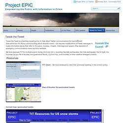
Use requires modifications of Tweet messages to make information pieces that refer to #location, #status, #needs, #damage and several other elements of emergency communications more machine readable. Leveraging Geospatially-Oriented Social Media Communications in Disaster Response. Abstract Geospatially-oriented social media communications have emerged as a common information resource to support crisis management. The research presented compares the capabilities of two popular systems used to collect and visualize such information - Project Epic’s Tweak the Tweet (TtT) and Ushahidi. The research uses geospatially-oriented social media gathered by both projects during recent disasters to compare and contrast the frequency, content, and location components of contributed information to both systems. The authors compare how data was gathered and filtered, how spatial information was extracted and mapped, and the mechanisms by which the resulting synthesized information was shared with response and recovery organizations.
In addition, the authors categorize the degree to which each platform in each disaster led to actions by first responders and emergency managers. Article Preview. Geoviz - This is a toolkit for geographic visualization and analysis. To try the GeoViz Toolkit with Google Flu data pre-loaded, click on the launch button below. Java 6.0+ required. Get Java The GeoViz toolkit is a project derived from the GeoVISTA Studio project. Penn State University. SaTScan - Software for the spatial, temporal, and space-time scan statistics. Classics - John Snow: The London Cholera Epidemic of 1854.
It wasn't until 1854 that Cholera struck England once again, that Snow was able to legitimate his argument that Cholera was spread through contaminated food or water. Snow, in investigating the epidemic, began plotting the location of deaths related to Cholera (see illustration). Lesson 5: Interpolation - From Simple to Advanced. Printer-friendly version Introduction In this lesson, we will examine one of the most important methods in all of spatial analysis. Frequently data are only available at a sample of locations when the underlying phenomenon is, in fact, continuous and, at least in principle, measurable at all locations.
The problem, then, is to develop reliable methods for 'filling in the blanks.' The most familiar examples of this problem are meterological, where weather station data are available, but we want to map the likely rainfall, snowfall, air temperature, and atmostpheric pressure conditions across the whole study region. Geospatial Metadata — Federal Geographic Data Committee. Natural Earth. Ushahidi. GEOG 497B: Location Intelligence for Business. Printer-friendly version Location Intelligence for Business New to GEOG 497B? Registered students—if this is your first visit to this course website, please take some time to become familiar with the course environment by visiting the Course Orientation (on the left navigation bar). This website provides the primary outline and materials for the course.
The Resources menu on the left links to important supporting materials, while the Course Outline menu links to the course lessons. GEOG 480: Exploring Imagery and Elevation Data in GIS Applications. Printer-friendly version. ISPRS - Homepage. ASPRS American Society for Photogrammetry and Remote Sensing. GEOG 497D: LIDAR Technology and Applications. Printer-friendly version Introduction. GEOG 862: GPS and GNSS for Geospatial Professionals. Practice @ Celestial Navigation. #237 TITLE: The Borgia World Map DATE: 1410 - 1458 AUTHOR: unknown DESCRIPTION: The famous Borgia world map, extant in the Biblioteca Vaticana, is engraved on two copper plates riveted together to form a circle 63 cm in diameter, with color rubbed in the. TITLE: The Borgia World Map. 29. Geometric Properties Preserved and Distorted. Printer-friendly version.
Point-set topological spatial relations - International Journal of Geographical Information Systems - Volume 5, Issue 2. Classics - Walter Christaller: Hierarchical Patterns of Urbanization. Red, Blue and Purple: mapping 2012 US Presidential Election. Very time an election occurs, maps become a key component in telling the story, but what type of map best tells the story of the winners and losers? Spatial is Special, Spatial IT is Not.
Spatial Isn't Special. Coordinates : A resource on positioning, navigation and beyond » Blog Archive » Is spatial special? Tobler_CameraReady - bhecht_cosit2009_tolberslaw.pdf. Economic Geography, Vol. 46 (Jun., 1970), pp. 234-240. Accueil. Welcome to OSGeo-Live 6.5 — OSGeo-Live 6.5 Documentation. The Arthur H. Robinson Map Library at the University of Wisconsin-Madison. My Community, Our Earth. Bostonography. Andy Woodruff, a cartographer. GeoVISTA Center.