
Holy Grail 3 column liquid-layout: No Quirks Mode, No IE Conditi. No Quirks Mode My original Holy Grail 3 column liquid layout required the XML declaration for it to display correctly in older versions of Internet Explorer.
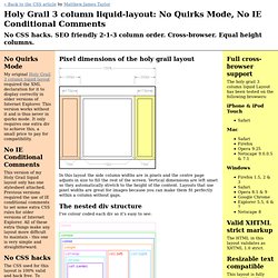
This version works without it and is thus never in quirks mode. It only requires one extra div to achieve this, a small price to pay for compatibility. No IE Conditional Comments This version of my Holy Grail liquid layout only has one stylesheet attached. No CSS hacks The CSS used for this layout is 100% valid and hack free. SEO friendly 2-1-3 column ordering The higher up content is in your page code, the more important it is considered by search engine algorithms. Equal height columns It doesn't matter which column has the longest content, the background colour of all columns will stretch down to meet the footer. Full cross-browser support The holy grail 3 column liquid Layout has been tested on the following browsers: iPhone & iPod Touch Safari Mac Safari Firefox Opera 9.25 Netscape 9.0.0.5 & 7.1 Windows Valid XHTML strict markup No Images.
Multi-Column Layouts Climb Out of the Bo. We all know the problems that arise when we try to build multi-column layouts in which the columns are of equal height.
It has been well documented elsewhere, so I won’t go into the details here. A project I recently worked on required an elastic layout with two columns of equal height, each with a different background color. As usual, there was no way to tell which column would be taller. I immediately thought of Dan Cederholm’s Faux Columns, but I needed an elastic layout. I also looked at the One True Layout, but this seemed buggy and required too much extra markup and too many hacks for my taste. But no, there had to be a better way. If this sounds familiar, that’s probably because a version of this method was introduced by Douglas Livingstone and extended by Holly Bergevin and John Gallant at Position Is Everything. The HTML:#section1 <div id="container"><div id="content">This is<br />some content</div><div id="rail">This is the rail</div></div> The CSS:#section2 The HTML:#section4.
Applying Divine Proportion To Your Web Designs. Advertisement Effective web design doesn’t have to be pretty and colorful — it has to be clear and intuitive; in fact, we have analyzed the principles of effective design in our previous1 posts2.

However, how can you achieve a clear and intuitive design solution? Well, there are a number of options — for instance, you can use grids, you can prefer the simplest solutions or you can focus on usability. However, in each of these cases you need to make sure your visitors have some natural sense of order, harmony, balance and comfort. And this is exactly where the so-called Divine proportion becomes important.
This article explains what is the Divine proportion and what is the Rule of Thirds and describes how you can apply both of them effectively to your designs. Divine Proportion Consider the example above. First, calculate the width of your #content-block. This is the whole idea behind the “Golden” proportion. The Rule of Thirds So how do you split a layout into 9 equal parts? Summary.