
[OC] Sorting through 1016 Resumes for 8 Warehouse Jobs (June - November 2020) : dataisbeautiful. 20 Years of Price Changes in the US (Guide to Modern Inflation) : coolguides. Comparing COVID-19 vs. Influenza Mortality in the U.S. [OC] : dataisbeautiful. Two different doctors once told me I wouldn’t live to see my 40th. I was 500 pounds at the time. Today is my 40th. During that time I lost 350lbs & learned my sons hfASD □ : nextfuckinglevel. In an election where land matters more than people, maybe this was something important to consider. : SandersForPresident. Basically every data map of Europe : europe. Scientfic Poster PowerPoint Templates. Menu close Scientific Poster PowerPoint Templates Looking for Billboard Poster Templates?
Billboard Posters, also called better posters or Posters 2.0, are a new style of scientific poster that intends to simplify posters and make sharing information easier in a shorter amount of time. We have templates and tutorials to get you started. Billboard Poster Templates Here are some PowerPoint templates to get you started. Persuading Sapphire 48 x 36 56x42 | 64x48 48 x 36 with trifold guides 48 x 24 72x36 | 84x42 | 96x48 36 x 24 54x36 | 63x42 | 72x48 36 x 36 (square) 42x42 | 48x48 36 x 48 (vertical) 42x56 | 48x64. Los Angeles Air Quality Index 1995-2020 : dataisbeautiful. These Are The Most Popular Books Set In Every State. Travel is off the table for now, but if you’re looking to explore the 50 states, there are other ways to go about it.
In addition to virtual tourism, you can go on adventures from home through the pages of a good book. Consider the large canon of books set in different parts of the United States. Personal loan company NetCredit put together a map highlighting the most popular book set in every state. From classics like “To Kill A Mockingbird” (Alabama) and “Little Women” (Massachusetts) to more modern picks like “The Lovely Bones” (Pennsylvania) and “Ready Player One” (Ohio), there are many options for those with different literary tastes. NetCredit put together the map by compiling a lengthy list of famous books explicitly set in certain states and then comparing their Goodreads ratings, number of ratings and number of reviews.
Visit NetCredit for more information about the books and the methodology behind this map series. What women want over the years [OC] : dataisbeautiful. Information is Beautiful. The 100 Best Infographics of 2019 [Interactive] 30 Shots Mixed shots are a popular pastime for many people, and they are represented well in this infographic.
![The 100 Best Infographics of 2019 [Interactive]](http://cdn.pearltrees.com/s/pic/th/best-infographics-interactive-164480118)
Using gradients to represent each, the designer found a way to create an elegant landscape to represent the alcoholic concoctions. It's useful, too — such simple recipes mean the details below make the shots easy to recreate. 3D Agriculture This infographic is my favorite on this list in terms of sheer visual beauty. 42 North American Butterflies The wings flapping in this animation is the part that really grabs you, so make sure you click through to see it in full. 50 Years, 50 Toys Nostaliga is always a powerful effect, and when combined with great illustrations, you get a piece like this — one that generates 140 LRDs and establishes a trend that would lead several others to create similar pieces.
A Brief Introduction to Typography As a general rule, we try to avoid "guides" when doing infographics. A Compendium of Glowing Creatures A Well-Balanced Blog. Editor. Education and Classroom Plans. Maps & Visualizations gallery. Here’s an incomplete gallery with links to some data visualizations and maps I’ve made: many are interactive, so you’ll need to click through through for the full experience.
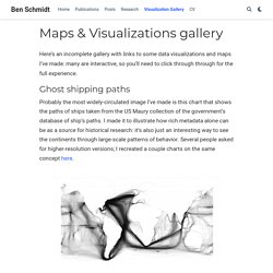
Ghost shipping paths Probably the most widely-circulated image I’ve made is this chart that shows the paths of ships taken from the US Maury collection of the government’s database of ship’s paths. I made it to illustrate how rich metadata alone can be as a source for historical research: it’s also just an interesting way to see the continents through large-scale patterns of behavior. Several people asked for higher-resolution versions; I recreated a couple charts on the same concept here. Gendered Language in Teaching Evaluations An interactive exploration of the different language used to describe professors in multiple fields. Archetypal Plot Structures Using topic modeling and my database of 80,000 film and TV captions, I look at the typical plot structures for about 150 common TV shows.
Infographic: See The Daily Routines Of The World's Most Famous Creative People. We tend to imagine writers, painters, and composers burning the midnight oil, skipping meals, and working feverishly when true inspiration strikes.
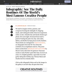
In fact, Tchaikovsky and Charles Dickens got plenty of Zs each night. Immanuel Kant made a point of visiting the pub every day. And Auden, Milton, and Beethoven kept precise work schedules. These details are catalogued in Creative Routines, an infographic from Info We Trust about the schedules of accomplished creatives. The poster draws on data from Daily Rituals: How Artists Work by Mason Currey about how 161 geniuses—from Jane Austen to Andy Warhol—spent their time. Click on the infographic below and on the images in the gallery to see how they all spent their time.