
Typography. Designing for responsiveness. Designing for responsive websites can be a bit challenging at first because the process is so different.
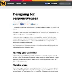
As designers, we’ve gotten used to building pixel-perfect mockups as our web blueprints. But responsive design takes a different approach. A designer’s role is no longer to produce a mockup and then pass it off to the developer because responsive design is not just a two step process, it is a series of revisions. Most of which are made in the browser. It is a collaborative effort between the designer and developer, no longer two separate tasks. Here are some tips and a general workflow to make the transition from designing static sites to designing responsive ones a little easier. Knowing your viewports Before starting any project it is important to determine your viewports. Planning ahead Sketching can be your best friend. You will quickly realize that not all of the content may fit in the smaller viewports.
Yup, those are my actual scribbles. Wireframes and mockups The browser Mockups. Convert a Menu to a Dropdown for Small Screens. The Five Simple Steps website has a responsive design with a neat feature. When the browser window is narrow, the menu in the upper right converts from a regular row of links into a dropdown menu. When you're on a small screen (iPhone shown here) and click the dropdown, you get an interface to select an option where each option is nice and big and easy to choose. That sure makes it easier to pick a place to go than a tiny link. Yeah, it's two taps instead of one, but that's arguable since you'd probably have to zoom in to tap the right link otherwise. The HTML The HTML for these two menus is different. Let's go with that for now. The CSS By default we'll hide the select menu with display: none;. Then using media queries, we'll do the switcheroo at some specific width. But now you gotta maintain two menus? Well yeah, that's one concern.
Using jQuery, we can do that with just a few lines of code: Then to make the dropdown menu actually work... But aren't dropdown menus kinda obtrusive? Kinda. Responsive Data Tables. In addition to the techniques below, see this roundup of additional explorations of this problem.
Garrett Dimon: Data tables don't do so well with responsive design. Just sayin'. He has a good point. Data tables can be quite wide, and necessarily so. Responsive design is all about adjusting designs to accomodate screens of different sizes. So here's what we are gonna do...
Boilerplates. Grids. Images.