
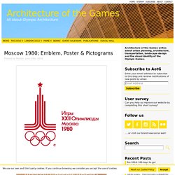
Design of the Olympic medals over the years. London 2012 Designer: David Watkins The biggest Summer Olympics medals to date.
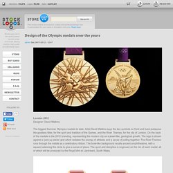
Artist David Watkins says the key symbols on front and back juxtapose the goddess Nike, for the spirit and tradition of the Games, and the River Thames, for the city of London. On the back of the medals is the 2012 branding, representing the modern city as a jewel-like, geological growth. The logo is shown against a 'pick-up-sticks' grid which radiates the energy of athletes and a sense of pulling together. How Wayfinding Guru Lance Wyman Defined the Field of Environmental Graphics.
When you visit a foreign (or not so foreign) city, maneuvering the streets can either fill you with ease or utter frustration.
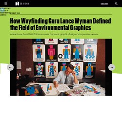
This is all due to wayfinding, a visual language that communicates how to navigate the terrain. From the 1960s onward, designer Lance Wyman masterminded wayfinding systems around the world and defined the field of environmental graphics along the way. Wyman built a career around vibrant, easy-to-decipher signs that communicate through pictorial graphics. "What makes him really distinctive is that all his best work has been done in the public realm, and nearly always for a mass audience," writes Adrian Shaughnessy in the introduction to Lance Wyman: The Monograph, a forthcoming book from Unit Editions.
A Pratt graduate, Wyman cut his teeth at General Motors where he developed a packaging system that was eventually used for packaging thousands of different Delco parts. 1968 Mexico City Olympics. As a graphics student, I am always interested in real world applications of a design that is intended to reach large, diverse populations.
The Olympics are a leading international sporting event, in which over 200 countries from all over the world participate. Therefore, there are numerous languages and cultures surrounding the event, and as we all know, each year it is held somewhere new in the world. Because of this, designers are faced with the challenge of creating a design system that is readable to a multilingual international audience.
In the case of the 1968 Mexico City Olympics, the designer faced an additional special challenge, because the event was held in the center of the city as opposed to a separate designated space. These Olympics marked the first time the games were held in a Latin American, Spanish-speaking country. MIN WANG. The Graphic Language of Min Wang In the summer of 2008, the eyes of the world will turn to Beijing, China as the city becomes host to the spectacle that will be the Games of the XXIX Olympiad.
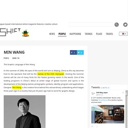
Hosting the Summer Games will be one of many firsts for the fastest growing nation in the world. One of the leading programs in China’s debut at center stage of global tourism and sports is the development of the Beijing Games pictographic symbols, identity program and applications. Designer Min Wang is the creative force behind this extraordinary undertaking which began three years ago in a country that just 30 years ago had no word for graphic design. Min Wang is the Design Director for the Beijing 2008 Olympic Games, a position to which he was appointed in 2006.
Pictograms - Architecture of the Games. The Olympic patchwork quilt, developed by Bosco’s creative department and given to the Sochi 2014 Organising Committee, will be the official Look of Russia’s first Winter Games.Our goal was to represent a diverse range of emotions and feelings, connecting concepts like Motherland, Family, Culture, Time, Olympism, Peace, Nobility, Friends, Memory, Honour, Dreams, Beauty, Freedom, Pride, Warmth, Happiness, Greatness, Reliability, Victory, Creativity, Hospitality, Creation, Future, Russia, Planet Earth.Every region in the world is proud of its unique origins, and it is no different in Russia.
That is why there are so many different local traditions, songs and crafts that highlight the individuality of their creators, each valuable in its own right. Deborah Sussman Passes After Long And Vivid Career – Design & Architecture. Deborah Sussman, veteran environmental designer, gifted colorist and pioneer of supergraphics, with daring personal style, has died, aged 83.
The cause was breast cancer. Sussman, designer of vivid environmental graphics who gained fame with the colorful identity for the 1984 Los Angeles Olympics, started her Los Angeles career when she came to work in the office of Charles and Ray Eames beginning around 1953. Deborah sussman loves LA. Dec 18, 2013 deborah sussman loves los angeles last week the exhibition ‘deborah sussman loves los angeles‘ opened at the WUHO gallery in los angeles.
1968 Mexico City Olympics. Summer of ‘68 Almost a half-century later, Lance Wyman’s graphics program for the 1968 Mexico City Olympic games is still considered Gold medal-worthy.
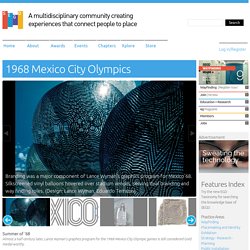
In 1963, Mexico won the bid to host the XIX Olympiad, becoming the first Latin American site for the Games. Why We Should Really Be Concerned About the Visual Identity for the Tokyo Olympics. Why We Should Really Be Concerned About the Visual Identity for the Tokyo Olympics This is an edited transcription of a lecture I gave at Temple University Japan on November 25, 2015.
このエッセイの日本語版はこちらです。 Identity design represents a specific refraction of the lens of Modernism — and it also represents the establishment of systems-based design. The Surprisingly Smart Strategy Behind London’s Infamous Olympic Branding. Say what you will about London’s Olympic logo--and many people have said, and are still saying, many, many things--it is nothing if not memorable.
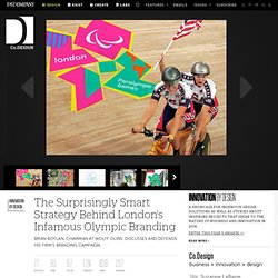
International branding consultancy Wolff Olins was no stranger to Olympic identities, having created the mark for the 2004 games in Athens. In 2006, the firm won the London logo and branding bid with their power-to-the-people style pitch, which focused on social and cultural aspects of the games and beyond in an attempt to broaden the event’s reach and appeal. When the famously staccato symbol was unveiled almost six years ago, however, the response was resoundingly critical. Speak Up Archive: Otl Aicher: An Expanded, Abridged Story.
By now some of you are aware of the stress-inducing book we are working on, Graphic Design Referenced. This week I had the pleasure of writing the entry of German designer Otl Aicher. Unfortunately I got carried away and wrote much more than the word count I knew I had to meet. A Fruitful Discomfort: The Face of the 2012 Olympics. The visual identity of the London Games was uncomfortable, like a shattered stained-glass window. But iconoclasm does have its fans; and the more ways we can look at something, and look through something, the better off we are. The stated intent of the London Organising Committee of the Olympic and Paralympic Games (LOCOG) was to focus on youth; naturally this extended to the visual identity system, the centerpiece being the logo, which has received little love. The logo’s severe angularity does not mesh with the reality that for virtually everybody (except the parents of athletes) the Olympics constitute a pleasant vacation, or a comfy staycation – they’re not about stress or tension.
Television “censorship” attests to this clearly, and this clash might be what puts people off. The Online Collection of Work by Ashley Ellen Goetz. Otto Neurath’s introduction of the International System of Typographic Picture Education, known as Isotype, has changed the way we look at information today. This movement of communication and education with the use pictographs, rather than words was a highly popular way to present statistical information from the 1920s to 1940s and began a revolution in design.
This essay will focus on three authors, Ellen Lupton, Philip Meggs and Andrew Shanken in a comparison of their historical perspective and analysis of Otto Neurath’s Isotype system. I will compare the background of each author, the context, content, approach and tone of their writing to gain an understanding of the complexity of intent and purpose in the writing of design history. This is 1968. . .This is Mexico. Of all Olympic events staged in living memory, Mexico 1968 – the XIX Olympiad – is one of the most fondly and best remembered.
Not because it was the Olympiad where a woman first lit the Olympic flame, nor because more world records were broken in Mexico than in any other prior Olympiad, nor even because of the clenched-fist, Black Panther salutes of two African American athletes whose names almost nobody now recalls. MEXICO 68 sticks in the mind because the originality and cogency of its system of communication converted it into a paradigm of modern graphic and event design. If we define communication as ‘a connection allowing access between persons or places’, then MEXICO 68 communicated supremely. It connected people with people, places with places, and each with the other as logically, elegantly and joyfully as may be possible. Beneath the general proposal, there was a profound aesthetic sensation: contemporary Mexico. Five Rings: Mount Olympics: I've got Mascot Fever! Meet the Fuwa, or for us Western folk the Friendlies.
They are China's Olympic mascots-- Beibei, Jingjing, Huanhuan, Yingying, and Nini. But don't just take my word for it, watch this AMAZING cartoon depicting their origins! Okay, so there's a fish, a flame, a panda, a swallow, and an antelope. But where do mascots really come from? Let's take a look at Olympic mascot history, in all its glory. 1968 Mexico City Olympics.
Interviews — The Gradient. Why We Should Really Be Concerned About the Visual Identity for the Tokyo Olympics. This is 1968. . .This is Mexico. Five Rings: Mount Olympics: I've got Mascot Fever! Understanding Olympic design. OLYMPICS AND JAPAN: 1964 OLYMPICS IN TOKYO, TRAINING, TECHNOLOGY, COMPANIES AND BIDS FOR FUTURE OLYMPICS. THE GRAPHIC LANGUAGE OF MIN WANG - PART 1 OF 3.
MIN WANG. Five Rings: Mount Olympics: I've got Mascot Fever! The History of the Olympic Pictograms: How Designers Hurdled the Language Barrier. This is 1968. . .This is Mexico. The Role of Sports in The Soviet Union. Olympics Memory: Beijing's Many Mascots Get An Un-Friendly Welcome. Rio 2016 olympics logo. The Stunning Rio 2016™ Olympic Font Design by Dalton Maag. Olympic Pictograms Through the Ages - Video Feature. Seoul 1988 Mascot Hodori. The Olympics' 15 Most Terrifying Mascots Ever Created. The History of the Olympic Pictograms: How Designers Hurdled the Language Barrier. Radiant Discord: Lance Wyman on the ’68 Olympic Design and the Tlatelolco Massacre — The Gradient. Total design Tokyo style – Creative Review. The Olympic Games. Go for the Gold Student Activity. Modern Olympics Modern Games, Modern Olympic Games. Opinion: the 2012 Olympics artists posters – Creative Review. London olympics 2012: the look of the games. Go for the Gold Student Activity.
The History of the Olympic Pictograms: How Designers Hurdled the Language Barrier. Rio 2016 launches sport pictograms. ★★★★★ Download 2004 Olympic Games Logo free. 2004 Olympic Games Logo cheked. ITC Binary, an Olympic font - Typografik. Lance Wyman, New York — Lance Wyman, New York — Channel. Robert Miles Runyan, 76, Adroit Graphic Designer, Dies. Experiencing Los Angeles: "Festive Federalism" at the 1984 Los Angeles Summer Olympics. We Made This: 1976 Olympic logo design. We Made This: GRAPHIC AMBIENT » Blog Archive » 1984 Los Angeles Olympics, USA. History of Graphic Design. History Of Olympic Logos — 1976. Archery - Olympic archery - pictograms through the ages - The Infinite Curve. Speak Up Archive: Otl Aicher: An Expanded, Abridged Story. Rio 2016 logo. Lance Wyman, New York — Lance Wyman, New York — Channel. Rio 2016 Branding Case Study. The Olympics' 15 Most Terrifying Mascots Ever Created. The History of the Olympic Pictograms: How Designers Hurdled the Language Barrier.
The Making of the Rio 2016 Olympic Logo. Rio 2016 Olympic and Paralympic pictograms revealed. Rio 2016 branding guidelines - A.A. Thornton & Co. The History of Symbols : Symbol Systems. The Surprisingly Smart Strategy Behind London’s Infamous Olympic Branding. Olympic Games History - Olympic-Legacy.com. Olympic Look > my experiences in... > Athens 2004 · Welcome to The Olympic Design.com.
Making of Rio 2016. Mouseplanet - Olympic Mascot Sam the Eagle by Jim Korkis. The History of the Olympic Pictograms: How Designers Hurdled the Language Barrier. The Making of the Rio 2016 Olympic Logo. Rio 2016 Branding Case Study. The Brand Identity Design of the 2012 London Olympic Games - Truly Deeply. Russians Get Misty for 1980 Olympic Mascot Misha—Except for His Creator. Olympicgames. Radiant Discord: Lance Wyman on the ’68 Olympic Design and the Tlatelolco Massacre — The Gradient.
Tony Pritchard's Blog. Total design Tokyo style – Creative Review. The Olympic Games. Olympic Pictograms Through the Ages - Video Feature. Summer Olympics Mascots Through the Years (1972-2012) Olympic Collection > Classification > Design Manuals · Welcome to The Olympic Design.com. The good, the bad and the ugly: typography in Olympics logo design. A Look Into: 6 Olympic Logo Designs. The Opening Ceremonies of the Olympic Games.
Semiotics of Olympic Logos: The Meaning-Making Process. Frases de Lisboa Traduzidas no Norte. Why We Should Really Be Concerned About the Visual Identity for the Tokyo Olympics.