

Your Cart - Facebook Brand Resources. UI Guidelines for mobile and tablet web app design. Official user interface (UI) and user experience (UX) guidelines from the manufacturers, links to which you can find below, are a source of inspiration for mobile web and app design.
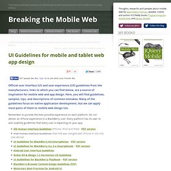
Here, you will find guidelines, samples, tips, and descriptions of common mistakes. Many of the guidelines focus on native application development, but we can apply most parts of them to mobile web design too. Remember to provide the best possible experience on each platform. Facebook mobile. First Look: WD TV Live Streaming Media Player. TV UI/UX Design. Exploring Graphic User Interface Styles – from Minimal to Futuristic. A user interface (UI) can come in many styles ranging graphically from very simple, all the way to extremely complex.

In this article we are going to explore a range of styles demonstrating that there isn't just one recipe for creating a good looking, and ultimately successful user interface. Of course, not every style is represented in this article; we will be exploring several high-quality examples, representing a wide range of graphical styles from simple to complex. Enjoy! Section 1: Minimal A minimal style UI relies heavily on type, symbols, and white space to create a clear and simple user experience. HelvetiNote™ Index of /wp-content/uploads. Adding Animations. Animations can add subtle visual cues that notify users about what's going on in your app and improve their mental model of your app's interface.

Animations are especially useful when the screen changes state, such as when content loads or new actions become available. Animations can also add a polished look to your app, which gives your app a higher quality feel. Keep in mind though, that overusing animations or using them at the wrong time can be detrimental, such as when they cause delays. This training class shows you how to implement some common types of animations that can increase usability and add flair without annoying your users. Lessons Crossfading Two Views Learn how to crossfade between two overlapping views. Finger-Friendly Design: Ideal Mobile Touchscreen Target Sizes. Advertisement In darts, hitting the bulls-eye is harder to do than hitting any other part of the dartboard.
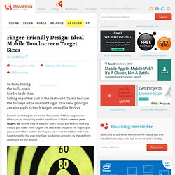
This is because the bullseye is the smallest target. This same principle can also apply to touch targets on mobile devices. Smaller touch targets are harder for users to hit than larger ones. When you’re designing mobile interfaces, it’s best to make your targets big so that they’re easy for users to tap. (Image credit: ogimogi) What the Mobile Platform Guidelines Say. Collection of Fresh and Professional GUI Sets.
Every web designer is aware of the benefits of using pre-designed GUI sets, particularly when they are as comprehensive, as sophisticated, and as modern as the sets we have for you today.

Some of the free gui sets have been designed for the web, others for mobile apps, and some have even been created to help you design infographics. So, no matter what project you are currently working on, you will find something useful below: TV Design Patterns - Google TV. This is a guide to developing user interfaces for Android applications running on Google TV.

Although there are few internal differences between an Android application for a phone and one for Google TV, there are differences in the user interface. The viewing environment of a television is commonly referred to as the ten foot (10ft) environment and the television screen as the 10ft UI. When you create apps for the 10ft environment, remember these basic concepts: The 10ft environment is traditionally for consuming content. The 10ft environment is a fun environment, not a work environment. Read about each of these concepts (and more) in the following sections. The 10ft Environment. 20 Free GUI Templates for 'Flat' Web Design. All of the UI templates and kits we have for you today have been designed in a Flat style.
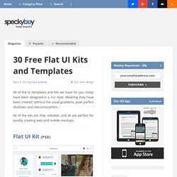
Meaning they have been created ‘without the usual gradients, pixel perfect shadows, and skeuomorphism…’ All of the kits are free, editable, and all are perfect for quickly creating web and mobile mockups. User Experience Trends for Admin Dashboards. The design techniques for admin dashboards are not as openly shared as website layouts.

This is because you do not always find examples of admin designs open on the web. To gain access you would need a user/password combo, so designers are often left building with trends found in other examples. But the dashboard interface has grown very quickly as a popular layout style for administrators. In this article I want to look into various styles and ideas for creating administration dashboard pages. These are typical website layouts built using HTML5/CSS3/JS. Tabbed Navigation. HEIMA. Smart Home Automation UI. on Behance. Free Wireframing Kits, UI Design Kits, PDFs and Resources.
Advertisement To mock-up the user interface of a website, software or any other product, you’ll need some basic UI elements.
Menus. Menus are a common user interface component in many types of applications.
To provide a familiar and consistent user experience, you should use the Menu APIs to present user actions and other options in your activities. Beginning with Android 3.0 (API level 11), Android-powered devices are no longer required to provide a dedicated Menu button. With this change, Android apps should migrate away from a dependence on the traditional 6-item menu panel and instead provide an action bar to present common user actions. Although the design and user experience for some menu items have changed, the semantics to define a set of actions and options is still based on the Menu APIs. Iconography. An icon is a graphic that takes up a small portion of screen real estate and provides a quick, intuitive representation of an action, a status, or an app.
When you design icons for your app, it's important to keep in mind that your app may be installed on a variety of devices that offer a range of pixel densities, as mentioned in Devices and Displays. But you can make your icons look great on all devices by providing each icon in multiple sizes. When your app runs, Android checks the characteristics of the device screen and loads the appropriate density-specific assets for your app.
Because you will deliver each icon in multiple sizes to support different densities, the design guidelines below refer to the icon dimensions in dp units, which are based on the pixel dimensions of a medium-density (MDPI) screen. Launcher The launcher icon is the visual representation of your app on the Home or All Apps screen. Menus.