HTML5, CSS3 & JavaScript playground for web designers & developers. Body { margin:0; height: 450px; background:#98B8CF; background-image: -webkit-linear-gradient(left , rgb(84,116,137) 0%, rgb(133,160,177) 50%, rgb(84,116,137) 100%); #text { Web Designer & Front-end Developer. Hi folks, this time we’re going to see and create three CSS3 animation loop, can be used in many fields, such as preloader for images with jQuery.
I remember this animations are only visible in Firefox, Safari and Chrome. Let’s see how to create it. First Example CSS3 Loading Animation Loop In this first example, create only two div and thanks to the border-radius property, they will take the circle shape. For the CSS style is very simple, just play with the parameters for the graphic you want, as regards the animation simply use the transform:rotateproperty.
Second Example CSS3 Loading Animation Loop The second example is the same as the precedent for the markup, the main difference you’ll find it in the CSS. Simply in this example we are going to act on the rotation, and more we insert an animation that will allow us to have an pulse effect. Third Example CSS3 Loading Animation Loop In this latest example we find a simple loop that is animated thanks to the transform:scale property. Понятно про CSS Masking и Shapes Modules, или Будущая революция дизайна контента. Shade: длинные тени трендового плоского дизайна на CSS.
11 сентября 2013 в 13:50 Доброго времени суток уважаемые хабражители.
Недавно я нашел очень интересный пример на SCSS и решил реализовать его на LESS да я люблю LESS больше: Пример работает на LESS 1.5.0, поэтому нет возможности разместить его на codepen или jsfiddle. CSS-Tricks. The Best Way to Learn CSS. CSS works hand in hand with HTML; HTML sorts out the page structure, CSS makes it look pretty and adds subtle levels of interaction.
As a web designer you should really get to grips with both these languages. Even if you don't do the coding yourself, understanding how they work will help you design for the web. Grasping the Basics: What is CSS? C.S.S. stands for Cascading Style Sheets; documents which contain styling rules for applying to HTML (or XML, along with a few other structural formats). Multiple style rules can point to one HTML element, in which case there needs to be a way to determine which rule should take effect. Through CSS, presentation can be separated from structure. Which keeps documents neater and DRYer. CSS is read by web browsers. They don't always interpret style rules the same as each other, and as browsers develop so too does their support of newer styling proposals.
Grasping the Basics: Learn the Syntax There are a great many possible selectors to learn. ..and.. Создаем эффект блика при наведении. UmbrUI - appearance:none styling. Screen Sizes. Liquidapsive (Liqui-dap-sive)
The Best Way to Learn CSS. Принцип цикады и почему он важен для веб-дизайнеров. Пару лет назад я прочитал интересные факты о жизненном цикле периодических цикад.
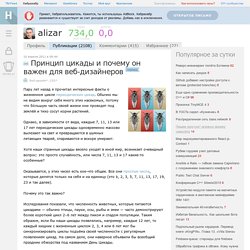
Обычно мы не видим вокруг себя много этих насекомых, потому что бóльшую часть своей жизни они проводят под землёй и тихо сосут корни растений. Однако, в зависимости от вида, каждые 7, 11, 13 или 17 лет периодические цикады одновременно массово вылезают на свет и превращаются в шумных летающих тварей, спариваются и вскоре умирают. CSS 3. Edit this Fiddle. Clown Car Technique: Solving Adaptive Images In Responsive Web Design. Advertisement Adaptive images are the current hot topic in conversations about adaptive and responsive Web design.

Why? Because no one likes any of the solutions thus far. New elements and attributes are being discussed as a solution for what is, for most of us, a big headache: to provide every user with one image optimized for their display size and resolution, without wasting time, memory or bandwidth with a client-side solution. We have foreground and background images. Some people waste bandwidth (and memory) by sending high-resolution images to all devices. What we really want to do is find the holy grail: the one solution that sends the image with the most appropriate size and resolution based on the browser and device making the request that can also be made accessible.
The “clown car” technique is the closest thing we’ve got to a holy grail: leveraging well-supported media queries, the SVG format and the <object> element to serve responsive images with a single request. Why?