
Virtual Worlds Timeline. Sony launches PlayStation Home open betaDec 11, 2008Sony Computer Entertainment Inc. (SCE) today announced that its highly anticipated PlayStation®Home Beta service for PLAYSTATION® 3 (PS3™) will become available for all PS3 users around the world on December 11, 2008. Following the successful completion of the closed beta service, PlayStation Home’s open beta service will continue to evolve with new features and functionality. PlayStation Home is a ground-breaking 3D social gaming community available on PS3 that allows users to interact, communicate and share gaming experiences. By leveraging the power of PS3, PlayStation Home delivers overwhelming visual graphics and rich gaming social experiences only possible on the PS3 platform. Within PlayStation Home, users can create and customize their own unique avatars and explore the virtual community in real time where they can communicate freely through text or voice chat.
Infographics & Data Visualizations. Welcome to Quid. Piktochart- Stories from Data. Your presentation/data visualization tool. Digital Nostalgia on the Behance Network. Designing The News. Voyage - RSS feed reader. A visual exploration on mapping complex networks. WikiMindMap. The Opte Project. Here you will find static and dynamic 2D JPG/PNG images and 3D VRML maps of the Internet.
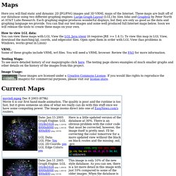
These maps are built off of our database using two different graphing engines: Large Graph Layout (LGL) by Alex Adai and Graphviz by Peter North at AT&T Labs Research. Each graphing engine produces wonderful displays, but they are only as good as the data and graphing language we provide. You can find our test images and some well produced full Internet maps below. Soon we will release the tools to create these maps on your own. How to view LGL data: You can view these maps with LGL View the LGL Java viwer (it requires JRE >= 1.4.1). VRML: Some of these graphs include VRML wrl files. Testing Maps: To see more detailed history of our maps/graphs click here. Image Usage: Webpages as graphs - an HTML DOM Visualizer Applet. Well-formed.eigenfactor.org : Visualizing information flow in science. Walrus - Gallery: Visualization & Navigation.
Walrus - Gallery: Visualization & Navigation These screenshots and animations are simply intended to give a feel for what visualization and navigation in Walrus are like.
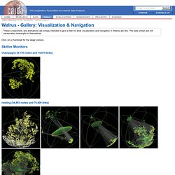
The data shown are not necessarily meaningful in themselves. Click on a thumbnail for the larger version. Skitter Monitors champagne (9,175 nodes and 15,519 links) riesling (54,893 nodes and 79,409 links) lhr (535,102 nodes and 601,678 links) CVS Repository (18,474 nodes and 18,473 links) Various Directory Trees Round-Trip Time Measurements (63,631 nodes and 63,630 links) A description of this data is available. CodeRed Infections (321,986 nodes and 321,985 links) A description of this data is available.
Animations These animated GIFs show graph navigation in Walrus. The CVS repository. [1.0MB] The lhr skitter monitor. [3.0MB] We Feel Fine / Movements. Movements We Feel Fine is divided into six discrete movements, each illuminating a different aspect of the chosen population.
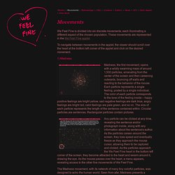
These movements are represented in the We Feel Fine applet. To navigate between movements in the applet, the viewer should scroll over the heart at the bottom left corner of the applet and click on the desired movement. Madness, the first movement, opens with a wildly swarming mass of around 1,500 particles, emanating from the center of the screen and then careening outwards, bouncing off walls and reacting to the behavior of the mouse. Each particle represents a single feeling, posted by a single individual. Any particle can be clicked at any time, revealing the sentence and/or photograph inside, along with any information about the sentence's author.
The Madness movement, with its network of many tiny colorful particles, was designed to echo the human world. Murmurs, the second movement, presents a highly structured environment in which to view human feelings.