
3 Column Liquid Layout. A lot of people have wanted to make 3 column CSS layouts but have always managed to run into problems ... like I did the first time I tried.
With this tutorial I hope to show you how you can overcome the problems of liquid layouts to create your very own liquid layout which will fit into the screen of the browser at any resolution. First off, we are going to create the HTML for a layout which has; A header. Left column. Dynamic Drive CSS Layouts- Liquid Layouts. Liquid layouts the easy way. Date: 30 December 2003 Author: Russ Weakley This article explains one method of achieving a successful liquid layout as well as providing basic definitions of liquid, fixed-width and em-driven layouts.
Some definitions Liquid layout All containers on the page have their widths defined in percents – meaning that they are completely based on the viewport rather than the initial containing block. No Resolution. The Perfect 3 Column Liquid Layout: No CSS hacks. SEO friendly. iPhone compatible. Download this layout (25kb zip file).
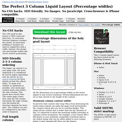
Percentage dimensions of the holy grail layout All the dimensions are in percentage widths so the layout adjusts to any screen resolution. Vertical dimensions are not set so they stretch to the height of the content. Maximum column content widths To prevent wide content (like long URLs) from destroying the layout (long content can make the page scroll horizontally) the column content divs are set to overflow:hidden.