
Leaflet for R - Introduction. Leaflet is one of the most popular open-source JavaScript libraries for interactive maps.
It’s used by websites ranging from The New York Times and The Washington Post to GitHub and Flickr, as well as GIS specialists like OpenStreetMap, Mapbox, and CartoDB. This R package makes it easy to integrate and control Leaflet maps in R. Features Interactive panning/zoomingCompose maps using arbitrary combinations of: Map tilesMarkersPolygonsLinesPopupsGeoJSONCreate maps right from the R console or RStudioEmbed maps in knitr/R Markdown documents and Shiny appsEasily render Spatial objects from the sp package, or data frames with latitude/longitude columnsUse map bounds and mouse events to drive Shiny logic Installation.
Data.frame - dropping factor levels in a subsetted data frame in R. Ggplot2.scatterplot : Easy scatter plot using ggplot2 and R statistical software. Ggplot2.scatterplot is an easy to use function to make and customize quickly a scatter plot using R software and ggplot2 package. ggplot2.scatterplot function is from easyGgplot2 R package.
An R script is available in the next section to install the package. The aim of this tutorial is to show you step by step, how to plot and customize a scatter plot using ggplot2.scatterplot function. At the end of this tutorial you will be able to draw, with few R code, the following plots: Basic R: rows that contain the maximum value of a variable. File under “I keep forgetting how to do this basic, frequently-required task, so I’m writing it down here.”
Let’s create a data frame which contains five variables, vars, named A – E, each of which appears twice, along with some measurements: Now, let’s say we want only the rows that contain the maximum values of obs1 for A – E. In bioinformatics, for example, we might be interested in selecting the microarray probeset with the highest sample variance from multiple probesets per gene.
R - Conditional formatting of panel background in GGplot2. R - Conditionally change panel background with facet_grid? How do I re-arrange…?: Ordering a plot. How do I re-arrange…?
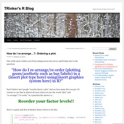
: Ordering a plot. One of the most widely seen FAQ coming across list serves and R help sites is the question: Multiple graphs on one page (ggplot2) Problem You want to put multiple graphs on one page.
Solution The easy way is to use the multiplot function, defined at the bottom of this page. If it isn’t suitable for your needs, you can copy and modify it. First, set up the plots and store them, but don’t render them yet. Library(ggplot2) p1 <- ggplot(ChickWeight, aes(x=Time, y=weight, colour=Diet, group=Chick)) + geom_line() + ggtitle("Growth curve for individual chicks") p2 <- ggplot(ChickWeight, aes(x=Time, y=weight, colour=Diet)) + geom_point(alpha=.3) + geom_smooth(alpha=.2, size=1) + ggtitle("Fitted growth curve per diet") p3 <- ggplot(subset(ChickWeight, Time==21), aes(x=weight, colour=Diet)) + geom_density() + ggtitle("Final weight, by diet") p4 <- ggplot(subset(ChickWeight, Time==21), aes(x=weight, fill=Diet)) + geom_histogram(colour="black", binwidth=50) + facet_grid(Diet ~ .) + ggtitle("Final weight, by diet") + theme(legend.position="none") Once the plot objects are set up, we can render them with multiplot.
R for Public Health: ggplot2: Cheatsheet for Scatterplots. Data and Code Download All data and code for this blog can be downloaded here: NB: It's been pointed out to me that some images don't show up on IE, so you'll need to switch to Chrome or Firefox if you are using IE.
Thanks! R FAQ: How can I subset a data set? Frequently Asked Questions about R How can I subset a data set?
The R program (as a text file) for all the code on this page. Subsetting is a very important component of data management and there are several ways that one can subset data in R. This page aims to give a fairly exhaustive list of the ways in which it is possible to subset a data set in R. First we will create the data frame that will be used in all the examples. We will call this data frame x.df and it will be composed of 5 variables (V1 - V5) where the values come from a normal distribution with a mean 0 and standard deviation of 1; as well as, one variable (y) containing integers from 1 to 5. In order to verify which names are used for the variables in the data frame we use the names function.
Software and Programmer Efficiency Research Group. Geoms that draw points have a "shape" parameter.
Legal shape values are the numbers 0 to 25, and the numbers 32 to 127. Only shapes 21 to 25 are filled (and thus are affected by the fill color), the rest are just drawn in the outline color. Shapes 32 to 127 correspond to the corresponding ASCII characters. For most geoms, the default shape is 16 (a dot). Geom_point. ggplot2 0.9.3.1. The scatterplot is useful for displaying the relationship between two continuous variables, although it can also be used with one continuous and one categorical variable, or two categorical variables.
See geom_jitter for possibilities. The bubblechart is a scatterplot with a third variable mapped to the size of points. There are no special names for scatterplots where another variable is mapped to point shape or colour, however. The biggest potential problem with a scatterplot is overplotting: whenever you have more than a few points, points may be plotted on top of one another. This can severely distort the visual appearance of the plot. P <- ggplot(mtcars, aes(wt, mpg)) p + geom_point() Legends (ggplot2) This page was recently updated to reflect changes in the new version of ggplot2, 0.9.3.
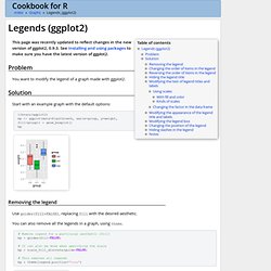
See Installing and using packages to make sure you have the latest version of ggplot2. Problem You want to modify the legend of a graph made with ggplot2. Solution Start with an example graph with the default options: Zevross. FAQ: Using a plugin to connect to a database. How do I connect to a database by using a Stata plugin? ODBC vs. plugin The easiest way to import data from a database directly into Stata is to use the odbc command.
However, there are occasions where the odbc command will not work or is not the best solution for importing data. For example, the odbc command will not work on your operating system (Solaris), there is not an ODBC driver for the database in question, or ODBC is too slow. If you encounter any of the above problems, you can use a Stata plugin to import and export your data directly to your database if your database has an application programming interface (API). This FAQ assumes that you have read and understood the FAQ on Stata plugins at the following URL: Lectures-trellis.pdf. Ggplot2. R Sites. User's manual - gstat.pdf. R - rgdal package installation. Install RGL in Ubuntu. I had a few hurdles to get through when trying to install the “rgl” R package in Ubuntu.
In summary, here was my solution: From the terminal: STT 2810 R. STT 2810 R-scripts Dotplots Problems 1.11-1.15 Tables and Barplots. A job/resume board for people and companies looking to hire R users. How to Add an Extra Vertical Axis to R Plots. Especially when analyzing time series, we often need plots with two vertical axes. Researchers often expect the two series to "move together," but with different locations and scales. To show that the series move together, you should give each series its own scale. One vertical scale should appear on the left side of the plot and the other on the right. In this post, I'll show you how to add the extra vertical axis on the right side of the plot.
Generating Sample Data Let's start by quickly generating two fake time series. Line Charts. Line charts are created with the function lines(x, y, type=) where x and y are numeric vectors of (x,y) points to connect. type= can take the following values: The lines( ) function adds information to a graph. It can not produce a graph on its own. Usually it follows a plot(x, y) command that produces a graph. By default, plot( ) plots the (x,y) points. Use the type="n" option in the plot( ) command, to create the graph with axes, titles, etc., but without plotting the points. In the following code each of the type= options is applied to the same dataset. Order - R - ordering in boxplot. Microsoft Word - Tutorial3_Graphics.doc - Tutorial3_Graphics.pdf. Untitled. Graphing in R R has very flexible built-in graphing capabilities, allowing you to create publication-quality graphs.