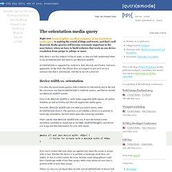

320 and Up ‘tiny screen first’ responsive web design boilerplate. The orientation media query. Page last changed today Right now Jason Grigsby’s excellent summary of the orientation media query is making the round of blogs and tweets, and that’s well deserved.

Media queries will become extremely important in the near future, when we have to build websites that work on any device resolution from 300px to 1280px or more. Still, there’s one tiny nitpick I’d like to make, so that you fully understand when to use orientation and when to use device-width. orientation is supported by Android 2, Bolt, MicroB, and Firefox. And now, apparently, by the iPad. I’ve often discussed media queries with Vodafone in Düsseldorf, and in the end the consensus was that orientation is relatively useless, and that we should use device-width instead.
First of all, device-width is vastly better supported. Secondly, device-width tells you what you need to know, while orientation doesn’t. That’s exactly what device-width tells you. There’s no way you can figure that out with only orientation. Concluding: Responsive Web Design: What It Is and How To Use It.
Advertisement Almost every new client these days wants a mobile version of their website.

It’s practically essential after all: one design for the BlackBerry, another for the iPhone, the iPad, netbook, Kindle — and all screen resolutions must be compatible, too. In the next five years, we’ll likely need to design for a number of additional inventions. When will the madness stop? It won’t, of course. In the field of Web design and development, we’re quickly getting to the point of being unable to keep up with the endless new resolutions and devices.
Responsive Web design is the approach that suggests that design and development should respond to the user’s behavior and environment based on screen size, platform and orientation. Determine iPhone orientation using CSS. With the beta of Firefox 3.5 showcasing 35 new features over 35 days, the article on CSS3 media queries stuck out, the orientation detection really got my attention and immediately put my thought process to mobile devices, in my case the iPhone.

I thought this is great maybe this has been snuck into the iPhone 3.0, unfortunately for us it wasn’t. That didn’t stop me and I got thinking about how it could be done if at all on the iPhone without using JavaScript. Still using the CSS3 media queries we can accomplish orientation detection with only CSS but instead of looking at the unsupported orientation property we can use the min-width and max-width propertities to our advantage to detect what orientation the user is currently in. Load the below demo in your iPhone/iPod Touch to see it in action, rotating the phone will either change the text from “Portrait” to “Landscape” depending on your orientation respectively. Post filed under: css. Skip to comment form. Responsive Theme Documentation and Tutorial. Style Tiles. Beginner’s Guide to Responsive Web Design. Whether you’re a beginner or a seasoned web professional, creating responsive designs can be confusing at first, mostly because of the radical change in thinking that’s required.

As time goes on, responsive web design is drifting away from the pool of passing fads and rapidly entering the realm of standard practice. In fact, the magnitude of this paradigm shift feels as fundamental as the transition from table based layouts to CSS. Simply put, this is a very different way of designing websites and it represents the future. Free trial on Treehouse: Do you want to learn more about responsive web design? Try a free trial on Treehouse. Over the past year, responsive design has become quite the hot topic in the web design community.
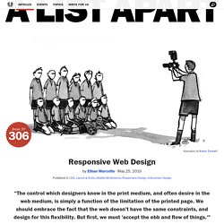
What is responsive design? Let’s just get right into it: Believe it or not, the Treehouse blog that you’re reading this article on is actually a responsive design! It’s hard to talk about responsive design without mentioning its creator, Ethan Marcotte. Fluid Grids. Responsive Web Design. The English architect Christopher Wren once quipped that his chosen field “aims for Eternity,” and there’s something appealing about that formula: Unlike the web, which often feels like aiming for next week, architecture is a discipline very much defined by its permanence.

Article Continues Below A building’s foundation defines its footprint, which defines its frame, which shapes the facade. Each phase of the architectural process is more immutable, more unchanging than the last. Creative decisions quite literally shape a physical space, defining the way in which people move through its confines for decades or even centuries. Working on the web, however, is a wholly different matter. But the landscape is shifting, perhaps more quickly than we might like.
In recent years, I’ve been meeting with more companies that request “an iPhone website” as part of their project. A flexible foundation#section1 Let’s consider an example design. Becoming responsive#section2 responsive architecture .