
Call to Action Buttons: Examples and Best Practices. Advertisement Call to action in web design — and in user experience (UX) in particular — is a term used for elements in a web page that solicit an action from the user.
The most popular manifestation of call to action in web interfaces comes in the form of clickable buttons that when clicked, perform an action (e.g. "Buy this now! ") or lead to a web page with additional information (e.g. "Learn more…") that asks the user to take action. How can we create effective call to action buttons that grab the user’s attention and entice them to click? Best Practices for Effective Call to Action Buttons Designing call to action buttons into web interfaces requires some forethought and planning; it has to be part of your prototyping and information architecture processes in order for them to work well. Draw user attention with size. Five Indispensable Skills for UX Mastery. By Jared M.
Spool Originally published: Aug 03, 2010 For practicing User Experience Designers, one of the most important laws isn't Fitts's Law, which helps us understand how to design interactive elements. Nor is it Hick's Law, which describes how long people take to make decisions. It's Sturgeon's Law, which tells us that 99% of everything is crap. Yet if we want to be really excellent at what we do, what are those essential skills? This is exactly the question we set out to answer as we studied the work of the master UX professional. Indispensable Skill #1: Sketching Someone once said that talking about design is like performing interpretive dance about architecture.
A quick sketch about a design—what it will look like, how information flows from one place to another, how the users move between activities—often is the best way to get our ideas across. Why We Sketch. By Jared M.
Spool Originally published: Sep 22, 2010 It seemed the conference room got brighter, as if, for the team staring at the whiteboard, light bulbs just went on. There was a collective sense of "Ohhh, I get it now. " It was the culmination of a very confusing discussion, where everyone thought they knew what they were talking about, but, as it turns out, nobody was on the same page. Turns out the junior designer got it wrong. That's when the group sighed their collective "ohhh" and the room lit up. The WHAT was now on the whiteboard—and in everybody's head. Sketching: Leveraging the Visual Words are powerful, but sometimes they don't cut it. As our team has been studying the skills of great designers, we've seen sketching emerge as a theme.
We've been looking at how these designers make their sketches. Sketching To Communicate An Idea "Here's what I'm trying to tell you... " Usability testing - UserTesting.com. 8 Things Programmers Should Know About UI Design. In an ideal world, each big subject from the software development process would be handed to a specialized professional: UI designers, programmers, architects, database administrators etc.
Unfortunately, this is not the case most of times. There a plenty of cases out there where projects suffer from lack of proper expertise and well trained people. That’s not to say we should know everything, nor that we should refuse doing work we are not sufficiently prepared for. From freelancers to big companies, we are sometime facing the need of wearing someone else’s hat. In those cases we have no other option but to simply get ourselves wet and just do it. While the Internet is big place, stuffed with lots of information and answers, it doesn’t hurt ones knowledge base to play, from time to time, with subjects collateral to your main professional field. 1. This is of course very important. The myth of the page fold: evidence from user testing. As web professionals, we all know that the concept of the page fold being an impenetrable barrier for users is a myth.
Over the last 6 years we’ve watched over 800 user testing sessions between us and on only 3 occasions have we seen the page fold as a barrier to users getting to the content they want. In this article we’re going to break down the page fold myth and give some tips to ensure content below the fold gets seen. What is the fold? Above the fold is a graphic design term that refers to important content being on the upper half of the front page of a newspaper. It’s commonly used on the web to describe the area you see on a web page before you have to scroll down the page.
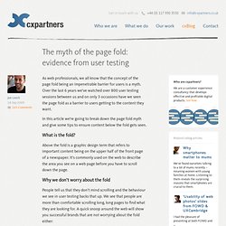
Why we don’t worry about the fold People tell us that they don’t mind scrolling and the behaviour we see in user testing backs that up. BBC, Play, Amazon.co.uk and the New York Times websites showing the position of the page fold Adding evidence from user testing. UI Contest McCabe Entry. Second Life User Interface Design Presentations.