
Navigation - Patterns - Material design guidelines. Navigation organizes content so that it’s easier to find important destinations in your app.
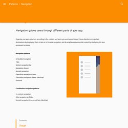
Navigation may include frequently visited places, contain settings, or encourage specific actions. To determine the type of navigation best suited to your app, identify your app’s users, typical paths they might take through your app, and actions you want them to perform. For instance, if your app is a restaurant guide, your users may want to make reservations, post menus, or write reviews. By identifying the goals most users will have, you’ll be able to better define a navigation structure that meets their priorities.
Take inventory Identify your app’s users and their potential roles, such as consumer, business owner, or journalist. Prioritize Assign priority levels of high, medium, or low to common user tasks. Adjust priority levels as user needs change over time. Sequence. Material Design Lite. Introduction The Material Design Lite (MDL) text field component is an enhanced version of the standard HTML <input type="text"> and <input type="textarea"> elements.
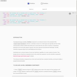
A text field consists of a horizontal line indicating where keyboard input can occur and, typically, text that clearly communicates the intended contents of the text field. The MDL text field component provides various types of text fields, and allows you to add both display and click effects. Text fields are a common feature of most user interfaces, regardless of a site's content or function. Their design and use is therefore an important factor in the overall user experience. The enhanced text field component has a more vivid visual look than a standard text field, and may be initially or programmatically disabled. To include a single-line MDL text field component: 1. <div> ... 2. 3.
<div><input type="text" id="user"><label for="user">User name</label></div> 4. 5. The single-line text field component is ready for use. 2. Maintainable Responsive Web Design with Sass. Get SourceView Demo Introduction Building maintainable, responsive layouts often feels like a huge undertaking.
A lot of people tend to revert to frameworks that end up having way more juice than they need. When I think of responsive layouts, I immediately think of Sass and three of its awesome features - maps, loops, and mixins. By leveraging these features, responsive design becomes a breeze. Breaking Down Sass Maps & Loops A Sass map is one of Sass' data types. $colors: ( primary: #333, secondary: #555, brand: #ff0033 ); Maps have a variety of map functions applicable to them. Maps also play very nicely in Sass iterative functions like @for and @each, which are called "control directives". The @for directive repeatedly outputs a set of styles by iterating from a through b, where a and b are integers. And the resulting output: An important thing to note here is the string interpolation syntax when incrementing the .box- selector. Bourbon Neat. Breakpoint.
When to use Flexbox : The Brolik Blog. Flexbox is a layout model that allows elements to align and distribute space within a container.
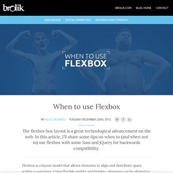
Using flexible widths and heights, elements can be aligned to fill a space or distribute space between elements, which makes it a great tool to use for responsive design systems. Flexbox has been around since 2009, and it’s beginning to be widely supported by all modern browsers. If you look at Flexbox on Can I Use? You’ll see that it has great support across the board. There are some problems in IE8 and IE9, but that’s to be expected. We also use the Compass @include function to get specific browser prefixes, which you can find in this Sass style sheet. Obviously, feel free to use these three files on your own websites.
When not to use flexbox Before I talk about how useful flexbox is, I want to touch on when flexbox overcomplicates things. Don’t use flexbox for page layout. Don’t add display:flex; to every single container div. Don’t use flexbox if you have a lot of traffic from IE8 and IE9. Ultimate Web Designer & Developer Course: Build 23 Projects! COURSE UPDATED – 36 New Lectures!
Added two brand new sections covering AngularJS, and WordPress Plugin Development. Are you looking for an all-in-one Web Design, Web Development and Career Building course that takes you step-by-step through the all of the skills you need know to start a working professionally? Are you a programmer looking to improve your design skills, so your designer colleagues can stop making fun of your bad designs? Or maybe you're a designer looking to learn how to code, so your programmer colleagues can stop laughing at your sad coding attempts?
Have you wasted hours of your time or money watching terrible video tutorials that make you fall asleep at your desk? Stop wasting your time & money! Here is my guarantee to you: If within 30 days you complete this course and you haven't experienced impressive results, you can't design or build modern websites, or you can't get a paying web design or development gig — I will give you 100% of your money back.