
Italian association of visual communication design. Search Results for “font”: SourceForge. Logopond - Identity Inspiration. iPad Art Tutorials: (Links and PDF's) iPad Art Tutorial: (Links and PDF's) This is a Review type of a post I decided to do for my friends over at Sketch Club.
If you haven't tried Sketch Club yet and you like to do Painting or Drawing or Art In General on the IPhone and/or iPad then you don't know what your missing. All of you that follow my Blog and have commented and/or your one of the people who send me emails daily thanking me for my reviews and requesting other review's and/or what posts you want next KNOW I don't give my seal of approval easily and it is next to impossible to get 10/10 stars from me unless you deserve it. As a matter of fact NOTHING has received over 8 stars as of yet. Sketch Club is a 9/10. (Example's): Create your own Brush, Dry Brushing, Paint Loads etc..
But to top it all off, the owner/creator of this App BlackPawn is one of the most friendly and down to earth guys you will EVER meet. Bottom line check it out immediately. (Example:) ProCreate has a blend tool and so does Sketch Club. BA.net Tutorials: Feast. TECHNOLOGY. As I rode up the escalators of the Los Angeles Convention Center’s South Hall, I could hear the booming bass from what were sure to be concert-sized subwoofers.
By the time I reached the top of the escalator, the flashing lights flickering through the hazy mist served as a promise that beyond these glass doors awaited an awesome sensory experience. Upon entering the hall I immediately walked in the flow of traffic and shuffled my way through crowds captivated by theater-sized screens with earth-shaking surround sound. Marketing and advertising today are dominated by a culture of obsolescence. This may be a lever for consumption, but it is potentially counterproductive for brands (apart from other problems – environmental, for example). For the digital environment is merciless and brands have no other choice than to be zapped or clicked: it is a race for novelty played out on social media in a matter of hours.
Our job is to communicate. Does the world need yet another touching memoir? The Museum of Forgotten Art Supplies. Before & After's creative director John McWade's conversations with subscribers. After posting my comment last week about printer points (72 per inch) matching Mac screen resolution (72 pixels per inch), I got wake-up calls from readers Saul Bottcher and Mordy Golding. Said Mr. Bottcher . . . “Nooooo! Not the 72 ppi [pixels per inch] myth again!
Your tips are normally great, but you have just done a disservice to any designer who is trying to make digital and print work together. “Here’s a current-day example of why. Computer Graphics World - Home. Ornamental Typography. 'Alfabeto di Lettere Iniziali' (c. 1730) from designs by Mauro Poggi.
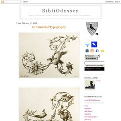
[The edition above, from the Austrian Musuem of Contemporary Art (link below), dates from c.1750, and the cover page - sans watermark - comes from here] "[T]his lovely engraved oblong folio [is] one of the most delightful 18th century alphabets in the high rococo style. Reflecting the style of the early 18th century engraver, Giambattista Betti, the design of each splendid plate features an elegant cursive capital form of one of the two dozen letters of the 18th century alphabet (there were 24 letters, rather than 26, because i and j were the same letter, and because there was no w).The capitals are elaborated with scrolls and flourishes and then inhabited by satyrs, mermaids, Medusa heads, birds, cats, dogs, snakes, and other creatures.
The letters were designed by Poggi, drawn in ink by Andrea Bimbi, and engraved by Lorenzo Lorenzi. In passing, I came across the following.. Content Management Analysis and Reviews.