
CSS Media Queries. CSS Media Queries By CRAIG KUNCE This tutorial teaches web designers how to design a web site for tablets, smartphones, and mobile devices.
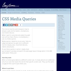
When I want to automatically adjust my web site to fit an iPad, iPhone, or smartphone, I use css media queries. Media queries, based on css at-rules, help me adapt and deliver my web site to different monitor display sizes, hand-held devices, tablets and phones. To see these queries in action, slowly close your browser's window and watch this web page layout change when it hits 480 pixels wide. How they work When a media query detects a different screen size, it simply delivers an additional set of css rules that styles the site for that specific screen size.
Where to put them I place media queries "inline" or inside, at the end, of your web site's main css file. Designing with flexibility (%) in mind I design my web pages with all widths defined in percents -- not pixels. Using CSS multi-column layouts - CSS. The CSS multi-column layout extends the block layout mode to allow the easy definition of multiple columns of text.
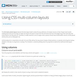
People have trouble reading text if lines are too long; if it takes too long for the eyes to move from the end of the one line to the beginning of the next, they lose track of which line they were on. Therefore, to make maximum use of a large screen, authors should have limited-width columns of text placed side by side, just as newspapers do. Unfortunately this is impossible to do with CSS and HTML without forcing column breaks at fixed positions, or severely restricting the markup allowed in the text, or using heroic scripting. This limitation is solved by adding new CSS properties to extend the traditional block layout mode.
Using columns Column count and width Two CSS properties control whether and how many columns will appear: column-count and column-width. The column-count property sets the number of columns to a particular number. Becomes: The columns shorthand Column Gaps. CSS Div stretch 100% page height. What is Responsive Web Design? Responsive design is a style of web design that responds to the user as they arrive at the web page.
Rather than forcing a mobile user to see a desktop site, a laptop user with a small screen to scroll horizontally to see a wide-screen monitor site, or a wide-screen monitor to view a site as a mobile customer might like, instead the design looks at each of these scenarios and adapts to display the content most effectively. Web Pages Must Be Flexible and Adapt I've said it many times, the web is not print. And with more and more different types and sizes of devices coming online, the sooner you accept that your pages will look different, no they must look different depending upon what is displaying them, the happier you will be.
The best web designs are the ones that make things easy. Creating a Whole Separate Website is a Bad Idea. Journey Into Mobile. Willdayton This is my favorite course yet.

The topic is increasingly relevant and soon to be essential knowledge for most front end developers. And a great topic is just the first thing the course gets right. Each screencast is professionally produced, informative yet not excessive, and builds incrementally. Alternating lectures with exercises is a proven learning technique that absolutely works. Flexible Math - A quick way to get pixel widths in percentages. 10 Steps To The Perfect Portfolio Website. Advertisement You may have a personal portfolio website for a number of reasons.

If you’re a freelancer, then you’d need one to showcase your work and allow people to contact you. If you’re a student (or unemployed), then you’d need one to show prospective employers how good you are and what you can do, so that they might hire you. If you’re part of a studio, then you might use one to blog about your design life, show people what you’re doing and build your online presence.
A personal portfolio website is all about promoting you. You may want to take a look at the following related articles: What makes for a good personal portfolio website? 1. Your logo is usually the first thing a user sees. It doesn’t necessarily have to be your name, but if you’re trying to promote yourself online, then it’s a good idea to go by your name. 3Mohit goes by the alias of CSS Jockey. 4Jason Reed uses a signature-style logo of his name. 2.
Beginners guide to HTML5 Canvas. The HTML5 Canvas element is arguably the most important addition to the next-gen specification, providing an array of possibilities for bringing graphical capabilities natively into the browser. As well as helping to make UIs richer, it has fuelled some progressive web work that spans animation, video and games – with the latter providing some experimental projects that push visual boundaries and those for user interactivity. By allowing designers and developers to create amazing 2D graphics with relatively little code opens up the door to some amazing possibilities in the field of image and video manipulation. This article defines what Canvas is all about, where it came from, what it means to work with and, perhaps most importantly, how some of its powerful functionality can be used in your own projects. What is the Canvas tag? How to Center a DIV with CSSFull Frontal Nerdity.
Css - How to center absolute element in div.