
LIA - Software Art. Interactive application for iPod >>> Interaction Shake the device to get a random color selection.
Tap to reposition the elements randomly, on the left side you get more, on the right side you get less elements. Palm Top Theater Exhibition. The International Film Festival Rotterdam has brought cinema to the large screen.
We think that the intimacy of small mobile screens are giving new impulses to the cinematic experience. V2_ will present a series of films and animations small enough to watch in the palm of your hand. Tools & code. Karsten Schmidt: enerugii wa antee shite inai I (Unstable Energy I) Mark Napier: Genesis (7 bit) FURTHER PROCESSING: Generative art, open systems 23.09.-11.11.2006, Kunstverein Medienturm, Graz Pablo Miranda Carranza (ES), Fabio Franchino (IT), Ben Fry (USA), Golan Levin (USA), Lia (AT), Mark Napier (USA), C.E.B.
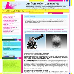
Reas (USA), Martin Wattenberg (USA), Marius Watz (NOR). Curated by Sandro Droschl and Marius Watz. FURTHER PROCESSING uses the Open Source software Processing as a departure point to examine positions based on computational processes. GENERATIVE ART: The system as art object All software is by its nature based on systems. Infographic: What Tools Developers Actually Use. Les Data de visualizing.org. Stanford Visualization Group. HTML5 Toolz. Visualizations.
Vis4.net. Data Visualization: 4 Swingin’ Infographics. Grip Ltd. presents: 101 Thoughts on Advertising « Big Orange Slide. DataVizChallenge.org. Healthymagination. Nervous System – explorations in generative design and natural phenomena. Tools. What’s Your Better Life Index? Your Better Life Index is designed to let you visualise and compare some of the key factors – like education, housing, environment, and so on – that contribute to well-being in OECD countries.
It’s an interactive tool that allows you to see how countries perform according to the importance you give to each of 11 topics that make for a better life. What’s the point of Your Better Life Index? There’s been a lot of debate lately on measuring the well-being of societies – is wealth all that matters, or should we be looking at other things, like the balance between work and the rest of our lives? The Index aims to involve citizens in this debate, and to empower them to become more informed and engaged in the policy-making process that shapes all our lives. Return to top Why choose 11 topics of well-being? Making Music Visual: Interact with music history, taxonomy and anatomy. Nov 22, 2011 Music doesn’t have to be invisible.
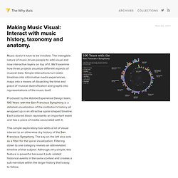
The intangible nature of music drives people to add visual and now interactive layers on top of it. We’ll examine how three projects visualize different aspects of musical data. Simple interactions turn static timelines into informative media experiences, maps into a means of dissecting the time and place of musical diversification and graphs into representations of the music itself.
Produced by the Adobe Experience Design team, 100 Years with the San Francisco Symphony is a detailed visualization of the institution’s history all wrapped up in an attractive spiral-shaped timeline. This simple exploratory tool adds a lot of visual interest to an otherwise dry history of the San Francisco Symphony. Kdd2011-mr-clustering.pdf (Objet application/pdf) Patrick Garvin: Blog» Blog Archive » 4 reasons why Adobe Flash was not a waste of our time. November 15th, 2011 at 14:24 Last week, Adobe Systems announced it would stop making Flash technology for mobile devices and would instead focus on HTML5.
Flash’s end has been predicted for the last few years now, as it is not supported on the iPhone or the iPad. Flash runs on other mobile devices, but Apple products are the Marcia Brady of their kind. If Apple rejects you, you’re kinda sorta screwed. For many graphic artists who joined newsrooms before the big push for “interactive graphics,” Flash was the first program we used to make web graphics with rollovers.
Infographics - Information graphics. About ChartsBin.com. What is ChartsBin?
ChartsBin is a web-based data visualization tool that will allow everyone to quickly and easily create rich interactive visualizations with their own data. You can then share your interactive visualizations with others by embedding them in websites, blogs or sharing via Facebook or Twitter. Work · Imazon. Refine - Google Refine, a power tool for working with messy data (formerly Freebase Gridworks)
Work · Spanish 2011 elections. News, Augmented » Articles de la categorie » Graphisme. 10101010. Joy of Processing. KrazyDad. Chris Harrison. Publications by Jim Bumgardner. Jim Bumgardner / jbum.com. Blended Mona. By: Jeff Clark Date: Wed, 09 Nov 2011 The previous post, Recursive Mona, showed an image of the Mona Lisa constructed from smaller versions of itself.
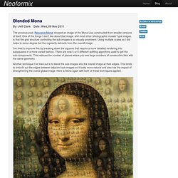
One of the things I don't like about that image, and most other 'photographic mosaic' type images, is that the grid structure controlling the sub-images is so visually prominent. Complex Diagrams. Information visualization.
Infographics news. The Infographics Showcase - Data Visualization - Infographic Design. D3 Tutorial - CS448B Data Visualization. Jeffrey Heer. Sigma Xi: The Scientific Research Society: Blogs & Web Sites. Welcome. Application Gallery - NYC BigApps. TechStars. NYC BigApps 3.0. The central platform for crowdsourcing US Government challenges, contests, competitions and open innovation prizes. NYC BigApps 3.0. Cloudhead's Profile - GitHub. Node.js. Style Chart - Free Ajax Visualization Charting Service. Free, open-source framework.
The Adobe USA site has been optimized for users within the United States.
If you live outside the U.S., we recommend that you visit your local site for the most relevant information, including pricing, promotions, and local events. United States Canada - English Your country selection will be remembered for future visits. Flex Developer Center. Publications: Book Chapters.