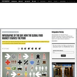

Infographic of the Day: How the Global Food Market Starves the Poor. To understand the complexities of the international food market--and how traders in Chicago can cause Africans to starve--you could get a ph.D. in economics, or read a 400-page report from the World Bank.

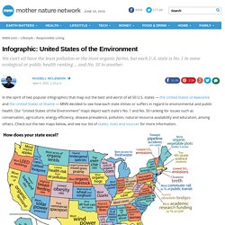
Or you watch this superb nine minute video, directed by Denis van Waerebeke. Though ostensibly created for a science show in Paris for 12 year olds, it's actually probably waaaay over a kid's head. Just watch--it's excellent, and very well illustrated: Voices of History - Old Time Radio Shows - OTR. Infographic: United States of the Environment. In the spirit of two popular infographics that map out the best and worst of all 50 U.S. states — the United States of Awesome and the United States of Shame — MNN decided to see how each state shines or suffers in regard to environmental and public health.

Our "United States of the Environment" maps depict each state's No. 1 and No. 50 ranking for issues such as conservation, agriculture, energy efficiency, disease prevalence, pollution, natural resource availability and education, among others. Check out the two maps below, and see our list of states, stats and sources for more information. Sources for "good U.S. " map:Alabama: Lowest rate of alcohol abuse or dependence (U.S. Substance Abuse and Mental Health Services Administration) Alaska: Most wetlands (U.S.
Emergency and Disaster Information Service. Travel. United Nations News & Commentary Global News – Forum.