
Researching the best ways to improve the online user experience - Baymard Institute. Don Norman Interview - UX Week Video - Events - User Experience - UX Design. Re.

UX Week – Video Don Norman, the esteemed “Ralph Nader of design,” gives us 52:29 of his time to offer wisdom gained from his experience in matters of user experience, design, business, and making our case to management. Don Norman Quotes Notable quotables, for those who may not have the fifty two and a half minutes: “Great design without smooth operations is worthless, but smooth operations without a good front end… good interaction design, is really worthless. “A good designer will actually design the company.” “User experience is really the whole totality. “One of my favorite questions is ‘what do you hate most about when you visit a Disney theme park?’ “Do not go to your executives with a little presentation or lecture about why it is good to treat customers well. “You have to learn to speak the language of business.” “Your job is to make your boss successful.” See all Adaptive Path UX Week videos on Vimeo » share.
10 Useful Usability Findings and Guidelines « Smashing Magazine. Everyone would agree that usability is an important aspect of Web design.
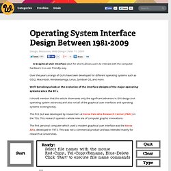
Whether you’re working on a portfolio website, online store or Web app, making your pages easy and enjoyable for your visitors to use is key. Many studies have been done over the years on various aspects of Web and interface design, and the findings are valuable in helping us improve our work. Here are 10 useful usability findings and guidelines that may help you improve the user experience on your websites. 1. Form Labels Work Best Above The Field A study by UX Matters1 found that the ideal position for labels in forms is above the fields. 2Tumblr3 features a simple and elegant sign-up form that adheres to UX Matter’s recommendation. Positioning labels on the left also poses another problem: do you left-align or right-align the labels? 2. People instinctively notice other people right away when they come into view. Eye-tracking heat map of a baby looking directly at us, from the UsableWorld study4. 3. I ♥ wireframes.
Quince / All Patterns. Operating System Interface Design Between 1981-2009. A Graphical User Interface (GUI for short) allows users to interact with the computer hardware in a user friendly way.
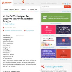
Over the years a range of GUI’s have been developed for different operating systems such as OS/2, Macintosh, Windowsamiga, Linux, Symbian OS, and more. We’ll be taking a look at the evolution of the interface designs of the major operating systems since the 80′s. I should mention that this article showcases only the significant advances in GUI design (not operating system advances) and also not all of the graphical user interfaces and operating systems existing today. The first GUI was developed by researchers at Xerox Palo Alto Research Center (PARC) in the ’70s. This research opened a whole new era of computer graphic innovations. The first personal computer which used a modern graphical user interface was the Xerox Alto, developed in 1973. Xerox 8010 Star (released in 1981) Xerox 8010 Star, Source: toastytech.com Apple Lisa Office System 1 (released in 1983) Acknowledgments.
10 Useful Techniques To Improve Your User Interface Designs. Advertisement Web design consists, for the most part, of interface design.
There are many techniques involved in crafting beautiful and functional interfaces. Here’s my collection of 10 that I think you’ll find useful in your work. They’re not related to any particular theme, but are rather a collection of techniques I use in my own projects. Without further ado, let’s get started. 1. Links (or anchors) are inline elements by default, which means that their clickable area spans only the height and width of the text.
Obviously, the larger the clickable area is, the easier it is to click on the link because there is less of a chance of missing it. Make sure to also add a healthy dose of padding to the links, because converting a link into a block only affects its behavior and width; adding padding ensures that the link is high enough and has some room to breathe. Nouvelle page 1. Reflections on user experience: Remote control usability: Comcast vs. Logitech Harmony. Usability Post. Babykleding en kinderkleding online. pForm - Free HTML Form Builder - Create Web Form Template Online. Useit.com: Jakob Nielsen on Usability and Web Design. Usabilityweb, kennisbank voor gebruikersvriendelijke websites.