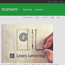

TypoTok: Łukasz Dziedzic [with English subtitles] Regular Bold Italic. Daily Type Specimen. Learn Lettering 2.0 – 30 Days of Lettering Posts Starts Now by seanwes. Since 2014, thousands have purchased the Learn Lettering class and now it gets even better.

Learn Lettering 2.0 launches on July 27th, 2015 with fully reproduced videos and all-new modules! (Yes, if you purchased the Master Class already, you’re going to get a free upgrade and access to all the new modules—I’ll send you an email with the details soon. I like rewarding loyalty!) I’ve gone through hundreds of emails from hand letterers like you sharing their biggest struggles, and as a result I’ve completely re-engineered the course. It’s tailored to the most important things you need to learn. I’m producing an all-new Starter Class. Lettering Masters is an interview series where you’ll go behind-the-scenes in an exclusive feature with expert hand letterers who share their inspiration, process, tools, methods of getting clients, selling products, and more. I’ve been receiving some of their work samples back today to include in the feature and it’s giving me goosebumps it’s so good. Jaz Parkinson. New Transport. Lettering and Calligraphy.
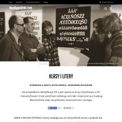
Klasy i litery. AREK GRUSZCZYŃSKI: Litery atakują nas ze wszystkich stron, a jednak nie zwracamy na nie uwagi.

Są przezroczyste. Właśnie wydaliście książkę poświęconą historii typografii – czy to w ogóle jest temat? MARIAN MISIAK: Przez to, że są powszechne, nie wiadomo, co się za nimi kryje. Ten paradoks sprawia, że litery stają się pasjonujące. AGATA SZYDŁOWSKA: Ciekawe jest to napięcie miedzy powszechnością/banalnością/niewidzialnością a splotem znaczeń, konfliktów i innych kontekstów związanych z literami. Agata Szydłowska, kuratorka, wykładowczyni historii dizajnu, autorka tekstów na temat projektowania graficznego. O czym opowiadacie w książce? MM: Udało nam się wygrzebać dużo nieznanych historii. Możesz więcej opowiedzieć o historii tych czcionek? MM: 40 lat po wynalezieniu druku, w Krakowie, została wydrukowana pierwsza na świecie książka wykorzystująca cyrylicę. Agata Szydłowska, Marian Misiak „Paneuropa, Kometa, Hel. MM: Staraliśmy się pisać raczej o różnorodności niż o peryferyjności.
Twój pierwszy font w 7 dni. 106.tut5.pdf. Responsive Typography: The Basics. By Oliver Reichenstein When we built websites we usually started by defining the body text.

The body text definition dictates how wide your main column is, the rest used to follow almost by itself. Used to. Until recently, screen resolution was more or less homogenous. Today we deal with a variation of screen sizes and resolutions. In the heat of the relaunch I wrote a quick blog post on responsive typography, focussing solely on the aspect of our latest experiment: responsive typefaces. To avoid designing different layouts for every possible screen size, many web designers have adopted the concept of Responsive Web Design. Adaptive layouts: adjusting the layout in steps to a limited number of sizes Liquid layouts: adjusting the layout continuously to every possible width Note: Responsive design already incorporates a lot of macro typographic issues (type size, line height, columns width). Choosing a typeface The right tone Serif or sans serif? What size? Line height and contrast. Typeset In The Future. The opening credits for Alien are nothing short of a typographic masterpiece.

You can watch them in their entirety on the Art Of The Title web site, but here's the general gist: a slow, progressive disclosure of a disjointed, customized Futura reveals the movie's central theme over 90 seconds of beautifully-spaced angular lettering. UPDATE: Susan Bradley (and others) have pointed out that this is much more like Helvetica Black than Futura. I'd based my original claim on Art Of The Title's interview with the creators, despite a mismatch when I checked it against Futura myself.
However, after a detailed comparison with Helvetica Black, I tend to agree with Susan. Thank you for the correction! (Before I show you how it looks, I should provide a sizable caveat: I got a lot of grief following my Moon article for spoiling that movie's central twist. Here we go. Can you tell what it is yet? It's looking pretty angular. Generis Flash Sale. Erik Spiekermann. Making it in the little leagues: Aaron Draplin at TEDxPortland. TYPO Talks » Videos » The best way to complain is to make things. Kursownik.