
NYU: Establish Campaign Objectives & Applying Metrics. Bloomberg Visual Data. Raport Kariera w UX UXbite 2011. SOTU graphic. Understanding npm. Graphic Shows Who’s Buying and Selling Animals Globally. Kaitlin Yarnall is the Executive Editor for Cartography, Art, and Graphics at National Geographic magazine.
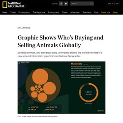
Tiger claws are sold to treat insomnia, and the skin of tiger noses is bought to heal wounds. Along with “tiger wine” made from ground-up bones, these are just a few of the ways that nearly 1,700 tigers were bought and sold around the world in 2013. This new graphic from National Geographic and Fathom Information Design—the first in a new series we’re calling Data Points—reveals many surprises in the animal trade. The United States is the biggest exporter of rhesus macaques, for instance, one of the main species used in medical research (and at times as NASA test-flight subjects). And reptiles are the most-traded animals in the world. The graphic draws its data from CITES, the United Nations’ Convention on International Trade in Endangered Species of Wild Fauna and Flora. What does CITES mean to National Geographic? At National Geographic, we love data. The Next Era of Designers Will Use Data as Their Medium.
The software industry today is in need of a new kind of designer: one proficient in the meaning, form, movement, and transformation of data.
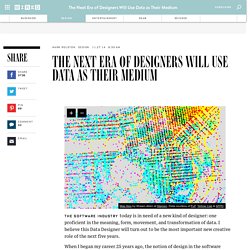
I believe this Data Designer will turn out to be the most important new creative role of the next five years. When I began my career 25 years ago, the notion of design in the software industry was still nascent. It was an engineer’s world, in which just making software function was the consuming focus. So the qualification for this design role was quite simple: do you know anything about software?
Those of us trying to apply humanistic or artistic notions to the process faced fundamental technical challenges. Mark Rolston About Mark Rolston is the cofounder and chief creative officer of argodesign. Over the years, the role of the designer has improved as demand for this talent increased. That leads to where we are now: the inflection point where data emerges as a critical new medium for design. But that is changing—and here’s why.
8 tips for great PowerPoint presentations - Business Insider. 50 great examples of infographics. Human Data Interactions. MoMA Makes a Facebook for Abstractionists. Abstraction was about relationships.
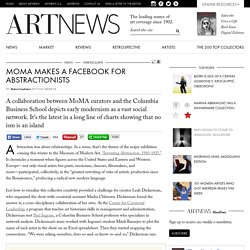
In a sense, that’s the theme of the major exhibition coming this winter to the Museum of Modern Art, “Inventing Abstraction, 1910-1925.” It chronicles a moment when figures across the United States and Eastern and Western Europe—not only visual artists but poets, musicians, dancers, filmmakers, and more—participated, collectively, in the “greatest rewriting of rules of artistic production since the Renaissance,” producing a radical new modern language.
Just how to visualize this collective creativity provided a challenge for curator Leah Dickerman, who organized the show with curatorial assistant Masha Chlenova. Dickerman found the answer in a cross-disciplinary collaboration of her own. At the Center for Curatorial Leadership, a program that teaches art historians skills in management and administration, Dickerman met Paul Ingram, a Columbia Business School professor who specializes in network analysis. Barr’s Code. 3199102299_147b1d0fc7_b.jpg (JPEG Image, 1024 × 632 pixels) 2987255835_4302f7713f_b.jpg (JPEG Image, 724 × 1024 pixels) - Scaled (97%) Ar12_03.png (PNG Image, 1440 × 900 pixels) - Scaled (71%) Data Visualization Technique - How to Design Charts and Graphs. So, what is data visualization? from the Course Data Visualization Fundamentals. So what is data visualization?
It is data visualized. No fancy definitions here for me. But, there's lots of things that go into good data visualizations, but that's not the point of this movie. The point is to really just show some examples and try to set some boundaries for what we're talking about here. And you'll notice probably, that the batteries are pretty broad.
It's off, maligned but it's arguably the best form of data visualization. The bar chart's great, it works fantastically, and I would argue whenever you're doing visualization, you should almost always ask yourself, why should I not do a bar chart? By the way one of the advantages of the bar chart, the line chart and the timeline and some of these others we're going to talk about, is that your audience knows them so well, which means they can immediately recognize them, they know how to read them, they won't be confused by them and that's a good thing. Radar charts and spider charts. So here's an example of one. Hans Rosling: The best stats you've ever seen.