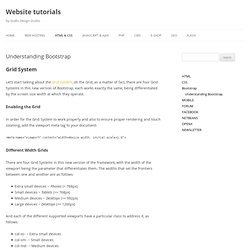

Iconmonstr - Free simple icons for your next project. NounProject ICON. Free vector icons - SVG, PSD, PNG, EPS & Icon Font - Thousands of Free Icons. Community-Software Build and cultivate your own community - Ning.com. Worldsoft. Design & Free Stuff. Mockup Tools. Understanding Bootstrap. Let’s start talking about the Grid System, oh the Grid, as a matter of fact, there are four Grid Systems in this new version of Bootstrap, each works exactly the same, being differentiated by the screen size width at which they operate.

Enabling the Grid In order for the Grid System to work properly and also to ensure proper rendering and touch zooming, add the viewport meta tag to your document: Different Width Grids There are four Grid Systems in this new version of the framework, with the width of the viewport being the parameter that differentiates them. The widths that set the frontiers between one and another are as follows: Extra small devices ~ Phones (< 768px)Small devices ~ Tablets (>= 768px)Medium devices ~ Desktops (>= 992px)Large devices ~ Desktops (>= 1200px) And each of the different supported viewports have a particular class to address it, as follows: col-xs- ~ Extra small devicescol-sm- ~ Small devicescol-md- ~ Medium devicescol-lg- ~ Large devices. Bootstrap. COLOR PALETTE. Web Tools Collection for Responsive Design Testing.
At Codeboxr (Follow @Codeboxr on twitter), for most of the web site or web application project we do responsive design.

We are a great fan of Twitter bootstrap too. Whenever you design for responsive and various screen sizes, you need to test them to make sure that every element of the website is working properly, interactions are right, the menu is not breaking etc. Here I am trying to list few tools which will help you test any responsive design: Web Based Tools: Google Chrome Extensions: Resizerresponsive-web-designresponsiViewDimensionsResolution Firefox Extensions: Firefox’s own Web Developer Tool (File > Web Developer > Responsive Design View (CTRL+SHIFT+M)) Other Tools: Opera Mobile Operatorscreensiz.es/phone to check different device’s screen size and many more.
Interesting Articles on Responsive Design What are you using? TOOLS (Wireframe / Responsive test / Site map) - QuirkTools. CSS Highlight on Hover Animation. Life Of Pix - Free Stock Photos & Images - Photography. Web Designs Based on Polygonal Art. OCR. 15 Beautifully Imperfect Free Brush Fonts. Distorted and irregular, yet beautifully imperfect.

Every individual character unique and painstakingly handmade. Vintage in style yet seamlessly blends in with the modern. Brush-style typography has been forgotten for quite a long time, but as happens with all design trends, is currently enjoying a revival in popularity. In this collection, we have 15 free brush fonts you can use in your designs. You’ll love them! Besom Brush Font Designed by Krisijanis Mezulis & Gatis Vilaks Duwhoers Brush Font Designed by Swistblnk Kust Free Brush Font Designed by Krisijanis Mezulis Reckless Brush Font Designed by Nadi Spasibenko Beacon Free Font Designed by Befonts BlowBrush Font Designed by Petar Acanski Selima Free Font Designed by Jroh Creative Sophia Hand-Lettered Brush Script Designed by Mats-Peter Forss & Emily Spadoni Brux Bold Brush Font Mazak Brush Font Designed by Ewelina Gaska.
Facebook Ad Examples - Thousands of Real Ads with 1 click. TOOLS (Wireframe / Responsive test / Site map) - QuirkTools.