
Institute for Applied Autonomy. iSee is a web-based application charting the locations of closed-circuit television (CCTV) surveillance cameras in urban environments.
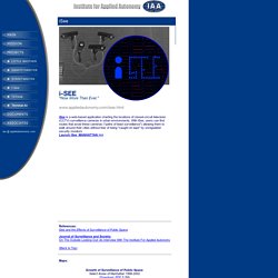
With iSee, users can find routes that avoid these cameras ("paths of least surveillance") allowing them to walk around their cities without fear of being "caught on tape" by unregulated security monitors. Launch iSee_MANHATTAN >>> References: iSee and the Effects of Surveillance of Public Space Journal of Surveillance and Society: On The Outside Looking Out: An Interview With The Institute For Applied Autonomy (Back to Top) Maps: Growth of Surveillance of Public Space: Select Areas of Manhattan 1998-2002 (Download .PDF 5.2M) Data collected by: New York Civil Liberties Union, Surveillance Camera Project Surveillance Camera Players Institute for Applied Autonomy Eyebeam Atelier Workshop Participants iSee Development Timeline: Winter - Fall 2001: Production of Alpha Version of iSee.
(Back to Top) Evolution of iSee interface: Visualizing The Traffic Of Rome, Paris, And Tel Aviv. Los Angeles managed to survive Carmageddon, with some help from Ashton Kutcher and traffic updates from Waze, a service that utilizes the GPS-enabled phones of its users to compile traffic maps.
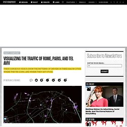
A few months ago, Waze made a slick video of a day of L.A. traffic, showing where people were driving and where they were getting congested. Now, they've made new videos (with the help of the Gray Area Foundation for the Arts) for other, more far-flung cities: Paris, Rome, and Tel Aviv. In these videos, each lit-up line represents a car trip. The lines burst with purple when there is traffic, and other colored bars rise above when various alerts are activated, like for police or hazards. In Paris, you can see the main ring road around the center city is in constant use, while one corridor through the city also becomes quite congested, especially at rush hour: Rome is configured much like Paris, though with much worse traffic, it appears.
Mapnificent - Dynamic Public Transport Travel Time Maps. Engineering vehicle efficiency via systems design. Live map of London Underground trains. Loading...

Powered by Leaflet — Map tiles © Thunderforest, data © OpenStreetMap contributors. Live London Underground map By Matthew Somerville. Data collected: Mon, 05 Sep 2016 08:33:02 +0100 <div style="border: solid 2px #cc0000; padding: 5px; width: 70%; margin: 1em auto;"> I'm afraid that this page requires JavaScript to draw the maps and plot move the trains, which isn't possible with just HTML. More information Hide What is this? This map shows all trains (yellow dots) on the London Underground network in approximately real time. I have similar things for the London buses and National Rail, and an awesome bookmarkable train times journey planner.
. — Matthew How does it work? Live departure data is fetched from the TfL API, and then it does a bit of maths and magic. Who did this? Matthew Somerville (with helpful hinderances from Frances Berriman and James Aylett). Originally built at Science Hackday, June 2010. AirTraffic LIVE. Copenhagen wheel project.