
Google Developers. Visualisierung. 20+ Tools to Create Your Own Infographics. A picture is worth a thousand words – based on this, infographics would carry hundreds of thousands of words, yet if you let a reader choose between a full-length 1000-word article and an infographic that needs a few scroll-downs, they’d probably prefer absorbing information straight from the infographic.
What’s not to like? Colored charts and illustrations deliver connections better than tables and figures and as users spend time looking back and forth the full infographic, they stay on the site longer. Plus, readers who like what they see are more likely to share visual guides more than articles. While not everyone can make infographics from scratch, there are tools available on the Web that will help you create your very own infographics. In this article, we’re listing more than 20 such options to help you get your messages across to your readers, visually. Information Is Beautiful. Signaux : infographies du monde. INFOGRAFIKA. Les 20 meilleurs outils de datavisualisation au banc d’essai.
Que vous soyez absolument novice ou codeur amateur, il existe aujourd’hui sur le web une impressionnante palette d’outils (presque) gratuits pour réaliser des datavisualisations.
Banc d’essai. Www.hyblab.fr. Video - Felice Frankel: Keynote on Communicating Science Visually. Videos All videos from VIZBI 2013 (26 matches)
Videos. Videos All videos from all years (106 matches) Bang Wong: VIZBI 2013 Opening Remarks.
Brief: Make a Bigger Impact by Saying Less - Joseph McCormack. A Practical Guide to Graphics Reporting: Information Graphics for Print, Web ... - Jennifer George-Palilonis. Infographics: The Power of Visual Storytelling - Jason Lankow, Josh Ritchie, Ross Crooks. The Power of Infographics: Using Pictures to Communicate and Connect with ... - Mark Smiciklas. Music Timeline.
How to Display Text in R. Visualization. All the buildings in Manhattan in 3-D map Taylor Baldwin mapped all of the buildings in Manhattan using a 3-D layout.… Get all caught up with The Avengers using this timeline It’s been a decade since the first Iron Man movie, and some 30… Waiting Game, through the steps of asylum seekers Sisi Wei for ProPublica and Nick Fortugno of Playmatics made a game to… Umpire strike zone changes to finish games earlier When watching baseball on television, we get the benefit of seeing whether a… Shapes we make, seen from the sky Look from the above at the shapes and geometry we use for cities,… Algorithms drawn as IKEA furniture instructions Learning algorithm steps can be a challenge when viewed only through code or… Maps show spring arriving earlier From Joshua Stevens at the NASA Earth Observatory: But over the longer term,… The Moon in 4k resolution Based on data gathered by the Lunar Reconnaissance Orbiter, NASA pieced together this… Day of the year companies stop paying women 556 people have gone to space.
100 Years of Design. DailyTekk. Music Timeline. Gerd Arntz Web Archive. How to Be an Educated Consumer of Infographics: David Byrne on the Art-Science of Visual Storytelling. As an appreciator of the art of visual storytelling by way of good information graphics — an art especially endangered in this golden age of bad infographics served as linkbait — I was thrilled and honored to be on the advisory “Brain Trust” for a project by Pulitzer-Prize-winning journalist, New Yorker writer, and Scientific American neuroscience blog editor Gareth Cook, who has set out to highlight the very best infographics produced each year, online and off.
(Disclaimer for the naturally cynical: No money changed hands.) The Best American Infographics 2013 (public library) is now out, featuring the finest examples from the past year — spanning everything from happiness to sports to space to gender politics, and including a contribution by friend-of-Brain Pickings Wendy MacNaughton — with an introduction by none other than David Byrne. Accompanying each image is an artist statement that explores the data, the choice of visual representation, and why it works. Circos Table Viewer - Circular Visualization of Tabular Data // with Circos - Circular Genome Data Visualization. Before uploading a data file, check the samples gallery to make sure that your data format is compatible. Your file must be plain text. Your data values must be non-negative integers. Data must be space-separated (one or more tab or space, which will be collapsed).
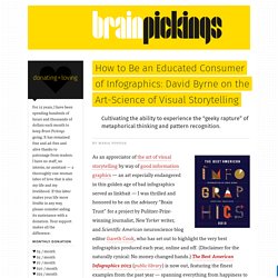
No two rows or columns may have the same name. Column and row names must begin with a letter (e.g. Need help? If you are using the size, order or color options below, make sure your input file has the appropriate content (see samples 5-9). Online graphing and data analysis. 8 types of infographics: which one is right for you? There is more to infographics than a bunch of scattered numbers and pictures in a long image.
Actually there are different types of infographics (this flowchart shows 8) that come with their own strengths. As Danny Ashton from NeoMam Studios puts it: “The right kind of infographic should match your data to your narrative and ensure that people take away your message after reading it. While infographics may not come in that many shapes or sizes (600 x 1,800 pixels is the norm), that doesn’t mean there’s a stock standard infographic for you.” Check the flowchart below to determine which infographic type works the best for you! Thank you NeoMam Studios! 1. 2. 3. 4. 5. 6. 7. 8. Data Visualization, Design and Information Munging // Martin Krzywinski / Genome Sciences Center.
Schemaball is a flexible schema visualizer for SQL databases.
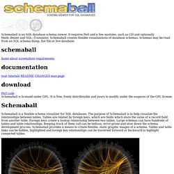
The purpose of Schemaball is to help visualize the relationships between tables. Tables are related by foreign keys, which are fields which store the value of a record field from another table. Foreign keys create a lookup relationship between two tables. Large schemas can have hundreds of tables and table relationships. Keeping track of them call can be tedious, error-prone and slow down the schema development process.
World Data. Diffusion of Innovation Theory. Diffusion of Innovation (DOI) Theory, developed by E.M.
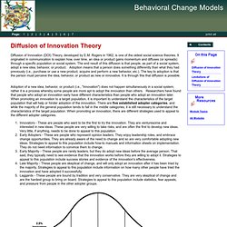
Rogers in 1962, is one of the oldest social science theories. It originated in communication to explain how, over time, an idea or product gains momentum and diffuses (or spreads) through a specific population or social system. The end result of this diffusion is that people, as part of a social system, adopt a new idea, behavior, or product.
Adoption means that a person does something differently than what they had previously (i.e., purchase or use a new product, acquire and perform a new behavior, etc.). The key to adoption is that the person must perceive the idea, behavior, or product as new or innovative. Adoption of a new idea, behavior, or product (i.e., "innovation") does not happen simultaneously in a social system; rather it is a process whereby some people are more apt to adopt the innovation than others. Innovators - These are people who want to be the first to try the innovation.
Visualization. Geek. Tools.