
Data visualisation DIY: our top tools. What data visualisation tools are out there on the web that are easy to use - and free?

Here on the Datablog and Datastore we try to do as much as possible using the internet's powerful free options. That may sound a little disingenuous, in that we obviously have access to the Guardian's amazing Graphics and interactive teams for those pieces where we have a little more time - such as this map of public spending (created using Adobe Illustrator) or this Twitter riots interactive. But for our day-to-day work, we often use tools that anyone can - and create graphics that anyone else can too.
So, what do we use? Google fusion tables This online database and mapping tool has become our default for producing quick and detailed maps, especially those where you need to zoom in. The main advantage is the flexibility - you can can upload a kml file of regional borders, say - and then merge that with a data table. This excellent tutorial by Google's Kathryn Hurley is a great place to start. Datamarket. Un jour, une infographie par Laurent Charpentier. Infographie en 1 image. Visualizations. Les 50 meilleures infographics et data visualization.
Cool Infographics - Blog. Infographies, Etudes & Présentations. Dans la catégorie Infographies, Etudes & Présentations Le 22 octobre 2012 0 Infographies, Etudes & Présentations [Infographie] L’histoire de la plateforme de développement de Facebook Le 21 octobre 2012 0 [Infographie] Infobésité 2.0 Le 18 octobre 2012 2 [Infographie] Le club des milliardaires de Facebook Le 17 octobre 2012 2 [Infographie] 5 mythes sur l’Open Source Le 15 octobre 2012 1 [Infographie] Chiffres et faits sur le télétravail.

BlogLESS: A Blog about Design Ethics. More 2011 Review: Year in Color To add to our review of year-in-reviews from last week, check out Imprint's Year in Color.

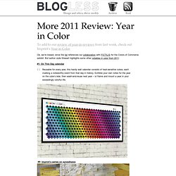
Written by Andrea on January 2, 2012 Ok, we’re biased, since the list references our collaboration with FICTILIS for the Colors of Commerce exhibit. But author Jude Stewart highlights some other notables in color from 2011: #1: On This Day calendar Reusable for every year, this handy wall calendar consists of heat-sensitive cubes, each marking a noteworthy event from that day in history. . #9: Imprint’s series on synesthesia #6: Google Image Search by Color.
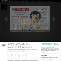
Happy 2012! These icons link to social bookmarking sites where readers can share and discover new web pages. 2011: Year in Review: In Review Please enjoy from the future in 2012 this brief summary of reviews of design in 2011. Written by Paul on December 30, 2011 First off, Design Milk has a nice review of the best of architecture in 2011. En 1 image. 9 Of The World's Most Inspiring Infographics. We spend lots of time here at Co.Design hunting down the smartest and most creative infographics to feature daily, but we’re limited by what’s available on the web, what we have permission to publish, and what languages we (and you) can understand.

Here to pick up where Infographic of the Day leaves off is Information Graphics (Taschen, April 2012), a 480-page doorstopper of a book that offers up a mind-boggling selection of infographics, many plucked from the furthest reaches of the media firmament. It has more than 400 examples, ranging from an illustration of stalled building projects in a Dutch design rag to a Nicholas Felton-designed chart of CNN.com traffic to a map of sonar and whale songs courtesy of a Danish geological institute. Preorder Information Graphics here.