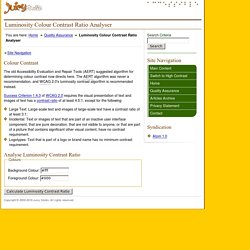

Cercle Chromatique Accessible - Palette de couleur Accessible. Luminosity Colour Contrast Ratio Analyser. Colour Contrast The old Accessibility Evaluation and Repair Tools (AERT) suggested algorithm for determining colour contrast now directs here.

The AERT algorithm was never a recommendation, and WCAG 2.0's luminosity contrast algorithm is recommended instead. Success Criterion 1.4.3 of WCAG 2.0 requires the visual presentation of text and images of text has a contrast ratio of at least 4.5:1, except for the following: Large Text: Large-scale text and images of large-scale text have a contrast ratio of at least 3:1; Incidental: Text or images of text that are part of an inactive user interface component, that are pure decoration, that are not visible to anyone, or that are part of a picture that contains significant other visual content, have no contrast requirement. Logotypes: Text that is part of a logo or brand name has no minimum contrast requirement.
Colour Contrast Check - snook.ca. Date created: January 11, 2005 Date last modified: March 30, 2009 The Colour Contrast Check Tool allows to specify a foreground and a background colour and determine if they provide enough of a contrast "when viewed by someone having color deficits or when viewed on a black and white screen"[W3C]. The tool will indicate that the colours pass the test if both the colour difference and the brightness difference exceed their threshold. It will indicate that it sort of passes if only one of the two values exceed their threshold. And finally, it'll fail to pass if neither value exceeds its threshold. Color Scheme Designer 3. Coloriser des scripts.