
Immersion: a people-centric view of your email life. Lifehacker. @Wyco: Thank you for those that offered help.

It took several "passes" for me to get this to run right on Windows XP, all based on your help, so thanks. FOR THOSE STRUGGLING on XP, this might put you over the top (very step by step hand-holdy directions): 0. If you don't have Python, the installation for that should be described on the Python site. Get Python 2.5. and install it as it suggests (I already had Python 2.5 set up). 1. 2. Cd Desktop/Cheetah-2.0.1 from the prompt (which for me was sitting at: C:\Documents and Settings\myname\ and I did the command as directed above: python [setup.py] install This will copy lots o' Cheetah files and create a Cheetah folder in your site-packages folder under Python. 3.
C:\Python25\Lib\site-packages\Cheetah (or wherever you have Python25 on your machine. _namemapper.pyd 4. 5. 6. Opts_map["max_messages"] = "1000" to say opts_map["max_messages"] = "100000" or whatever you think is a good maximum. 7. And paste it into a new Notepad sheet. YouAreWhatYouLike. Facebook report. OOM Creative – We Design Data Visualizations – Melbourne, Australia. Christopher Baker. Email became an integral part of my life in 1998.
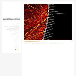
Like many people, I have archived all of my email with the hope of someday revisiting my past. I am interested in revealing the innumerable relationships between me, my schoolmates, work-mates, friends and family. This could not readily be accomplished by reading each of my 60,000 emails one-by-one. Instead, I created My Map, a relational map and alternative self portrait. My Map is a piece of custom designed software capable of rendering the relationships between myself and individuals in my address book by examining the TO:, FROM:, and CC: fields of every email in my email archive. My Map can be viewed as a large scale static print (40″x40″ archival inkjet) or as an up-to-date dynamic visualization (see Quicktime video above).
What we do — Luminoso. We're the answer to the nagging question that's plaguing global business: "We've got all this data.

Now what? " View Solutions and Case Studies » Years of work teaching computers to think. (And not one thank-you note from them.) The people behind Luminoso spent a decade — including many years at the fabled MIT Media Lab — building the world's first cloud-based, massively multi-lingual, scalable solution for understanding text. Our clients are delighted by the way we dig out the concepts that dart and lurk within the text. Inspiring applications. Once people grasp the power of our engine, they instantly come up with applications for their individual business challenges. Anymails - Visualization of my email inbox. Graphical Bios. Stunning. Simple.