
Sans titre. Webfont & Desktop font. ABaker. RAFAELRIBAS LES DISCOURS DUNE ECRITURE. Home » Altiplano. Nizioleti – ABYME. The Venetian street signs, or nizioleti, don’t prevent you from getting lost in the labyrinth, but they do comfort or allow you to get lost in the most elegant way.
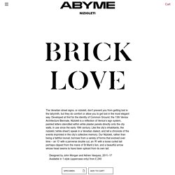
Developed at first for the identity of Common Ground, the 13th Venice Architecture Biennale, Nizioleti is a reflection of Venice’s sign system, painted letters stencilled within white plaster panels directly onto the city walls, in use since the early 19th century. Like the city’s inhabitants, the nizioleti (‘white sheet’) speak in a Venetian dialect, and tell a chronicle of the events imprinted in the city’s collective memory. Our Nizioleti, rather than being a faithful revival, borrows from a variety of forms that evolved over time – an ‘O’ with a perverse double cut, an ‘R’ with a loose curled tail perhaps clipped from the mane of St Mark’s lion, and a beautiful arrow whose head seems to have been spliced from its own tail.
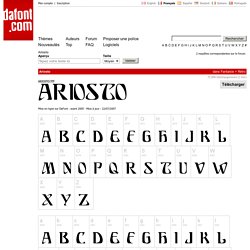
Designed by John Morgan and Adrien Vasquez, 2011–17Available in 1 style (uppercase only) from £ 240. Ariosto. English Français Español Deutsch Italiano Português Mon compte | Inscription Thèmes Nouveautés Auteurs Top.
Fonts Wants. Displaay - Displaay Type Foundry. Displaay - Displaay Type Foundry. Dinamo Darkroom. L'Éventuel, exploration dans le futur des formes typographiques. Carolinéale. [#technology] Gregorio's typefacesWe have seen that in responding to a real request from a religious and scientific community, Gregorio has become a reference for the composition of Gregorian music and its notations.
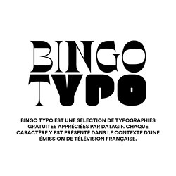
Gregorio offers, in its standard delivery and for the square notation, several libre fonts: Gregorio, developed at the origin of the project, Greciliae, a typeface based on Caeciliae, itself designed by Matthew Spencer, and Grana Padano, an adaptation of Parmesan, a typeface designed by Juergen Reuter. Regarding the text of the chant, no particular typeface has been developed for Gregorio. The software uses, if one do not personalize it, the standard typographic typeface of TeX: Computer Modern [fig.5/8], a "Scotch-Face" designed by Donald Knuth in the 80's. Computer Modern is a particularly interesting typeface. Its drawing is indeed parametric. Type Club Düsseldorf. Charlotte Rohde — Typefaces Copy. BINGO TYPO. Émission Questions pour un champion Des chiffres et des lettres.
L’Outil typographique - Sommaire. Descarga libre – Descarga 'Chulapa', la tipografía de la ciudad de Madrid. Chulapa es una tipografía de uso libre y gratuito, netamente madrileña, basada en la realizada por Ruiz de Luna para el callejero histórico de Madrid.
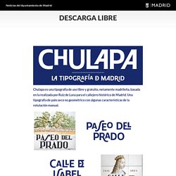
Una tipografía de palo seco no geométrico con algunas características de la rotulación manual. Existen distintas variaciones de tamaño, ubicación o ligaduras de caracteres que respetan el dinamismo y la irregularidad de la rotulación original, permitiendo crear palabras como logotipos no necesariamente sistemáticos. Chulapa es una tipografía producida por Joan Carles Casasín y Pablo Gámez sobre una idea original de Silvia Fernández Palomar que el Ayuntamiento de Madrid publica para uso libre y abierto, bajo el proyecto tipográfico Madrid-Ferpal.
Typeface from Titus Kaphar / Reginald Dwayne Betts’ show at MoMA PS1. The Redaction project seeks to highlight the abuses in the criminal justice system, in particular the way poor and marginalized people are imprisoned for failure to pay court fines and fees.
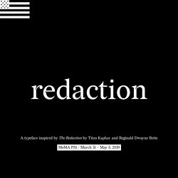
When Titus Kaphar and Reginald Dwayne Betts began their collaboration on The Redaction, they identified that typography should be an important extension of the work. Using legal documents from claims filed by the Civil Rights Corps as source material, Betts crafted new poems by redacting out superfluous information – text that is juxtaposed with Kaphar’s portraits of the individuals represented in the claims.
This emphasis on text and legibility presented a unique design opportunity: to create a bespoke typeface that could be used in the work, and also serve as a scalable tool to raise awareness of the project and reach even more people. The first phase of the project consisted of research and immersion. Climate Fonts. Font: Climate Base Download here ABCDEFGHIJKLMNOPQRSTUVWXYZ abcdefghijklmnopqrstuvwxyz 0123456789.,?!
Font: Climate Melt 1 Download here ABCDEFGHIJKLMNOPQRSTUVWXYZ abcdefghijklmnopqrstuvwxyz 0123456789.,?! Collletttivo. NEW LETTERS. Get the Font. Le bureau du titre. TROIS TYPOGRAPHES EN AVAIENT MARRE. Du livre considéré comme un des beaux arts dimanche 17 janvier 2010 • TROIS TYPOGRAPHES EN AVAIENT MARRE / © by GLM 1967 / ‘Ces pages furent écrites par Guy Lévis Mano en Décembre 1934 et imprimées par lui à 145 exemplaires en mai 1935.
Home. Home. Nimbus Sans D Bold - Desktop font. Berthe – ABYME. Wakamai Fondue, the tool that answers the question “what can my font do?” Fonts Wants. Font Map · An AI Experiment by IDEO. Signo™ Fonts, typefaces and all things typographical — I love Typography (ILT) Font Library. Free Font. Search Lost your password?
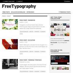
Free Font Free Font: Paradiso Fontsgood is a small team based in Bali, a full time freelance graphic design and type foundry service who believes that a design should look aesthetically ... Exclusive DownloadFree FontTypography0 Comments 12. Typographic oasis: The Neon Boneyard: idsgn (a design blog) An old motel sign sits in the Neon Boneyard.
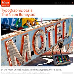
(Photos: Josh Smith and Skylar Challand with permission at The Neon Museum, Las Vegas, Nevada) In the most unlikeliest location lies a typographer’s oasis.