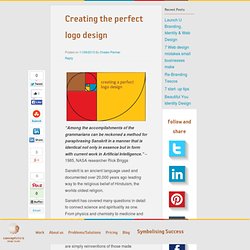
Fibonacci spiral elephant concept logo by Jan Zabransky. A New Look at Work, Part 2: The Angel in the Marble. This is part two of a four-part series about the design of the new logo and website for Mesa Public Schools.
For more information, please read the introduction: A New Look at Work. There’s a great story about Michelangelo, perhaps best told (with embellishments, I’m sure) by a character on Lost: “…a visiting Prince came into Michelangelo’s studio and found the master staring at a single 18-foot block of marble. Then he knew the rumors were true–that Michelangelo had come in every day for the past four months, stared at the marble, and gone home for his supper. So the Prince asked the obvious, ‘What are you doing?’
I am no Michelangelo. That’s why I didn’t shrug my shoulders and say “good enough” after I created this: By the way, something about this logo makes me hungry. There it is. Ahem… So yeah, anyway… Red and blue would not have been my first choice for colors. There were other issues with the color. Color wasn’t the only problem. Blog : #NewTwitter’s Divine Proportions. “To anyone curious about #NewTwitter proportions, know that we didn’t leave those ratios to chance,” explains Twitter’s Creative Director, Doug Bowman, referring to the site’s recent revamp.
The two-pane layout remains the basis for the redesign, but the new proportions are based on an age-old mathematical constant that – applied correctly – can result in some of the most effective, perfectly balanced, and visually compelling creations. The Golden Ratio – also known as the Divine Proportion – is represented by the calculated number 1.6180339887, and denoted by the Greek letter Phi (Φ). Blog – Golden Ratio in logo designs. Golden Ratio in logo designs.
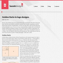
Beauty and aesthetics have been praised from time immemorial. But little did people know that the most effective, perfectly balanced, and visually compelling creations followed the tid-bits of mathematics. At least not until 1860, when German physicist and psychologist Gustav Theodor Fechner proposed that a simple ratio, an irrational number defines the balance in nature. The Golden Ratio!
Fechner’s experiment was simple: ten rectangles varying in their length-to-width ratios were placed in front of a subject, who was asked to select the most pleasing one. Golden Ratio Golden Mean, Golden Section, Divine Proportion are all common names for what is known as the Golden Ratio which is based off the number phi (φ) = 1.61803398874… discovered by Italian Mathematician Fibonacci.
The ratio between these numbers soon become very close to φ (1.618). Le nombre d'or : secret du design d'Apple et Twitter... Creating the perfect logo design. “Among the accomplishments of the grammarians can be reckoned a method for paraphrasing Sanskrit in a manner that is identical not only in essence but in form with current work in Artificial Intelligence.” – 1985, NASA researcher Rick Briggs Sanskrit is an ancient language used and documented over 20,000 years ago leading way to the religious belief of Hinduism, the worlds oldest religion.
Sanskrit has covered many questions in detail to connect science and spirituality as one. From physics and chemistry to medicine and maths, the language and discoveries made in the time of Sanskrit have been astonishing. Its even considered that the technological advancements and discoveries made today are simply reinventions of those made previously via the Sanskrit.
It wasn’t just the formidable top three subjects that it covered (Science, English Maths) it also made great progress in the development of todays industry of graphic design. The Fibonacci Little Owl by ark4n on deviantART. Fibonacci Font Friday. A glorious number of type designers have created fonts based on the Fibonacci spiral.
Some of the designs are lovely, such as Sarah Samira’s, some are incomprehensible, such as Nicola Ball’s, and some are just terrible, such as Rachel Sinclair’s, but it’s the (mathematical) thought that counts. Fibonacci Font—Sarah Samira Design The Fibonacci Spiral Fibonacci Font—Nicola Ball Nicola Ball is a third year graphic design student at Salford University, and lives in Manchester, UK. She used Fibonacci patterns in her creation of the Turing alphabet (2012), named in celebration of Alan Turing’s 100th birthday. Written by Luc Devroye McGill University Montreal, Canadalucdevroye@gmail. to main font pageUp to main font index page Fibonacci Font—Rachel Sinclair Rachel Sinclair, illustrator and fine artist in Louisville, KY, confesses to many art nouveau influences.
Written by Luc Devroye McGill University Montreal, Canadalucdevroye@gmail. to main font pageUp to main font index page. Les 7 Principes Fondamentaux de Design d’un Site. Les 7 Principes Fondamentaux de Design d’un Site Cette semaine, le blog accueille Tarik Peudon de Clicboutic, qui nous livre une adaptation d’une grande qualité sur les fondamentaux en ergonomie et webdesign.
Une aventure « livresque », au travers des théories fondamentales a avoir en tete a l’heure de concevoir un site. Le design de votre site est plus important que vous ne le pensez pour améliorer vos conversions. Peu importe les tactiques que vous avez déjà mises en oeuvre pour booster votre taux de conversion, si votre site ne ressemble à rien : vous gaspillez vos ressources.Le design ne se réduit pas au travail d’un graphiste.Le design, c’est aussi du marketing.Le design, c’est votre produit et son fonctionnement.
Nombre d'or et suite de Fibonacci. Infos : nombre d'or.