
Teacher Infographics. Students love rich useful feedback. But, what exactly do they want and need from the instructor? Here are a few questions I have been asked by students, and ways to respond. Tools. Adioma creates information graphics out of your textual data, using timelines, grids and icons.
Create impressive charts from spreadsheets. Assemble into dashboards, embed in websites, or simply share a link. A Python interactive visualization library that targets modern web browsers for presentation Cacoo is a free online drawing tool that allows you to create a variety of diagrams such as site map, flowchart, mind map, wire frame, UML diagram and network diagram. Crowdsourced Analytics Solution Marketplace - Make Sense of Big Data Free interactive charts created online in seconds ChartGo is an online graph maker tool. Simply choose your settings, enter your data and hit create. Tools - Cool Infographics. 20 ways to create classroom pizzazz with Piktochart. Piktochart makes creating infographics and visuals easy — and it’s free!
There are so many ways to add it to class, too. (Public domain image via Pixabay) We live in an increasingly visual world. I first really noticed it in USA Today. I always loved those infographics in the bottom corner of the front page. Billboards. Unfortunately, our classroom activities seldom reflect the stunning qualities of these visuals. 10 steps to creating the perfect infographic. While the term 'infographic' is a relatively new one, the concept of displaying information in a graphical format has been around for a long, long time.
For thousands of years humans have attempted to explain the world around them through visual means - from 30,000-year-old cave paintings, the striking use of simple iconography to tell complex stories in ancient Egyptian hieroglyphs, or the evolution of Chinese script, to the very first examples of cartography and the bar chart. We are visual creatures by nature, and we tend to learn and explain best when information is presented in a visual format. The modern day infographic has taken on a slightly different form to that of its predecessors. However, the fundamentals remain the same. The combination of visual storytelling with data presentation is the key driver behind the popularity of infographics and, in an age where data is everywhere, they have become genuinely indispensable. Creating eye-popping infographics with Google Drawings. Infographics. Creating eye-popping infographics with Google Drawings. Here Are The 100 Best Education Infographics. POSTERS – EDUWELLS.
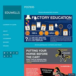
Factory education fails everyone Are you putting your cart before your horse?
10 tips for administrators to help new teachers avoid burnout The Class a Teacher Talks to [Star Wars Edition] – More SW Posters HERE My Five focal points for 2016 The Principal’s New Role by Michael Fullan The SAMR Mindsets Facebook School: Safe to use The teachers you work with Twitter Intro A New School Day Move your School forward Answer the “Why” questions first Understand you level of understanding Lessons? No coding expertise needed. Are your students involved with the learning? Design Thinking: A Teacher’s Target: PDF version here School iPad workflow Keeping Kids Safe on iPads: 9 Tips for teachers who just got iPads EdChat – A Measure of School quality: Learn to Code on an iPad app Journey School improvement through Teacher Inquiry. Icons that might be useful to some. Is your school blocking Facebook?
iPad4Schools #AppSmash icon (Transparent background version Here) Moving from 20C to 21C Learning Why iPad 4 schools? Creating Infographics with Students I have been mesmerized by Infographics for a while now.
Take a look at my previously written posts. Top 10 Visuals & Infographics on Langwitches. Create and share visual ideas online. Thing 24: Infographics. Using graphics and text to present data and information in not a new idea.
Infographics, or ‘information graphics’, have been appearing in print, advertising, on tv news shows and more, for a very long time. But it’s only recently that easy to use and free/cheap tools for creating them have become available. Pictures really can be worth a thousand words. Images quickly grab our attentions. And carefully created representations of data and other information can help us quickly grasp what is being presented and communicate a message more effectively. “We are bombarded by slick images every minute of everyday. The beauty of data visualization: TED Talk by David McCandless Infographics can be used in so many different ways: for advocacy, creating persuasive arguments, as teaching tools, as learning assessments, for presentation slides, in research presentations and more.
Infographics as a Creative Assessment from Kathy Schrock on Vimeo. 5 Great Online Tools for Creating Infographics Professional infographic designers rely primarily on a core vector graphics software program to create their infographics designs.
The main advantage is that all the icons, charts, images, illustrations, and data visualizations are treated as separate objects that can be easily moved, resized, overlapped, and rotated. No matter where you create the individual design elements, the final infographic design is usually put together in a vector graphics program. Creating infographics using online tools has never been easier. In the last few years a number of online tools have emerged that allow anyone to create great visual content.